This process involves reading the theory and looking at the wide range of component implementations in a standard AEM instance. This latter approach is slightly complicated by the fact that although AEM has shifted to the modern, touch-enabled UI, it continues to support the classic UI.
Overview
This section covers key concepts and issues as an introduction to the details needed when developing your own components.
Planning
Before starting to actually configure/code your component you should ask:
What exactly do you need the new component to do?
- A clear specification helps at all stages of development, testing, and handover.
- Details may change over time, but the specification can be updated (though changes should be documented too).
- There is no need to reinvent the wheel.
- There are several mechanisms provided by AEM to allow you to inherit and extend details from another component definition including override, overlay, and the Sling Resource Merger.
- Logic should be kept separate from the user interface layer. HTL is designed to help ensure this happens.
- CSS formatting should be kept separate from the component definitions. Define conventions for naming your HTML elements so that you can modify them through external CSS files.
- See Security Checklist - Development Best Practices for further details.
Before any serious discussion starts about developing components you need to know which UI your authors will be using:
- Touch-Enabled UI
- The standard user interface that was introduced in AEM 5.6.0 as a preview and extended in 6.x. It is based on the unified user experience for the Adobe Marketing Cloud, using the underlying technologies of Coral UI and Granite UI.
- Classic UI
- User interface based on ExtJS technology that was introduced with CQ 5.1.
See UI Interface Recommendations for Customers for more details.
Components can be implemented to support the touch-enabled UI, the classic UI, or both. When looking at a standard instance you will also see out-of-the-box components that were originally designed for the classic UI, or the touch-enabled UI, and/or both.
Components can be implemented to support the touch-enabled UI, the classic UI, or both. When looking at a standard instance you will also see out-of-the-box components that were originally designed for the classic UI, or the touch-enabled UI, and/or both.
For this reason, we will cover the basics of both, and how to recognize them, on this page.
Content Logic and Rendering Markup
It is recommended to keep the code responsible for markup and rendering separate from the code that controls the logic used to select the component's content.
This philosophy is supported by HTL, a templating language that is purposely limited to ensure a real programming language is used to define the underlying business logic. This (optional) logic is invoked from HTL with a specific command. This mechanism highlights the code that is called for a given view and, if required, allows specific logic for different views of the same component.
HTL vs JSP
HTL is an HTML templating language, introduced with AEM 6.0.
The discussion of whether to use HTL or JSP (Java Server Pages) when developing your own components should be straightforward as HTL is now the recommended scripting language for AEM.
HTL vs JSP
HTL is an HTML templating language, introduced with AEM 6.0.
The discussion of whether to use HTL or JSP (Java Server Pages) when developing your own components should be straightforward as HTL is now the recommended scripting language for AEM.
Both HTL and JSP can be used for developing components for both the classic and the touch-enabled UI. Although there can be a tendency to assume that HTL is only for the touch-enabled UI and JSP for the classic UI, this is a misconception and more due to timing. The touch-enabled UI and HTL were incorporated into AEM over approximately the same period. Since HTL is now the recommended language, it is being used for new components, which tend to be for the touch-enabled UI.
Note:
The exceptions are Granite UI Foundation Form Fields (as used in dialogs). These still require the use of JSP.
Developing Your Own Components
To create your own components for the appropriate UI see (after reading this page):
A quick way to get started is to copy an existing component and then make the changes you want. To learn how to create your own components and add them to the paragraph system see:
Developing Components (focused on the touch-enabled UI)
Moving Components to the Publish Instance
The components that render content must be deployed on the same AEM instance as the content. Therefore, all components that are used for authoring and rendering pages on the author instance must be deployed on the publish instance. When deployed, the components are available to render activated pages.
Use the following tools to move your components to the publish instance:
- Use the Package Manager to add your components to a package and move them to another AEM instance.
- Use the Activate Tree replication tool to replicate the components.
These mechanisms can also be used for transferring your component between other instances e.g. from your development to your test instance.
Components to be aware of from the Start
Page:
- AEM has the page component (cq:Page).
- This is a specific type of resource that is important for content management.
- A page corresponds to a web page holding content for your website.
- The paragraph system is a key part of a website as it manages a list of paragraphs. It is used to hold and structure the individual components that hold the actual content.
- You can create, move, copy, and delete paragraphs in the paragraph system.
- You can also select the components to be available for use within a specific paragraph system.
- There are various paragraph systems available within a standard instance (e.g. parsys, responsivegrid).
The structure of an AEM component is powerful and flexible, the main considerations are:
- Resource Type
- Component Definition
- Properties and Child Nodes of a Component
- Dialogs
- Design Dialogs
- Component Availability
- Components and the Content They Create
A key element of the structure is the resource type.
- Content structure declares intentions.
- Resource type implements them.
Component Definition
COMPONENT BASICS
The definition of a component can be broken down as follows:
AEM components are based on Sling.
AEM components are (usually) located under:
- HTL: /libs/wcm/foundation/components
- JSP: /libs/foundation/components
- /apps/<myApp>/components
jcr properties:
- A list of jcr properties; these are variable and some may be optional though the basic structure of a component node, its properties and subnodes are defined by the cq:Component definition
- These define static elements used by the component.
- Scripts:
- Are used to implement the behavior of the resulting instance of the component.
- <mycomponent> (cq:Component) - Hierarchy node of the component.
- jcr:title - Component title; for example, used as a label when the component is listed in the components browser or sidekick.
- jcr:description - Description for the component; can be used as mouse-over hint in the components browser or sidekick.
- Classic UI:
- icon.png - Icon for this component.
- thumbnail.png - Image is shown if this component is listed within the paragraph system.
- Touch UI
- See the section Component Icon in Touch UI for details.
- cq:editConfig (cq:EditConfig) - Defines the edit properties of the component and enables the component to appear in the Components browser or Sidekick.
- Note: if the component has a dialog, it will automatically appear in the Components browser or Sidekick, even if the cq:editConfig does not exist.
- cq:childEditConfig (cq:EditConfig) - Controls author UI aspects for child components that do not define their own cq:editConfig.
- cq:dialog (nt:unstructured) - Dialog for this component. Defines the interface allowing the user to configure the component and/or edit content.
- cq:design_dialog (nt:unstructured) - Design editing for this component
- dialog (cq:Dialog) - Dialog for this component. Defines the interface allowing the user to configure the component and/or edit content.
- design_dialog (cq:Dialog) - Design editing for this component.
The icon or abbreviation for the component is defined via JCR properties of the component when the component is created by the developer. These properties are evaluated in the following order and the first valid property found is used.
- cq:icon - String property pointing to a standard icon in the Coral UI library to display in the component browser
- Use the value of the HTML attribute of the Coral icon.
- abbreviation - String property to customize the abbreviation of the component name in the component browser
- The abbreviation should be limited to two characters.
- Providing an empty string will build the abbreviation from the first two characters of the jcr:title property.
- For example "Im" for "Image"
- The localized title will be used to build the abbreviation.
- The abbreviation is only translated if the component has an abbreviation_commentI18n property, which is then used as a translation hint.
- cq:icon.png or cq:icon.svg - Icon for this component, which is shown in the component browser
- 20 x 20 pixels is the size of icons of standard components.
- Larger icons will be downsized (client-side).
- The recommended color is rgb(112, 112, 112) -> #707070
- The background of standard component icons is transparent.
- Only .png and .svg files are supported.
- If importing from the file system via Eclipse plugin, filenames need to be esacaped as _cq_icon.png or _cq_icon.svg for example.
- .png takes precedent over .svg if both are present
- The system will search for the same properties on the super components following the sling:resourceSuperType property.
- If nothing or an empty abbreviation is found at the super component level, the system will build the abbreviation from the first letters of the jcr:title property of the current component.
The Component Console displays how the icon for a particular component is defined.
SVG ICON EXAMPLE
<?xml version="1.0" encoding="utf-8"?>
<!DOCTYPE svg PUBLIC "-//W3C//DTD SVG 1.1//EN" "http://www.w3.org/Graphics/SVG/1.1/DTD/svg11.dtd">
<svg version="1.1" id="Layer_1" xmlns="http://www.w3.org/2000/svg" xmlns:xlink="http://www.w3.org/1999/xlink" x="0px" y="0px"
width="20px" height="20px" viewBox="0 0 20 20" enable-background="new 0 0 20 20" xml:space="preserve">
<ellipse cx="5" cy="5" rx="3" ry="3" fill="#707070"/>
<ellipse cx="15" cy="5" rx="4" ry="4" fill="#707070"/>
<ellipse cx="5" cy="15" rx="5" ry="5" fill="#707070"/>
<ellipse cx="15" cy="15" rx="4" ry="4" fill="#707070"/>
</svg>
Properties and Child Nodes of a Component
Many of the nodes/properties needed to define a component are common to both UIs, with differences remaining independent so that your component can work in both environments.
A component is a node of type cq:Component and has the following properties and child nodes:
Name Type Description
. cq:Component Current component. A component is of node type cq:Component.
componentGroup String A group under which the component can be selected in the Components browser (touch-enabled UI) or Sidekick (classic UI).
A value of .hidden is used for components that are not available for selection from the UI such as the actual paragraph systems.
cq:isContainer Boolean Indicates whether the component is a container component and therefore can contain other components such as a paragraph system.
cq:dialog nt:unstructured Definition of the edit dialog for the touch- enabled UI.
dialog cq:Dialog Definition of the edit dialog for the classic UI
cq:design_dialog nt:unstructured Definition of the design dialog for the touch-enabled UI.
design_dialog cq:Dialog Definition of the design dialog for the classic UI
dialogPath String Path to a dialog to cover the case when the component does not have a dialog node.
cq:cellName String If set, this property is taken as Cell ID. For more information, please refer to the Knowledge Base article How are Design Cell IDs built.
cq:childEditConfig cq:EditConfig When the component is a container, as for example a paragraph system, this drives the edit configuration of the child nodes.
cq:editConfig cq:EditConfig Edit configuration of the component.
cq:htmlTag nt:unstructured Returns additional tag attributes that are added to the surrounding html tag. Enables addition of attributes to the automatically generated divs.
cq:noDecoration Boolean If true, the component is not rendered with automatically generated div and css classes.
cq:template nt:unstructured If found, this node will be used as a content template when the component is added from the Components Browser or Sidekick.
cq:templatePath String Path to a node to use as a content template when the component is added from the Components browser or Sidekick. This must be an absolute path, not relative to the component node.
Unless you want to reuse content already available elsewhere, this is not required and cq:template is sufficient (see below).
jcr:created Date Date of creation of the component.
jcr:description String Description of the component.
jcr:title String Title of the component.
sling:resourceSuperType String When set, the component inherits from this component.
virtual sling:Folder Enables the creation of virtual components. To see an example, please look at the contact component at:
/libs/foundation/components/profile/form/contact
<breadcrumb.jsp> nt:file Script file.
icon.png nt:file The icon of the component appears next to the Title in Sidekick.
thumbnail.png nt:file An optional thumbnail that is shown while the component is dragged into place from Sidekick.
If we look at the Text component (either version), we can see these elements:


Properties of particular interest include:
cq:editConfig cq:EditConfig Edit configuration of the component.
cq:htmlTag nt:unstructured Returns additional tag attributes that are added to the surrounding html tag. Enables addition of attributes to the automatically generated divs.
cq:noDecoration Boolean If true, the component is not rendered with automatically generated div and css classes.
cq:template nt:unstructured If found, this node will be used as a content template when the component is added from the Components Browser or Sidekick.
cq:templatePath String Path to a node to use as a content template when the component is added from the Components browser or Sidekick. This must be an absolute path, not relative to the component node.
Unless you want to reuse content already available elsewhere, this is not required and cq:template is sufficient (see below).
jcr:created Date Date of creation of the component.
jcr:description String Description of the component.
jcr:title String Title of the component.
sling:resourceSuperType String When set, the component inherits from this component.
virtual sling:Folder Enables the creation of virtual components. To see an example, please look at the contact component at:
/libs/foundation/components/profile/form/contact
<breadcrumb.jsp> nt:file Script file.
icon.png nt:file The icon of the component appears next to the Title in Sidekick.
thumbnail.png nt:file An optional thumbnail that is shown while the component is dragged into place from Sidekick.
If we look at the Text component (either version), we can see these elements:
- HTL (/libs/wcm/foundation/components/text)
- JSP (/libs/foundation/components/text)
Properties of particular interest include:
- jcr:title - Title of the component; this can be used to identify the component, for example, it appears in the component list within the components browser or sidekick
- jcr:description - description for the component; can be used as mouse-over hint in the component list within sidekick
- sling:resourceSuperType: this indicates the path of inheritance when extending a component (by overriding a definition)
- cq:editConfig (cq:EditConfig) - this controls visual aspects; for example, it can define the appearance of a bar or widget or can add customized controls
- cq:childEditConfig (cq:EditConfig) - this controls the visual aspects for child components that do not have their own definitions
- cq:dialog (nt:unstructured) - defines the dialog for editing content of this component
- cq:design_dialog (nt:unstructured) - specifies the design editing options for this component
- dialog (cq:Dialog) - defines the dialog for editing content of this component (specific to the classic UI)
- design_dialog (cq:Dialog) - specifies the design editing options for this component
- icon.png - graphics file to be used as an icon for the component in the Sidekick
- thumbnail.png - graphics file to be used as a thumbnail for the component while dragging it from the Sidekick
Dialogs are a key element of your component as they provide an interface for authors to configure and provide input to that component.
Depending on the complexity of the component your dialog may need one or more tabs - to keep the dialog short and to sort the input fields.
Dialog definitions are specific to the UI:
Note:
For compatibility purposes, the touch-enabled UI can use the definition of a classic UI dialog, when no dialog has been defined for the touch-enabled UI.
The Dialog Conversion Tool is also provided to help you extend/convert components that only have dialogs defined for the classic UI.
Touch-Enabled UI
- cq:dialog (nt:unstructured) nodes:
- define the dialog for editing content of this component
- specific to the touch-enabled UI
- are defined using Granite UI components
- have a property sling:resourceType, as standard Sling content structure
- can have a property helpPath to define the context-sensitive help resource (absolute or relative path) that is accessed when the Help icon (the ? icon) is selected.
- For out-of-the-box components, this often references a page in the documentation.
- If no helpPath is specified, the default URL (documentation overview page) is shown.

Within the dialog, individual fields are defined:

Classic UI
- dialog (cq:Dialog) nodes
- define the dialog for editing content of this component
- specific to the classic UI
- are defined using ExtJS widgets
- have a property xtype, which refers to ExtJS
- can have a property helpPath to define the context-sensitive help resource (absolute or relative path) that is accessed when the Help button is selected.
- For out-of-the-box components, this often references a page in the documentation.
- If no helpPath is specified, the default URL (documentation overview page) is shown.

Within the dialog, individual fields are defined:

Within a classic dialog:
- you can create the dialog as cq:Dialog, which will provide a single tab - as in the text component, or if you need multiple tabs, as with the textimage component, the dialog can be defined as cq:TabPanel.
- a cq:WidgetCollection (items) is used to provide a base for either input fields (cq:Widget) or further tabs (cq:Widget). This hierarchy can be extended.
Design dialogs are very similar to the dialogs used to edit and configure content, but they provide the interface for authors to configure and provide design details for that component.
Design dialogs are available in Design Mode, though they are not needed for all components e.g. Title and Image both have design dialogs, whereas Text does not.
The design dialog for the paragraph system (e.g. parsys) is a special case as it allows the user to specify other components to be available for selection (from the components browser or sidekick) on the page.
Adding your Component to the Paragraph System
Once a component has been defined it must be made available for use. To make a component available for use in a paragraph system you can either:
Components and the Content They Create
If we create and configure an instance of the Title component on the page: <content-path>/Prototype.html
Touch-Enabled UI

Classic UI

Then we can see the structure of the content created within the repository:

In particular, if you look at the actual text for a Title:
the definition (for both UIs) have the property name=./jcr:title
The properties defined are dependent on individual definitions. Although they can be more complex than above they still follow the same basic principles.
Component Hierarchy and Inheritance
Components within AEM are subject to 3 different hierarchies:
Resource Type Hierarchy
This is used to extend components using the property sling:resourceSuperType. This enables the component to inherit. For example, a text component will inherit various attributes from the standard component.
Adding your Component to the Paragraph System
Once a component has been defined it must be made available for use. To make a component available for use in a paragraph system you can either:
- Open Design Mode for a page and enable the required component.
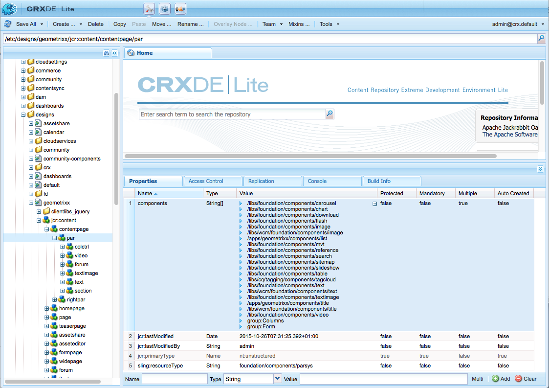
- Add the required component(s) to the components property of your template definition under:
- /etc/designs/<yourProject>/jcr:content/<yourTemplate>/par
- For example, see:
- /etc/designs/geometrixx/jcr:content/contentpage/par
Components and the Content They Create
If we create and configure an instance of the Title component on the page: <content-path>/Prototype.html
Touch-Enabled UI
Classic UI
Then we can see the structure of the content created within the repository:
In particular, if you look at the actual text for a Title:
the definition (for both UIs) have the property name=./jcr:title
- /libs/foundation/components/title/cq:dialog/content/items/column/items/title
- /libs/foundation/components/title/dialog/items/title
The properties defined are dependent on individual definitions. Although they can be more complex than above they still follow the same basic principles.
Component Hierarchy and Inheritance
Components within AEM are subject to 3 different hierarchies:
Resource Type Hierarchy
This is used to extend components using the property sling:resourceSuperType. This enables the component to inherit. For example, a text component will inherit various attributes from the standard component.
- scripts (resolved by Sling)
- dialogs
- descriptions (including thumbnail images, icons, etc)
Container Hierarchy
This is used to populate configuration settings to the child component and is most commonly used in a parsys scenario.
For example, configuration settings for the edit bar buttons, control set layout (editbars, rollover), dialog layout (inline, floating) can be defined on the parent component and propagated to the child components.
Configuration settings (related to edit functionality) in cq:editConfig and cq:childEditConfig are propagated.
Include Hierarchy
This is imposed at runtime by the sequence of includes.
This hierarchy is used by the Designer, which in turn acts as the base for various design aspects of the rendering; including layout information, css information, the available components in a parsys among others.
Edit Behavior
This section explains how to configure the edit behavior of a component. This includes attributes such as actions available for the component, characteristics of the inplace editor, and the listeners related to events on the component.
The configuration is common to both the touch-enabled and classic UI, albeit with certain, specific differences.
The edit behavior of a component is configured by adding a cq:editConfig node of type cq:EditConfig below the component node (of type cq:Component) and by adding specific properties and child nodes. The following properties and child nodes are available:
cq:editConfig node properties:
The edit behavior of a component is configured by adding a cq:editConfig node of type cq:EditConfig below the component node (of type cq:Component) and by adding specific properties and child nodes. The following properties and child nodes are available:
cq:editConfig node properties:
- cq:actions (String array): defines the actions that can be performed on the component.
- cq:layout (String): defines how the component is edited in the classic UI.
- cq:dialogMode (String): defines how the component dialog is opened in the classic UI
- In the touch-enabled UI, dialogs are always floating in desktop mode and automatically opened as fullscreen on mobile.
- cq:emptyText (String): defines the text that is displayed when no visual content is present.
- cq:inherit (Boolean): defines if missing values are inherited from the component that it inherits from.
- dialogLayout (String): defines how the dialog should open.
cq:editConfig child nodes:
In this page, a node (properties and child nodes) is represented as XML, as shown in the following example.
<jcr:root xmlns:cq="http://www.day.com/jcr/cq/1.0" xmlns:jcr="http://www.jcp.org/jcr/1.0"
cq:actions="[edit]"
cq:dialogMode="floating"
cq:layout="editbar"
jcr:primaryType="cq:EditConfig">
<cq:listeners
jcr:primaryType="cq:EditListenersConfig"
afteredit="REFRESH_PAGE"/>
</jcr:root>
There are many existing configurations in the repository. You can easily search for specific properties or child nodes:
To look for a property of the cq:editConfig node, e.g. cq:actions, you can use the Query tool in CRXDE Lite and search with the following XPath query string:
//element(cq:editConfig, cq:EditConfig)[@cq:actions]
To look for a child node of cq:editConfig, e.g. you can search for cq:dropTargets, which is of type cq:DropTargetConfig; you can use the Query tool in CRXDE Lite and search with the following XPath query string:
//element(cq:dropTargets, cq:DropTargetConfig)
Configuring with cq:EditConfig Properties
cq:actions
The cq:actions property (String array) defines one or several actions that can be performed on the component. The following values are available for configuration:
Property Value Description
text:<some text> Displays the static text value <some text>
Only visible in classic UI. The touch-enabled UI does not display actions in a contextual menu, so this is not applicable.
- Adds a spacer.
Only visible in classic UI. The touch-enabled UI does not display actions in a contextual menu, so this is not applicable.
edit Adds a button to edit the component.
delete Adds a button to delete the component
insert Adds a button to insert a new component before the current one
copymove Adds a button to copy and cut the component.
The following configuration adds an edit button, a spacer, a delete and an insert button to the component edit bar:
<jcr:root xmlns:cq="http://www.day.com/jcr/cq/1.0" xmlns:jcr="http://www.jcp.org/jcr/1.0"
cq:actions="[edit,-,delete,insert]"
cq:layout="editbar"
jcr:primaryType="cq:EditConfig"/>
The following configuration adds the text "Inherited Configurations from Base Framework" to the component edit bar:
<jcr:root xmlns:cq="http://www.day.com/jcr/cq/1.0" xmlns:jcr="http://www.jcp.org/jcr/1.0"
cq:actions="[text:Inherited Configurations from Base Framework]"
cq:layout="editbar"
jcr:primaryType="cq:EditConfig"/>
cq:layout (Classic UI Only)
The cq:layout property (String) defines how the component can be edited in the classic UI. The following values are available:
Property Value Description
rollover Default value. The component edition is accessible "on mouseover" through clicks and/or context menu.
For advanced use, note that the corresponding client-side object is: CQ.wcm.EditRollover.
editbar The component edition is accessible through a toolbar.
For advanced use, note that the corresponding client-side object is: CQ.wcm.EditBar.
auto The choice is left to the client-side code.
Note:
The concepts of rollover and editbar are not applicable in the touch-enabled UI.
The following configuration adds an edit button to the component edit bar:
<jcr:root xmlns:cq="http://www.day.com/jcr/cq/1.0" xmlns:jcr="http://www.jcp.org/jcr/1.0"
cq:actions="[edit]"
cq:layout="editbar"
jcr:primaryType="cq:EditConfig">
</jcr:root>
cq:dialogMode (Classic UI Only)
The component can be linked to an edit dialog. The cq:dialogMode property (String) defines how the component dialog will be opened in the classic UI. The following values are available:
Property Value Description
floating The dialog is floating.
inline (default value). The dialog is anchored over the component.
auto If the component width is smaller than the client-side CQ.themes.wcm.EditBase.INLINE_MINIMUM_WIDTH value, the dialog is floating, otherwise, it is inline.
Note:
In the touch-enabled UI, dialogs are always floating in desktop mode and automatically opened as fullscreen on mobile.
The following configuration defines an edit bar with an edit button and a floating dialog:
<jcr:root xmlns:cq="http://www.day.com/jcr/cq/1.0" xmlns:jcr="http://www.jcp.org/jcr/1.0"
cq:actions="[edit]"
cq:dialogMode="floating"
cq:layout="editbar"
jcr:primaryType="cq:EditConfig">
</jcr:root>
cq:emptyText
The cq:emptyText property (String) defines the text that is displayed when no visual content is present. It defaults to: Drag components or assets here.
cq:inherit
The cq:inherit property (boolean) defines whether missing values are inherited from the component that it inherits from. It defaults to false.
dialogLayout
The dialogLayout property defines how a dialog should open by default.
A value of fullscreen opens the dialog in full screen.
An empty value or absence of the property defaults to opening the dialog normally.
Note that the user can always toggle the fullscreen mode within the dialog.
It does not apply to the classic UI.
Configuring with cq:EditConfig Child Nodes
cq:dropTargets
The cq:dropTargets node (node type nt:unstructured) defines a list of drop targets that can accept a drop from an asset dragged from the content finder. It serves as a collection of nodes of type cq:DropTargetConfig.
Note:
Multiple drop targets are only available in the classic UI.
In the touch-enabled UI, only the first target will be used.
Each child node of type cq:DropTargetConfig defines a drop target in the component. The node name is important because it must be used in the JSP, as follows, to generate the CSS class name assigned to the DOM element that is the effective drop target:
<drop target css class> = <drag and drop prefix> +
<node name of the drop target in the edit configuration>
The <drag and drop prefix> is defined by the Java property:
com.day.cq.wcm.api.components.DropTarget.CSS_CLASS_PREFIX.
For example, the class name is defined as follows in the JSP of the Download component
(/libs/foundation/components/download/download.jsp), where the file is the node name of the drop target in the edit configuration of the Download component:
String ddClassName = DropTarget.CSS_CLASS_PREFIX + "file";
The node of type cq:DropTargetConfig needs to have the following properties:
Property Name Property Value
accept Regex applied to the asset mime type to validate if dropping is allowed.
groups An array of drop target groups. Each group must match the group type that is defined in the content finder extension and that is attached to the assets.
propertyName Name of the property that will be updated after a valid drop.
The following configuration is taken from the Download component. It enables any asset (the mime-type can be any string) from the media group to be dropped from the content finder into the component. After the drop, the component property fileReference is being updated:
<cq:dropTargets jcr:primaryType="nt:unstructured">
<file
jcr:primaryType="cq:DropTargetConfig"
accept="[.*]"
groups="[media]"
propertyName="./fileReference"/>
</cq:dropTargets>
cq:actionConfigs (Classic UI Only)
The cq:actionConfigs node (node type nt:unstructured) defines a list of new actions that are appended to the list defined by the cq:actions property. Each child node of cq:actionConfigs defines a new action by defining a widget.
The following sample configuration defines a new button (with a separator for the classic UI):
a separator, defined by the xtype tbseparator;
cq:actions="[EDIT,COPYMOVE,DELETE,INSERT]"
jcr:primaryType="cq:EditConfig">
<cq:actionConfigs jcr:primaryType="nt:unstructured">
<separator0
jcr:primaryType="nt:unstructured"
xtype="tbseparator"/>
<manage
jcr:primaryType="nt:unstructured"
handler="function(){CQ_collab_forum_openCollabAdmin();}"
text="Manage comments"/>
</cq:actionConfigs>
</jcr:root>
Note:
See Add New Action to a Component Toolbar as an example for the touch-enabled UI.
cq:formParameters
The cq:formParameters node (node type nt:unstructured) defines additional parameters that are added to the dialog form. Each property is mapped to a form parameter.
- cq:dropTargets (node type nt:unstructured): defines a list of drop targets that can accept a drop from an asset of the content finder
- Multiple drop targets are only available in the classic UI.
- In the touch-enabled UI, a single drop target is allowed.
- cq:actionConfigs (node type nt:unstructured): defines a list of new actions that are appended to the cq:actions list.
- cq:formParameters (node type nt:unstructured): defines additional parameters that are added to the dialog form.
- cq:inplaceEditing (node type cq:InplaceEditingConfig): defines an inplace editing configuration for the component.
- cq:listeners (node type cq:EditListenersConfig): defines what happens before or after an action occurs on the component.
In this page, a node (properties and child nodes) is represented as XML, as shown in the following example.
<jcr:root xmlns:cq="http://www.day.com/jcr/cq/1.0" xmlns:jcr="http://www.jcp.org/jcr/1.0"
cq:actions="[edit]"
cq:dialogMode="floating"
cq:layout="editbar"
jcr:primaryType="cq:EditConfig">
<cq:listeners
jcr:primaryType="cq:EditListenersConfig"
afteredit="REFRESH_PAGE"/>
</jcr:root>
There are many existing configurations in the repository. You can easily search for specific properties or child nodes:
To look for a property of the cq:editConfig node, e.g. cq:actions, you can use the Query tool in CRXDE Lite and search with the following XPath query string:
//element(cq:editConfig, cq:EditConfig)[@cq:actions]
To look for a child node of cq:editConfig, e.g. you can search for cq:dropTargets, which is of type cq:DropTargetConfig; you can use the Query tool in CRXDE Lite and search with the following XPath query string:
//element(cq:dropTargets, cq:DropTargetConfig)
Configuring with cq:EditConfig Properties
cq:actions
The cq:actions property (String array) defines one or several actions that can be performed on the component. The following values are available for configuration:
Property Value Description
text:<some text> Displays the static text value <some text>
Only visible in classic UI. The touch-enabled UI does not display actions in a contextual menu, so this is not applicable.
- Adds a spacer.
Only visible in classic UI. The touch-enabled UI does not display actions in a contextual menu, so this is not applicable.
edit Adds a button to edit the component.
delete Adds a button to delete the component
insert Adds a button to insert a new component before the current one
copymove Adds a button to copy and cut the component.
The following configuration adds an edit button, a spacer, a delete and an insert button to the component edit bar:
<jcr:root xmlns:cq="http://www.day.com/jcr/cq/1.0" xmlns:jcr="http://www.jcp.org/jcr/1.0"
cq:actions="[edit,-,delete,insert]"
cq:layout="editbar"
jcr:primaryType="cq:EditConfig"/>
The following configuration adds the text "Inherited Configurations from Base Framework" to the component edit bar:
<jcr:root xmlns:cq="http://www.day.com/jcr/cq/1.0" xmlns:jcr="http://www.jcp.org/jcr/1.0"
cq:actions="[text:Inherited Configurations from Base Framework]"
cq:layout="editbar"
jcr:primaryType="cq:EditConfig"/>
cq:layout (Classic UI Only)
The cq:layout property (String) defines how the component can be edited in the classic UI. The following values are available:
Property Value Description
rollover Default value. The component edition is accessible "on mouseover" through clicks and/or context menu.
For advanced use, note that the corresponding client-side object is: CQ.wcm.EditRollover.
editbar The component edition is accessible through a toolbar.
For advanced use, note that the corresponding client-side object is: CQ.wcm.EditBar.
auto The choice is left to the client-side code.
Note:
The concepts of rollover and editbar are not applicable in the touch-enabled UI.
The following configuration adds an edit button to the component edit bar:
<jcr:root xmlns:cq="http://www.day.com/jcr/cq/1.0" xmlns:jcr="http://www.jcp.org/jcr/1.0"
cq:actions="[edit]"
cq:layout="editbar"
jcr:primaryType="cq:EditConfig">
</jcr:root>
cq:dialogMode (Classic UI Only)
The component can be linked to an edit dialog. The cq:dialogMode property (String) defines how the component dialog will be opened in the classic UI. The following values are available:
Property Value Description
floating The dialog is floating.
inline (default value). The dialog is anchored over the component.
auto If the component width is smaller than the client-side CQ.themes.wcm.EditBase.INLINE_MINIMUM_WIDTH value, the dialog is floating, otherwise, it is inline.
Note:
In the touch-enabled UI, dialogs are always floating in desktop mode and automatically opened as fullscreen on mobile.
The following configuration defines an edit bar with an edit button and a floating dialog:
<jcr:root xmlns:cq="http://www.day.com/jcr/cq/1.0" xmlns:jcr="http://www.jcp.org/jcr/1.0"
cq:actions="[edit]"
cq:dialogMode="floating"
cq:layout="editbar"
jcr:primaryType="cq:EditConfig">
</jcr:root>
cq:emptyText
The cq:emptyText property (String) defines the text that is displayed when no visual content is present. It defaults to: Drag components or assets here.
cq:inherit
The cq:inherit property (boolean) defines whether missing values are inherited from the component that it inherits from. It defaults to false.
dialogLayout
The dialogLayout property defines how a dialog should open by default.
A value of fullscreen opens the dialog in full screen.
An empty value or absence of the property defaults to opening the dialog normally.
Note that the user can always toggle the fullscreen mode within the dialog.
It does not apply to the classic UI.
Configuring with cq:EditConfig Child Nodes
cq:dropTargets
The cq:dropTargets node (node type nt:unstructured) defines a list of drop targets that can accept a drop from an asset dragged from the content finder. It serves as a collection of nodes of type cq:DropTargetConfig.
Note:
Multiple drop targets are only available in the classic UI.
In the touch-enabled UI, only the first target will be used.
Each child node of type cq:DropTargetConfig defines a drop target in the component. The node name is important because it must be used in the JSP, as follows, to generate the CSS class name assigned to the DOM element that is the effective drop target:
<drop target css class> = <drag and drop prefix> +
<node name of the drop target in the edit configuration>
The <drag and drop prefix> is defined by the Java property:
com.day.cq.wcm.api.components.DropTarget.CSS_CLASS_PREFIX.
For example, the class name is defined as follows in the JSP of the Download component
(/libs/foundation/components/download/download.jsp), where the file is the node name of the drop target in the edit configuration of the Download component:
String ddClassName = DropTarget.CSS_CLASS_PREFIX + "file";
The node of type cq:DropTargetConfig needs to have the following properties:
Property Name Property Value
accept Regex applied to the asset mime type to validate if dropping is allowed.
groups An array of drop target groups. Each group must match the group type that is defined in the content finder extension and that is attached to the assets.
propertyName Name of the property that will be updated after a valid drop.
The following configuration is taken from the Download component. It enables any asset (the mime-type can be any string) from the media group to be dropped from the content finder into the component. After the drop, the component property fileReference is being updated:
<cq:dropTargets jcr:primaryType="nt:unstructured">
<file
jcr:primaryType="cq:DropTargetConfig"
accept="[.*]"
groups="[media]"
propertyName="./fileReference"/>
</cq:dropTargets>
cq:actionConfigs (Classic UI Only)
The cq:actionConfigs node (node type nt:unstructured) defines a list of new actions that are appended to the list defined by the cq:actions property. Each child node of cq:actionConfigs defines a new action by defining a widget.
The following sample configuration defines a new button (with a separator for the classic UI):
a separator, defined by the xtype tbseparator;
- This is only used by the classic UI.
- This definition is ignored by the touch-enabled UI as xtypes are ignored (and separators are unnecessary as the action toolbar is constructed differently in the touch-enabled UI).
- a button named Manage comments that runs the handler function CQ_collab_forum_openCollabAdmin().
cq:actions="[EDIT,COPYMOVE,DELETE,INSERT]"
jcr:primaryType="cq:EditConfig">
<cq:actionConfigs jcr:primaryType="nt:unstructured">
<separator0
jcr:primaryType="nt:unstructured"
xtype="tbseparator"/>
<manage
jcr:primaryType="nt:unstructured"
handler="function(){CQ_collab_forum_openCollabAdmin();}"
text="Manage comments"/>
</cq:actionConfigs>
</jcr:root>
Note:
See Add New Action to a Component Toolbar as an example for the touch-enabled UI.
cq:formParameters
The cq:formParameters node (node type nt:unstructured) defines additional parameters that are added to the dialog form. Each property is mapped to a form parameter.
The following configuration adds a parameter called name, set with the value photos/primary to the dialog form:
<cq:formParameters
jcr:primaryType="nt:unstructured"
name="photos/primary"/>
cq:inplaceEditing
The cq:inplaceEditing node (node type cq:InplaceEditingConfig) defines an inplace editing configuration for the component. It can have the following properties:
Property Name Property Value
active (boolean) True to enable the inplace editing of the component.
configPath (String) Path of the editor configuration. The configuration can be specified by a configuration node.
editorType
(String) Editor type. The available types are:
plaintext: to be used for non HTML content.
title: is an enhanced plaintext editor that converts graphical titles into a plaintext before editing begins. Used by the Geometrixx title component.
text: to be used for HTML content (uses the Rich Text Editor).
The following configuration enables the inplace editing of the component and defines plaintext as the editor type:
<cq:inplaceEditing
jcr:primaryType="cq:InplaceEditingConfig"
active="{Boolean}true"
editorType="plaintext"/>
cq:listeners
The cq:listeners node (node type cq:EditListenersConfig) defines what happens before or after an action on the component. The following table defines its possible properties.
Property Name Property Value Default Value(Classic UI Only)
beforedelete The handler is triggered before the component is removed.
beforeedit The handler is triggered before the component is edited.
beforecopy The handler is triggered before the component is copied.
beforemove The handler is triggered before the component is moved.
beforeinsert The handler is triggered before the component is inserted.
Only operational for the touch-enabled UI.
beforechildinsert The handler is triggered before the component is inserted inside another component (containers only).
afterdelete The handler is triggered after the component is removed. REFRESH_SELF
afteredit The handler is triggered after the component is edited. REFRESH_SELF
aftercopy The handler is triggered after the component is copied. REFRESH_SELF
afterinsert The handler is triggered after the component is inserted. REFRESH_INSERTED
aftermove The handler is triggered after the component is moved. REFRESH_SELFMOVED
afterchildinsert The handler is triggered after the component is inserted inside another component (containers only).
Note:
The REFRESH_INSERTED and REFRESH_SELFMOVED handlers are only available in the classic UI.
Note:
Default values for the listeners are only set in the classic UI.
Note:
In the case of nested components, there are certain restrictions on actions defined as properties on the cq:listeners node:
For nested components, the values of the following properties must be REFRESH_PAGE:
afteredit = "project.customerAction"
<cq:formParameters
jcr:primaryType="nt:unstructured"
name="photos/primary"/>
cq:inplaceEditing
The cq:inplaceEditing node (node type cq:InplaceEditingConfig) defines an inplace editing configuration for the component. It can have the following properties:
Property Name Property Value
active (boolean) True to enable the inplace editing of the component.
configPath (String) Path of the editor configuration. The configuration can be specified by a configuration node.
editorType
(String) Editor type. The available types are:
plaintext: to be used for non HTML content.
title: is an enhanced plaintext editor that converts graphical titles into a plaintext before editing begins. Used by the Geometrixx title component.
text: to be used for HTML content (uses the Rich Text Editor).
The following configuration enables the inplace editing of the component and defines plaintext as the editor type:
<cq:inplaceEditing
jcr:primaryType="cq:InplaceEditingConfig"
active="{Boolean}true"
editorType="plaintext"/>
cq:listeners
The cq:listeners node (node type cq:EditListenersConfig) defines what happens before or after an action on the component. The following table defines its possible properties.
Property Name Property Value Default Value(Classic UI Only)
beforedelete The handler is triggered before the component is removed.
beforeedit The handler is triggered before the component is edited.
beforecopy The handler is triggered before the component is copied.
beforemove The handler is triggered before the component is moved.
beforeinsert The handler is triggered before the component is inserted.
Only operational for the touch-enabled UI.
beforechildinsert The handler is triggered before the component is inserted inside another component (containers only).
afterdelete The handler is triggered after the component is removed. REFRESH_SELF
afteredit The handler is triggered after the component is edited. REFRESH_SELF
aftercopy The handler is triggered after the component is copied. REFRESH_SELF
afterinsert The handler is triggered after the component is inserted. REFRESH_INSERTED
aftermove The handler is triggered after the component is moved. REFRESH_SELFMOVED
afterchildinsert The handler is triggered after the component is inserted inside another component (containers only).
Note:
The REFRESH_INSERTED and REFRESH_SELFMOVED handlers are only available in the classic UI.
Note:
Default values for the listeners are only set in the classic UI.
Note:
In the case of nested components, there are certain restrictions on actions defined as properties on the cq:listeners node:
For nested components, the values of the following properties must be REFRESH_PAGE:
- aftermove
- aftercopy
afteredit = "project.customerAction"
The following example is equivalent to the REFRESH_INSERTED configuration:
afterinsert="function(path, definition) { this.refreshCreated(path, definition); }"
Note:
For the classic UI, to see which parameters can be used in the handlers, refer to the before<action> and after<action> events section of the CQ.wcm.EditBar and CQ.wcm.EditRollover widget documentation.
With the following configuration the page is refreshed after the component has been deleted, edited, inserted or moved:
<cq:listeners
jcr:primaryType="cq:EditListenersConfig"
afterdelete="REFRESH_PAGE"
afteredit="REFRESH_PAGE"
afterinsert="REFRESH_PAGE"
afterMove="REFRESH_PAGE"/>

No comments:
Post a Comment
If you have any doubts or questions, please let us know.