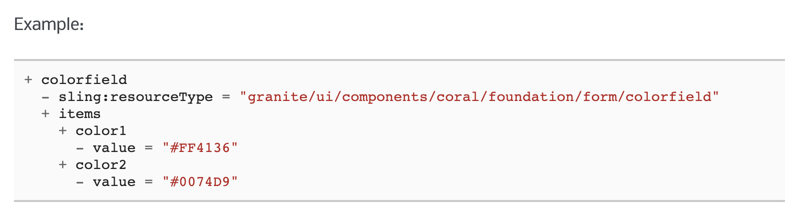
In classic UI, it was easy to specify the options property on a selection xtype.
This made getting dynamic data into a dropdown very easy. Simply point the options property to /path/to/resource.infinity.json and you were done. In Granite, things don't work this easy.
There are two approaches that I found. 1) Use a listener. 2) Use ACS Commons GenericList / Datasource solution.
The ACS commons solution works great, but it's a bit rigid on the data structure. I used it as my starting point for the solution below.
My solution is a 3 step process, requires no JS and no external dependencies.
Step 1
Make a data source component. It only needs to have one JSP file in it...
<%@page session="false" import="
org.apache.sling.api.resource.Resource,
org.apache.sling.api.resource.ResourceUtil,
org.apache.sling.api.resource.ValueMap,
org.apache.sling.api.resource.ResourceResolver,
org.apache.sling.api.resource.ResourceMetadata,
org.apache.sling.api.wrappers.ValueMapDecorator,
java.util.List,
java.util.ArrayList,
java.util.HashMap,
java.util.Locale,
com.adobe.granite.ui.components.ds.DataSource,
com.adobe.granite.ui.components.ds.EmptyDataSource,
com.adobe.granite.ui.components.ds.SimpleDataSource,
com.adobe.granite.ui.components.ds.ValueMapResource,
com.day.cq.wcm.api.Page,
com.day.cq.wcm.api.PageManager"%><%
%><%@taglib prefix="cq" uri="http://www.day.com/taglibs/cq/1.0" %><%
%><cq:defineObjects/><%
request.setAttribute(DataSource.class.getName(), EmptyDataSource.instance());
Locale locale = request.getLocale();
Resource datasource = resource.getChild("datasource");
ResourceResolver resolver = resource.getResourceResolver();
ValueMap dsProperties = ResourceUtil.getValueMap(datasource);
String genericListPath = dsProperties.get("path", String.class);
// What fields and values do we want from the children resources? This should be inside the component dialog.
String value = dsProperties.get("value", String.class);
String text = dsProperties.get("text", String.class);
// If the path isn't null, get the resource and loop through the children.
if (genericListPath != null) {
Resource parentResource = resourceResolver.getResource(genericListPath);
// Create a list to stuff our values
List<Resource> fakeResourceList = new ArrayList<Resource>();
// Grab the children and get their properties.
for(Resource child : parentResource.getChildren()){
ValueMap vm = new ValueMapDecorator(new HashMap<String, Object>());
ValueMap childProperties = ResourceUtil.getValueMap(child);
vm.put("value", childProperties.get(value, String.class));
vm.put("text", childProperties.get(text, String.class));
fakeResourceList.add(new ValueMapResource(resolver, new ResourceMetadata(), "nt:unstructured", vm));
}
// Create a new data source from iterating through our fakedResourceList
DataSource ds = new SimpleDataSource(fakeResourceList.iterator());
// Add the datasource to our request to expose in the view
request.setAttribute(DataSource.class.getName(), ds);
}
%>
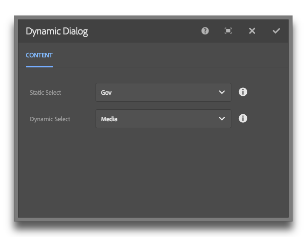
Step 2
Add a data source node to your dialog property. Read the gist for pertinent info.
<dropdown
jcr:primaryType="nt:unstructured"
sling:resourceType="granite/ui/components/foundation/form/select"
fieldLabel="Dropdown"
name="./dropdown"
rootPath="/content">
<!-- Params: value, text, path -->
<datasource
jcr:primaryType="nt:unstructured"
sling:resourceType="myapp/components/utilities/datasource"
value="value"
text="text"
path="/apps/myapp/components/content/snippets/statsbar/dialog/articleLabels/articleLabelsSelect/options" />
</dropdown>
Step 3
Profit.
Make a data source component. It only needs to have one JSP file in it...
<%@page session="false" import="
org.apache.sling.api.resource.Resource,
org.apache.sling.api.resource.ResourceUtil,
org.apache.sling.api.resource.ValueMap,
org.apache.sling.api.resource.ResourceResolver,
org.apache.sling.api.resource.ResourceMetadata,
org.apache.sling.api.wrappers.ValueMapDecorator,
java.util.List,
java.util.ArrayList,
java.util.HashMap,
java.util.Locale,
com.adobe.granite.ui.components.ds.DataSource,
com.adobe.granite.ui.components.ds.EmptyDataSource,
com.adobe.granite.ui.components.ds.SimpleDataSource,
com.adobe.granite.ui.components.ds.ValueMapResource,
com.day.cq.wcm.api.Page,
com.day.cq.wcm.api.PageManager"%><%
%><%@taglib prefix="cq" uri="http://www.day.com/taglibs/cq/1.0" %><%
%><cq:defineObjects/><%
request.setAttribute(DataSource.class.getName(), EmptyDataSource.instance());
Locale locale = request.getLocale();
Resource datasource = resource.getChild("datasource");
ResourceResolver resolver = resource.getResourceResolver();
ValueMap dsProperties = ResourceUtil.getValueMap(datasource);
String genericListPath = dsProperties.get("path", String.class);
// What fields and values do we want from the children resources? This should be inside the component dialog.
String value = dsProperties.get("value", String.class);
String text = dsProperties.get("text", String.class);
// If the path isn't null, get the resource and loop through the children.
if (genericListPath != null) {
Resource parentResource = resourceResolver.getResource(genericListPath);
// Create a list to stuff our values
List<Resource> fakeResourceList = new ArrayList<Resource>();
// Grab the children and get their properties.
for(Resource child : parentResource.getChildren()){
ValueMap vm = new ValueMapDecorator(new HashMap<String, Object>());
ValueMap childProperties = ResourceUtil.getValueMap(child);
vm.put("value", childProperties.get(value, String.class));
vm.put("text", childProperties.get(text, String.class));
fakeResourceList.add(new ValueMapResource(resolver, new ResourceMetadata(), "nt:unstructured", vm));
}
// Create a new data source from iterating through our fakedResourceList
DataSource ds = new SimpleDataSource(fakeResourceList.iterator());
// Add the datasource to our request to expose in the view
request.setAttribute(DataSource.class.getName(), ds);
}
%>
Step 2
Add a data source node to your dialog property. Read the gist for pertinent info.
<dropdown
jcr:primaryType="nt:unstructured"
sling:resourceType="granite/ui/components/foundation/form/select"
fieldLabel="Dropdown"
name="./dropdown"
rootPath="/content">
<!-- Params: value, text, path -->
<datasource
jcr:primaryType="nt:unstructured"
sling:resourceType="myapp/components/utilities/datasource"
value="value"
text="text"
path="/apps/myapp/components/content/snippets/statsbar/dialog/articleLabels/articleLabelsSelect/options" />
</dropdown>
Step 3
Profit.
