Showing posts with label Components. Show all posts

July 1, 2021
Estimated Post Reading Time ~

Groovy Script to update components with dialog property

/* this script is to update the Booking widget component "summarybarDisabled" and "slideOutEnabled"*/

def path = "/content/we-retail"
def pageCount = 0;
def summarybarDisabledProperty = "summarybarDisabled";
def slideOutEnabledProperty = "slideOutEnabled";

getPage(path).recurse { page ->
def content = page.node
def pagePath = page.path;

content?.recurse { node ->
def componentNode = node.get("sling:resourceType")
if(componentNode == "
we-retail/components/content/image"){
def newNodePathtemp = node.path;

if(node.get(summarybarDisabledProperty)){
def summaryBarStr = getPropertyValueAsStr(node, summarybarDisabledProperty);

if (summaryBarStr == "true") {
nodePath = node.path;
if (nodePath.contains("slideouthero/findhotel")) {
//Inside Slide Out Hero Component
println page.path;

//Remove and set the property, uncomment this block to save the changes
/*
node.getProperty(summarybarDisabledProperty).remove();
node.set(slideOutEnabledProperty, "{Boolean}true");
session.save();
*/

pageCount++;

} else {
//Do not do anything
}

} else {
//println summaryBarStr +" " +page.path;
}

}
}
}
}

println "Total number pages : "+pageCount

def getPropertyValueAsStr(def content, def propertyName){
def propertyValStr = "";
if(content.get(propertyName)){
def propertyVal = content.getProperty(propertyName);
if(propertyVal){
if(!propertyVal.isMultiple()){
propertyValStr = propertyVal.getString();
}else{
values = propertyVal.getValues();
values.each {
if(propertyValStr.length() > 0){
propertyValStr = propertyValStr + " ; " + "$it";
}else{
propertyValStr = "$it";
}
}
}
}
}
return propertyValStr;
}


By aem4beginner

March 30, 2021
Estimated Post Reading Time ~

Update to SVG Component

The SVG component has been updated with a contribution from Gabriel Walt. The HTML has been cleaned up and simplified.

Go get latest from here.


By aem4beginner

January 4, 2021
Estimated Post Reading Time ~

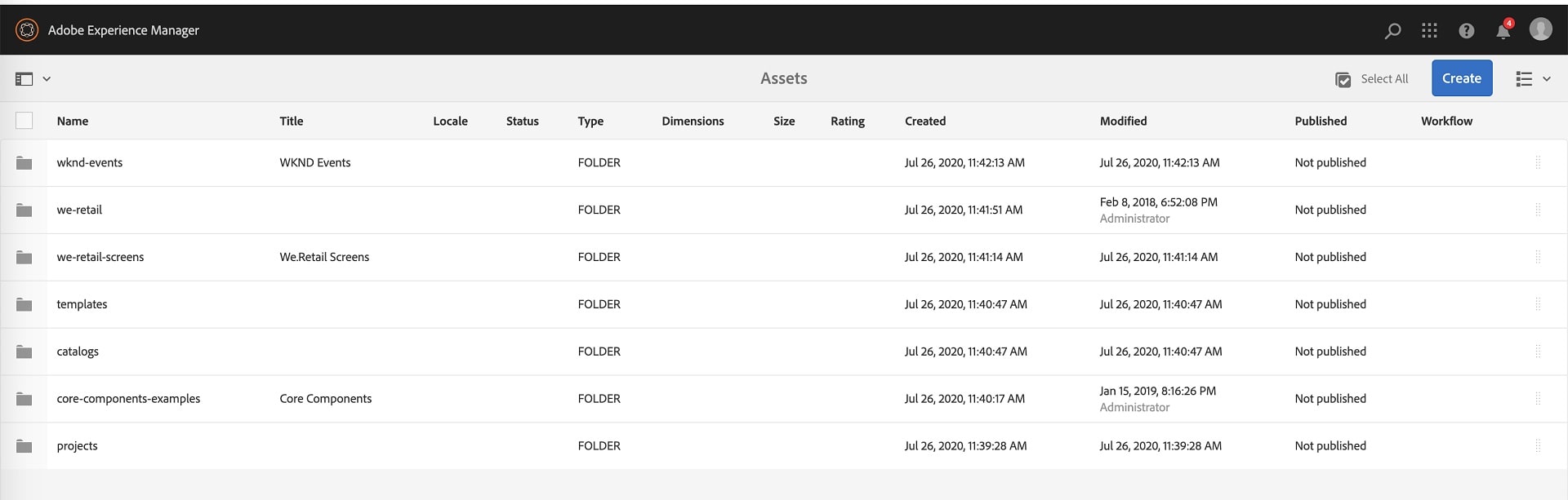
Make List View As Default View In AEM Assets

AEM Assets allows customers to manage their digital assets for e.g., images, videos, documents, and audio clips in a web-based repository. It includes Metadata-support, Renditions, Digital Asset Management Finder, and AEM Assets Administration UI.

Most of the AEM Authors like to view their assets in List view compared to Column view and Card view. By default, AEM shows the assets in Card view. Through my experience in AEM, I had found an easy solution to make list view a default view for assets.

Solution:
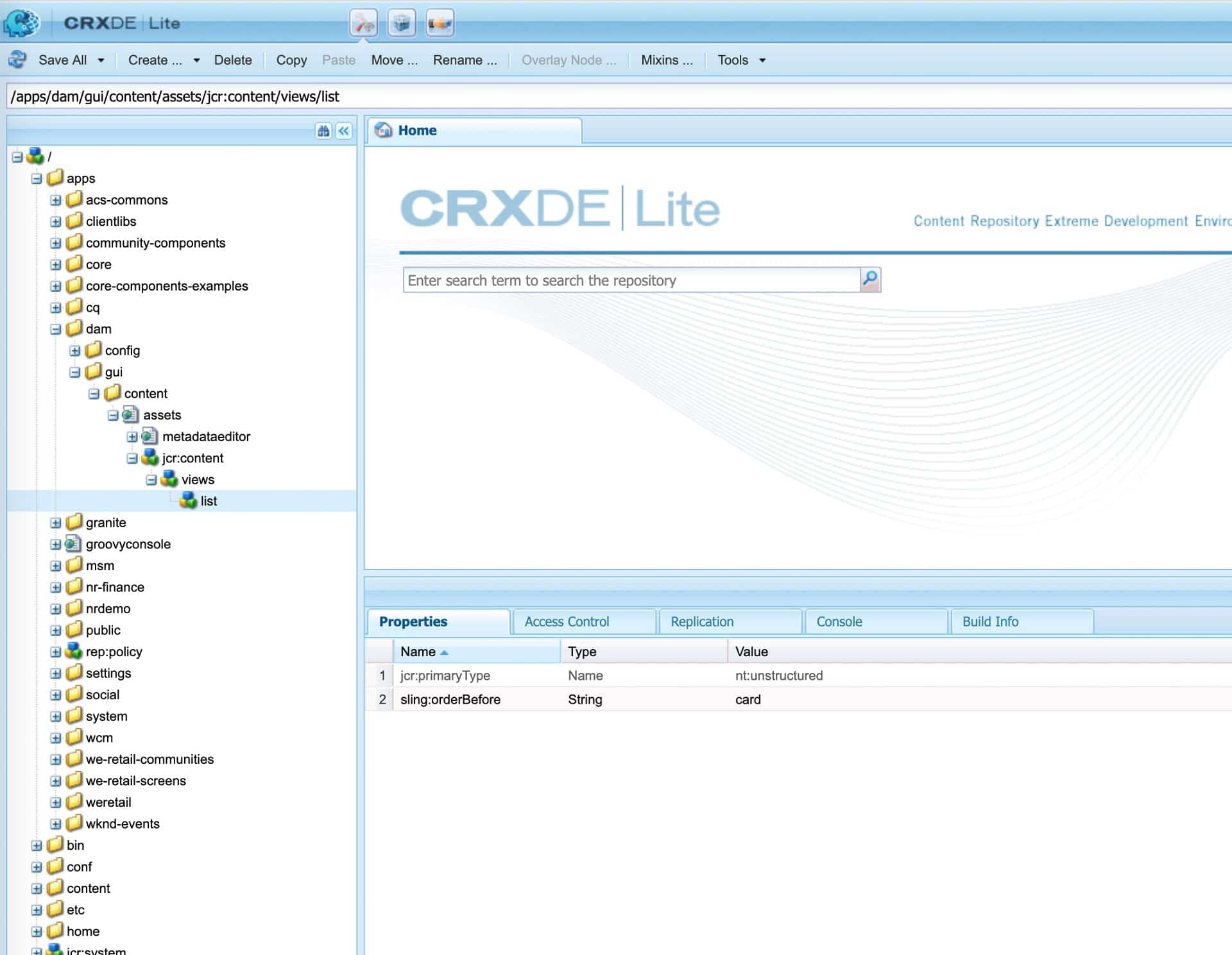
1. Overlay the /libs/dam/gui/content/assets/jcr:content/views/list and under /apps/dam/gui/content/assets/jcr:content/views/list

2. Add a property sling:orderBefore to the list node, something like below

name: sling:orderBefore String card

3. The XML looks something like this

<views jcr:primaryType=”nt:unstructured”>
<list
    jcr:primaryType=”nt:unstructured”
    sling:orderBefore=”card”/>
</views>


4. Click on Save All.


Although there are multiple ways you can customize views in assets, this is one the simplest way to achieve this.


By aem4beginner

Search/Filter Touch UI Dialog Dropdown in AEM

Sometimes we have a requirement that needs to populate the dynamic list in the touch UI dialog dropdown. We can achieve populating the dynamic list in dialog easily for example https://helpx.adobe.com/experience-manager/using/creating-granite-datasource.html but what if the list is too long, assume we need to create a dialog dropdown to choose color and color list having approximate 148 items (https://www.w3schools.com/colors/colors_names.asp )
So it’s quite tough for the content author to scroll the dropdown to select the appropriate value.

What can be done to reduce efforts for content author:
Is it possible to have a kind of In-place search dropdown where the content author can type the character and the drop-down list will only show relevant value?
The answer is Yes, It is possible.

How:
This can be achieved by modifying the existing dropdown node:

Replacing sling:resourceType value from ‘select’ to 'autocomplete' component (/libs/granite/ui/components/coral/foundation/form/autocomplete)
Create ‘options’ nodes parallel to ‘datasource’ node and create sling:resourceType property with granite/ui/components/coral/foundation/form/autocomplete/list value for ‘options’ node

That’s it. Find more info about the autocomplete component at Autocomplete

Example dialog:
<?xml version="1.0" encoding="UTF-8"?>
<jcr:root xmlns:sling="http://sling.apache.org/jcr/sling/1.0" xmlns:cq="http://www.day.com/jcr/cq/1.0" xmlns:jcr="http://www.jcp.org/jcr/1.0" xmlns:nt="http://www.jcp.org/jcr/nt/1.0"
jcr:primaryType="nt:unstructured"
jcr:title="Promo Box"
sling:resourceType="cq/gui/components/authoring/dialog">
<content
jcr:primaryType="nt:unstructured"
sling:resourceType="granite/ui/components/coral/foundation/container">
<items jcr:primaryType="nt:unstructured">
<tabs
jcr:primaryType="nt:unstructured"
sling:resourceType="granite/ui/components/coral/foundation/tabs">
<items jcr:primaryType="nt:unstructured">
<contentdata
jcr:primaryType="nt:unstructured"
jcr:title="Content"
sling:resourceType="granite/ui/components/coral/foundation/fixedcolumns">
<items jcr:primaryType="nt:unstructured">
<column
jcr:primaryType="nt:unstructured"
sling:resourceType="granite/ui/components/coral/foundation/container">
<items jcr:primaryType="nt:unstructured">
<heading
jcr:primaryType="nt:unstructured"
sling:resourceType="granite/ui/components/coral/foundation/form/textfield"
fieldDescription="Enter Promo Box Heading"
fieldLabel="Heading"
name="./heading"/>
<background
jcr:primaryType="nt:unstructured"
sling:resourceType="granite/ui/components/coral/foundation/form/autocomplete"
emptyText="---- Please Select a Value -----"
fieldDescription="Select Background colour from Dropdown"
fieldLabel="Select or type background colour from Dropdown"
name="./bg-color"
required="{Boolean}true">
<datasource
jcr:primaryType="nt:unstructured"
sling:resourceType="/apps/blog/dailog/dropdown"/>
<options
jcr:primaryType="nt:unstructured"
sling:resourceType="granite/ui/components/coral/foundation/form/autocomplete/list"/>
</background>
</items>
</column>
</items>
</contentdata>
</items>
</tabs>
</items>
</content>
</jcr:root>


Dropdown with all items


Dropdown with Filter/Search


By aem4beginner

January 3, 2021
Estimated Post Reading Time ~

Touch UI - RTE HTML Element Selector, Custom Style Plugin & Color Picker Plugin

Touch UI RTE is always a challenging topic because of a lack of documentation to create or customize plugins, There are great articles at http://experience-aem.blogspot.com/2013/08/in-blog-experiencing-adobe-experience.html which talk about RTE plugins. I got the idea from the ColorPicker plugin and tried to create a new Style Picker plugin that may help the AEM community to achieve more from RTE.

This blog covers :
HTML DOM Navigation and HTML element selector inside RTE Editor
Custom Style(Style Picker) Plugins
Color Picker Plugin

HTML DOM Elements Navigator extension:
  • Shows selected/current HTML element's DOM structure in RTE
  • Allows selecting an exact HTML element in RTE to apply settings using RTE plugins.
Style Picker Plugins apply a class attribute to selected HTML elements unlike the OOTB style plugin to create a span tag. The exact HTML element can be selected from the DOM navigator e.g. ul, ol, hr, p, div, img, etc. These elements can be selected by DOM Element Navigator and class can be applied to them.
The Color Picker Plugin as the same as ColorPicker Plugin from http://experience-aem.blogspot.com but I modified it to work with all AEM version from 6.3+

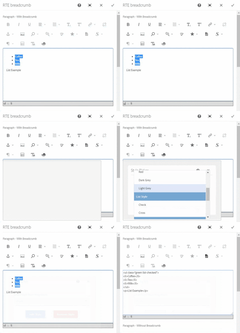
Color Picker, Style Picker Plugins, and HTML DOM navigation


RTE Element Selection from DOM navigation


Applying class to ul element using Style Picker

When the selected item already has existing styles, the style will be pre-selected in the dropdown, If another style is chosen, the new class will be added and the existing class will also remain, this will allow applying multiple styles to a single element.

In case of applying a different style or a single style to an element then an existing style should be chosen and removed using the Remove Style button. 

Pre-selected style


Applying another style to list


Removing style from the list

If only a text is selected for applying the style using this custom style picker plugin, the style will be added to its parent's node. If you want to apply a style to text using a span tag, use the OOTB style plugin.

Style is added to P tag


OOTB style plugin, style added with a span tag

Note: If multiple HTML items are selected then the style will be applied to only one element.

Code
You can install the below packages from GitHub to use these plugins in AEM 6.3+
Packages contain:
Details
1. DOM Elements Navigation and Selector inside RTE Editor

In RTE, the element tree breadcrumb is created at the bottom section of RTE, which shows the DOM navigation and allows a user to select a particular HTML element in RTE by clicking on breadcrumb items.

RTE Navigation will only be shown for the RTE which has showBreadcrumb property with true.
ShowBreadcrumb property in RTE item node


RTE DOM Tree
Although navigation can be enable for all the RTEs by changing below line in /apps/commons/rte/rte-breadcrumb/js/rte-breadcrumb.js file
replace
$('.coral-RichText[data-showbreadcrumb="true"]').each(function() {
$(this).parent().find(".rte-sourceEditor").after(breadcrumbItem);
});

with
$('.coral-RichText').each(function() {
$(this).parent().find(".rte-sourceEditor").after(breadcrumbItem);
});

The DOM navigation extension is independent of the style plugin and can be used with other plugins as well to select, cut, copy, etc.

2. Custom Style Picker Plugins

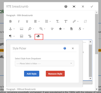
StylePicker Plugin in RTE toolbar

After installing the package you can find the Style Picker Plugins files at:

Plugins JS and CSS at
/apps/commons/rte/plugins/clientlibs/js/style-picker.js
/apps/commons/rte/plugins/clientlibs/css/style-picker.css

Plugins popover dialogs
/apps/commons/rte/plugins/popovers/style-picker

Plugin Popover Dialog - dropdown option datasource and JSON at
/apps/commons/rte/plugins/popovers/style-picker/datasource
/apps/commons/rte/plugins/popovers/style-picker/options.json

Datasource is a JSP file which read json specified in options property and populates dropdown option for Style Picker plugin.
JSON file should have an array of elements in the below format:

If want to show as Heading/Category use the below format(value could be anything)
{"text": "Background Color","value": "BTC","heading": "true"}

If Option

{"text": "White","value": "white"}

Example: /apps/commons/rte/plugins/popovers/style-picker/options.json

[
{"text": "Background Color","value": "BTC","heading": "true"},
{"text": "White","value": "white"},
{"text": "Black","value": "black"},
{"text": "Green","value": "green"},
{"text": "Orange","value": "orange"},
{"text": "Light Grey","value": "lightgrey"},
{"text": "List Style","value": "LS","heading": "true"},
{"text": "Check","value": "list-checked"},
{"text": "Cross","value": "list-crossed"},
{"text": "Link Style","value": "LS","heading": "true"},
{"text": "Primary","value": "btn-primary"},
{"text": "Secondary","value": "btn-secondary"}
]


List Style and List Style are the Category and can't be selected

Plugin configuration in RTE
create 'styleformat' child node of rtePlugins node and create features property in it with * value as shown in below screenshot.

Add 'styleformat#styles' in the toolbar property on the inline node as shown in the below screenshot.


3. Color Picker Plugin
ColorPicker Plugin in RTE toolbar

After installing the package you can find the ColorPicker Plugins files at :

Plugins JS and CSS at
/apps/commons/rte/plugins/clientlibs/js/color-picker.js
/apps/commons/rte/plugins/clientlibs/css/color-picker.css

Plugins popover dialogs
/apps/commons/rte/plugins/popovers/color-picker

Plugin configuration in RTE

create 'colorformat' child node of rtePlugins node and create features property in it with * value as shown in below screenshot.

Add 'colorformat#colorPicker' in the toolbar property on the inline node as shown in the below screenshot.


Sample Components
Sample Test Component package contains a sample component (/apps/mfHTL63/components/content/simple-rte)

This component can be referred for ColorPicker and StylePicker Plugins configurations.

References
http://experience-aem.blogspot.com/2017/06/aem-63-touch-ui-rte-rich-text-editor-color-picker-plugin-inplace-dialog-edit.html


By aem4beginner

Touch UI Dialog - Display fields in a same row in Two Column Layout

In Touch UI dailog Coral/Granite type fields displays in a stack/top to bottom, one after another in a floating dialog and in fullscreen. In fullscreen it can be displayed in 2 column layout if column layout is used for dialog (columns inside granite/ui/components/foundation/layouts/fixedcolumns type )


and It will show fields in a dialog like below:

Floating mode and Fullscreen mode

Improve Authoring Experience
Visit https://experiencemanaged.com/posts/improve-the-aem-authoring-experience-ax.html blog to see how the authoring experience can be improved.

There are several scenarios where having a top-to-bottom approach to all fields can have a negative impact on the authoring experience. To improve the experience, fields can be added one after another in the same row.
How to do it

Create clientlibs from code mentioned in ClientLibs Code section
Add rowresume (Boolean) = true property in the field to display field in the same row. Make sure this property is added in all the fields which should display in the same row.
rowresume property

Add rowresume property in the field, if Coral2 type is used
if you are using coral3/Granite type then add rowresume property in granite:data node


'rowresume' Coral2 resource type

'rowresume' Granite/Coral3 resource type

ClientLibs Code
Create a clientlibs of category 'cq.authoring.dialog'
Create js.txt , css.txt, dialog.field.2column-layout.css and dialog.field.2column-layout.js files with below content or click on the file name to get the file from Github.

js.txt
dialog.field.2column-layout.js

dialog.field.2column-layout.js

(function($, $document) {

"use strict";
$document.on("dialog-ready", function() {
var items = $('[data-rowresume="true"]');
$(items).each(function(i) {
$(this).closest('.coral-Form-fieldwrapper').addClass("coral-Form-fieldwrapper--rowresume");
});
});

})($, $(document));


css.txt
dialog.field.2column-layout.css
.coral-Form-fieldwrapper.coral-Form-fieldwrapper--rowresume { width: 44%; display: inline-grid; margin: 0 3%; }

Dialog fields after adding rowresume property to width, height, dropdown, and radio group fields


Fullscreen mode

Dialog fields after adding rowresume property to height, dropdown, and radio group fields


Package
You can install the below packages from GitHub to enable this feature for the Touch UI dialog. These works in AEM 6.3+

However, packages contain:
1. Clientlibs to enable the side panel option in the Touch UI dialog.
2. Clientlibs to enable displayingTouch UI field in two-column layout in floating touch UI dialog

If you install this package, the Below files will be installed in the repository at
  • /apps/commons/clientlibs/dialog/js.txt
  • /apps/commons/clientlibs/dialog/js/dialog.field.2column-layout.js
  • /apps/commons/clientlibs/dialog/css.txt
  • /apps/commons/clientlibs/dialog/css/dialog.field.2column-layout.css
Other files are getting used to enable the side panel option in Touch UI dialog, Find more details about it at AEM - Touch UI Dialog - Assets Panel

Limitation:Work only with form field type.


By aem4beginner

Restrict Allowed Component Group in Template Policy

In Dynamic/Editable Template, The Component level policy allows configuring various properties. One of the properties for responsivegrid or container or any other container component is to allow child components inside parsys/responsivegrid, which template author can define.

To Allow Components, the Template author has to create a policy and select components from the Allowed Components list.

But Template Author can see all the components group to select and sometimes you just want to enable few components to be allowed, for example, a card container can only have card components. But you cannot restrict the template Author to choose from.

How to Restrict Groups in the Allowed Components list

Unfortunately, there is no OOTB configuration/solution to achieve this. If you want to restrict allowed components then you have to write a custom solution. I am going to explain one of the custom solutions here. 

The Allowed Component list is generated from /libs/cq/gui/components/authoring/allowedcomponents , so I will create custom allowedcomponents (/apps/commons/components/authoring/allowedcomponents) based on /libs/cq/gui/components/authoring/allowedcomponents

I am going to create a custom allowed component which will be used wherever I have to restrict allowedcomponents.

Steps :

1. Copy allowedcomponent node with all the subnode from /libs/cq/gui/components/authoring/allowedcomponents to apps folder e.g. /apps/commons/components/authoring/allowedcomponents


2. Modify /apps/commons/components/authoring/allowedcomponents/allowedcomponents.html to update JAVA reference, the package name should be the same as the location of allowedcomponents folder which was copied in Step 1 i.e. apps.commons.components.authoring.allowedcomponents.AllowedComponents

3. Modify /apps/commons/components/authoring/allowedcomponents/AllowedComponents.java to add logic to filter group list. 
I am using logic to read allowed groups from the node property where this custom component is used via resourceType. e.g.

JAVA Logic - AllowedComponents.java
3.1 update package 
package apps.commons.components.authoring.allowedcomponents;

3.2 Read allowedGroups property inside the activate method
    @Override
    public void activate() throws Exception {
        // get all available components
        Map<String, Component> components = getAllComponents();
        // get selected groups and components from properties
        Set<String> selected = getSelectedComponents();
        // keeps track of encountered resources types
        Set<String> resourceTypes = new HashSet<String>();
        // stores groups indexed by their name
        Map<String, GroupInfo> groupsMap = new HashMap<String, GroupInfo>();

        // Get Allowed Groups
        ValueMap vmAG = getResource().getValueMap();
        String resGroup[] = vmAG.get("allowedGroups", new String[] {});

        // iterate over all components and build component and group info
        for (Component component : components.values()) {

3.3 Update condition to skip groups similar to groups start with.
// filter components that are part of a hidden group and non allowed group
            if (group.startsWith(".") || (resGroup.length > 0 && notAllowedGroup(resGroup, group))) {
                continue;
            }

3.4 Create notAllowedGroup method at the bottom(you can create anywhere I just created at the bottom of the file)

     /**
     * Returns true if component groups is not allowed
     */

    public boolean notAllowedGroup(String[] resGroup, String group) {
        for (int i = 0; i < resGroup.length; i++) {
if (group.matches(resGroup[i])) {
return false;
}
}
return true;
    }

4. Refresh the Template. And we are done.


By aem4beginner