Showing posts with label AEM Author. Show all posts

March 30, 2021
Estimated Post Reading Time ~

Improve the AEM Authoring Experience

Below are a few rules we go by when building dialogs.
1. Differentiate labels, descriptions, and help paths
  • Label (fieldLabel) - Short & concise
  • Description (fieldDescription) - More context & information
  • Dialog Help (helpPath) - Dense and verbose, full documentation with screenshots and examples.
Each should have a different meaning and purpose. On adobe.com, we optimize for the everyday use experience, not the first use experience. Sure, an author may need more instruction with a short label like 'Border' during first-use, but once an author is trained on a feature, something more verbose like, 'Component Border Control' is redundant and unnecessary.

Examples
Label: Border
Description: Define the width, type, and color of the component's border.
Label: Enable Container
Description: Turn on a container to prevent the contents from expanding beyond a 1200px max-width.

Personally, I also try to re-word concepts between label and description to prevent duplicating the same words. 'Enable Container' worded differently would be, 'Turn on a container'. This is to capture different ways authors may read and understand a particular field.

2. Remove complex and redundant words
The general idea is that most authors don't need overly complex labels and descriptions, this is the work they do every day. It's also important to remove redundant words. If you're in a table component, there's no sense in saying, 'Table Width'. The term, 'Table' is implied.

Words we strictly prohibit that sound overly complex and typically do not bring value to labels:
  • Configuration - I.E. Border Configuration
  • Control - I.E. Background Control
  • Select - I.E. Select Type
  • Set - I.E. Set Type
These terms do not provide value. We're in a dialog; configuring, controlling, selecting, and setting things is the whole point we're there.


3. Add a little CSS
There's nothing saying you cannot add a clientlib to give Coral 3 a little help. There are several scenarios where having a top-to-bottom approach to all fields can have a negative impact on the authoring experience.

Let's look at setting a custom width with OOTB Coral 3:


With a little CSS, we can clean things up and give better differentiation of the section:


Or how about a multifield:


Anyone who has worked with multifield knows it can get very complex very fast. Above, we have little differentiation of items and no easy way to identify each. With a little CSS, we can add an index and a separator:


4. Lean on mobile-first inheritance
Building mobile-first components is a no-brainer. However, providing tools inside the dialog to create an inheritance model can also reduce complexity. Below we have an example of how an author can set mobile/default colors, and inherit or override as needed.


5. Hide complexity until it's needed
On adobe.com, we have two powerful components used for a lot of general-purpose layouts. Unfortunately, with power comes complexity. We do everything possible to remove complexity until it's needed. We have two primary ways we achieve this:

Using cq-dialog-dropdown-showhide-target we can show/hide containers.
Using granite:renderconditions we can completely remove fields. - See point 6.

Below we have an area to define borders:


However, there might be a scenario where a design calls for a border on an individual side.

We can expose that complexity using cq-dialog-dropdown-showhide-target :


6. Leverage Editable Templates and Render Conditions
Sometimes the best UI is no UI. Combining the power of render conditions with the power of editable templates (and content policies) can allow you to selectively render parts of a component during page creation.

7. Use Custom Icons


Custom icons are a great way to give a little extra polish and help show authors some love.

You can use a file (_cq_icon.svg or _cq_icon.png) in the component folder or you choose one of the many coral icons names in your component's XML definition.

I've created a sample of a _cq_icon.svg on GitHub free to download.

Source:


By aem4beginner

May 19, 2020
Estimated Post Reading Time ~

WCM modes in CQ5

Before developing in CQ5 it's vital to know the different modes in cq5 authoring. These modes are referred to as WCM modes. There are 3 authoring modes in cq5;
  • Edit mode
  • Design mode
  • Preview Mode
The significant thing to know about these modes is where the data is stored when the author does something in these modes.

Preview mode: The name says it all. This mode removes all the authoring interface and shows you how the web page would look on the website. It's best to use this mode for checking the end results. Usually, the CSS styling will not look like it's supposed to in the other modes as the pages in other two modes will have a lot of additional marks up to aid authoring (Example: The green highlight on the component for editing, edit bars, etc. come from additional markup[<HTML>] added by cq5).

Edit mode: This is the mode used most. Whenever the author makes changes or configures components (Example: Adding a title to a page by editing the Title component)in this mode the data is stored under the components' node. If a component has been included on a page, then the component is stored under the JCR node of the page. Any data configured by the user in the component will be stored under the component's node. The path of the configured data will look something like this : /content/your_website/path_to_the_page/jcr/component

As you can notice from the path any changes will be limited to that particular component on the page. Even if the page has multiple instances of the same component the changes will hold the effect on that exact component. To better understand how it works I suggest you <cq:include> the component and also drag the same component onto a parsys on the same page. Configure the component. Go to the /content in CRXDE lite's tree (if you're familiar with content explorer it would be a better choice) folder navigate to the page and observe the data structure under the page.

Design mode: This mode is used to configure components that have the same data on different pages as the logo or footer. Any changes you make on the component in any one of the pages' will be reflected on all the pages that have the component. The catch is all these pages must have the same design.

What is design? looking at design from a high level, the design is the common data for a bunch of web pages(could be an entire website). The data stored in the design is generally the css and common stuff like logo, header, footer, etc. The designs are stored under /etc. The design is assigned through the page properties dialog in the sidekick. The changes you make to the component in design mode will be saved under /etc/your_website's_design. To better understand how it works add the OOTB Logo component in your page component. Edit it in design mode after you have assigned it a design through page properties. Navigate to /etc/design in CRXDE lite and check the contents under your website's design. Since your component is picking data from the design all pages referring to the same design will reflect the changes.

For how to choose these modes while authoring checks out this link: http://dev.day.com/docs/v5_2/html-resources/cq5_guide_power_user/ch03s03.html.

Now that you know how the data is stored you can choose in which mode the component must be edited by the author. Design for the common and Edit for the rest.

To create a design go-to site admin → tools and create a new page under design (just like you create a page under website in site admin).


By aem4beginner

Web Accessibility Best Practices for Content Authors: Accessible Links

Authoring Accessible Links
There are many accessibility issues around the hyperlink element and its use. As a primary functional element used in webpages, we want to make sure that any experience that a non-impaired user has of our site’s links, there is an equivalent experience for the impaired user. For content authoring, however, we primarily need to worry about the guideline of link purpose (in context). This is the double-A standard and while there is a triple-A WCAG 2.0 standard for link purpose, that won’t be our focus here.

The guideline for link purpose says that,
The purpose of each link can be determined from the link text alone or from the link text together with its programmatically determined link context, except where the purpose of the link would be ambiguous to users in general.
While the guideline seems pretty straightforward, following the guideline consistently will require attention every time we author content for a page.
As you work on the content of your site a good question to ask yourself when creating links is this:

Does the user need to look outside of the element the link is in for nearby context in order to determine the purpose of the link?

Examples:
For content authoring purposes, we can successfully follow this guideline in a few different ways (not a complete list):

1. Use link text that describes the purpose of the link where there is no other context. This is one of the easier-to-solve situations. The purpose is going to be fully described by the text of the link itself because there is no other context to let the user know anything about the purpose of the link. So, what we need to focus on is making sure we’re creating a clear text description.

Example: Let’s look at the situation where you want to link to a specific product category page with a text link. Choose text that describes the purpose of the link. In this case, our purpose is to have users visit a specific product category page.
· If our category is Home & Kitchen, our link text could be “Home & Kitchen category”.
· Above you can see what is read by the VoiceOver screen reader when the user encounters that link.
· Back to our question: Does the user need to look outside of the element the link is in for nearby context in order to determine the purpose of the link?

With the link text above, NO! This link could stand alone with no other context and be understood by all users however they encounter it.

2. Use link text that describes the purpose of the link where there is programmatically determined additional context.
The key to this example is to make sure the context is able to be programmatically associated with the link. That means that the context must either be:

1. Encased in the same content element (paragraph, list, table cell, etc…)
2. A preceding heading the content
3. Associated using aria-label or aria-labeled by properties.

If we know that the context fits one of the conditions above, we can focus on just providing link text that will make the purpose of the link clear given that other context.

Example: Consider a block of links with a heading partially identifying the group of links from Amazon.com.

For the situation above, the block of links is identified as being top categories for the user. Visually, these links might be easy to associate together contextually, however, we don’t know if they are fully accessible.
However, we don’t know if the text “top categories for you” is programmatically associated with the links below it.

If we check the HTML we see the below for the ‘heading’:
Additionally, each link below the ‘heading’ is contained inside of its own <div> tag.
Analysis: the links provided do not have enough programmatic context to stand on their own.

So, what would Amazon need to do to make these links accessible? Any of these four would work and there are probably a few more ways to solve this beyond these.

1. Use an appropriate heading (h2, h3, h4, etc…) tag for the “Top categories for you” text
2. Add an aria-label to each link that describes the purpose of the link
3. Use aria-labelledby on each link using the ID of the description element
4. Make the “top categories for you” text a list element parent with the links below as a nested list.

3. Use image alt text that describes the purpose of the link when an image is the only link content.

When you are using an image as the only content of a link, your image’s alt text is going to define the purpose of the link. The best solution for this situation is to have the image and link text all be contained within the link. However, if using actual text for the link is not an option, the alt text of the image should be used.

When read by screenreaders, the user will hear the identification of the element type in order of nesting. So, for alt text on an image nested in a link, they will hear “link, image, [alt text]”. It is that context that we want to provide a text alternative to the meaning and purpose of the linked image.

For example, if we had an image of kitchen gadgets on our page that we wanted to link to our home & kitchen category, our link’s purpose is still to get the user to the Home & Kitchen category page. So, our alt text on the image should be “Home & Kitchen category”, the same as in the first example.

SEO Considerations:
Overall, what’s good for SEO is good for Accessibility. Best practices for search engine optimization and accessibility best practices are not in conflict when considering link text. The same things you want for accessibility make for good SEO practices. For instance:

BAD: “Click Here!” is bad for SEO just as it’s bad for Accessibility.
GOOD: “Home & Kitchen” would be good for both SEO and Accessibility.

For search engine optimization we also want page names that roughly describe the content of the page rather than just a string of random characters. If we are already naming our pages in a descriptive way for SEO, we can very easily use link text that roughly matches the page name. Doing so creates a good association for SEO as well as for accessibility.

Warning: exact matching every single page name throughout your site will potentially trigger spam filters.

That means that if your page pathname is “…/home-kitchen”, every single link to that page throughout your site should not be “home kitchen”. It would be more natural to have “home and kitchen”, “home & kitchen”, “home & kitchen category”, etc… Just don’t use something completely unrelated like “patio chairs” for a link to “…/home-kitchen”.

Other negative SEO practices such as keyword stuffing, spammy anchor text, and other techniques regarding links should also be avoided for accessibility.

Basic Do’s and Don’ts:
· DO use text that describes the purpose of the link
· DO make sure context can be determined programmatically
· DO keep links consistent throughout your site
· DO write clear and concise link text
· DO clean up empty or broken links
· DON’T use the “links to”, “link”, etc… in the link text (screenreaders announce that the user has encountered a link, so this will be repetitive)
· DON’T use ASCII characters or all Capital letters
· DON’T use URLs as link text
· DON’T use direct download links without notice

For more information and to read the full guidelines from W3 you can go directly to their site.


By aem4beginner

May 13, 2020
Estimated Post Reading Time ~

AEM Author and Publish

AEM Author
The main purpose of the author is to give editorial staff a single place they can edit the editorial parts of their site, and control what is visible to the end-user.

For most users that login to the author this is all, they will be able to do, using the sites page the user can browse to the page they want to edit, and depending on the rights their user as they can then make changes and potentially publish the changes to the publishers.

The author is, in fact, a full AEM instance with all of the same functionality that is available to the publishers, but because it is the hub between the multiple publishers it has a very important task of content replication to all of the publisher's servers.

Most of the administration of an AEM stack is done on the author. This includes not only site creation/modification but also user/group administration, content restrictions, and site mappings. All of these tasks are undertaken on the author and published to each of the publishers for use on the published site.

Because it is a full system any page can be viewed on the author as if it was running on the end system, which allows the editorial staff the ability to see what the site will look like when it is live.

The setup of an author is as simple as telling it what port and run mode to start with. This is done from the AEM jar file. Renaming the jar as aem-author-4502.jar and running it with java jar-aem-author-4502.jar will create an author in the crx-quickstart folder.

You will need a valid AEM license file in the same folder for AEM to work.

The name of the jar file is what determines the default runmode (author/publish) and the port to start the server on. The default structure for the jar name is <name>-<default run mode>-<port>.jar. While this is the standard to be able to create a new server with the command java -jar aem-author-4502.jar you can also pass the parameters to determine this information as discussed on the custom standalone install page

Once created the default run mode can't be changed as it is backed into the extracted system folders.

AEM Publish
The main purpose of the publisher is to serve content to the end-user. The publisher is generally not visible to any user other than the operations staff for maintenance.

Content is delivered to the publisher from the author as part of its replication services, this includes replication from the publisher back to the author via the reverse replication service which pulls content from the publishers outbox.

Because the server is generally hidden from the internet only a system administrator can make changes to the configuration of the publisher. Because of this, any changes that have to be made manually should be kept to a minimum.

Setting up a publisher is as simple as telling it what port and run mode to start with. This is done from the AEM jar file. Renaming the AEM jar as aem-publish-4503.jar and running it with the command java jar-aem-publish-4503.jar will create a new publisher in the crx-quickstart folder.

You will need a valid AEM license file in the same folder for AEM to work.

The name of the jar file is what determines the default runmode (author/publish) and the port to start the server on. The default structure for the jar name is <name>-<default run mode>-<port>.jar. While this is the standard to be able to create a new server with the command java -jar aem-author-4502.jar you can also pass the parameters to determine this information as discussed on the custom standalone install page

Once created the default run mode can't be changed as it is backed into the extracted system folders. 


By aem4beginner

May 12, 2020
Estimated Post Reading Time ~

Working as an Author – AEM Interface related Functions

The author environment allows you to perform the:
  • Authoring (including page authoring, managing assets, communities)
  • Administering tasks you need when generating and maintaining the content on your website
Two graphical user interfaces are provided to achieve this, these are accessible through any modern browser:
  • Touch-Optimized UI
    • The newer UI.
    • Designed for use on both touch and desktop devices (optimized for touch).
    • Predominantly grey.
  • Classic UI
    • This UI has been available from the start (of CQ5).
    • Designed for use on desktop devices.
    • Predominantly green.

Navigating and Managing your Site

MANAGING YOUR SITE – TOUCH-OPTIMIZED UI

The Sites console of the touch-optimized UI allows you to navigate and manage your website, using the header bar, navigation rail, toolbar, action icons (applicable for the selected resource) and when selected, secondary rails (for example, references, timeline, and search).
For example, card view with the references rail:

MANAGING YOUR SITE – CLASSIC UI

The Websites console of the classic UI also allows you to manage and navigate your website; using the two panes the structure of your website can be expanded and actions taken on the required element:

Editing your Page Content

EDITING PAGE CONTENT – TOUCH-OPTIMIZE

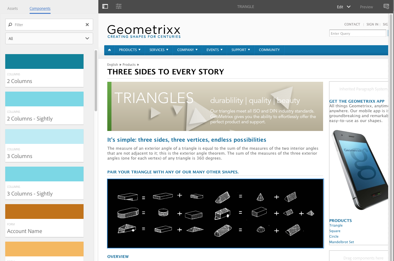
You can edit a page with the touch-optimized UI page editor; for example:
http://localhost:4502/editor.html/content/geometrixx/en/products/triangle.html

NOTE: The first time you open a page for editing with the touch-optimized UI, a series of slides will provide you with a tour of the features.
You can skip the tour if wanted and repeat it at any time by selecting from the Page Information menu.

EDITING YOUR PAGE CONTENT – CLASSIC UI

There is a separate page editor with the classic UI, using the content finder and the sidekick: 
http://localhost:4502/cf#/content/geometrixx/en/products/triangle.html

Accessing Help

Various Help resources can be directly accessed from within AEM:
  • Touch-optimized UI
    When editing a page, Help can be accessed from:
    • the Page Information selector; this will show the introductory slides (as shown the first time you access the editor).
    • the configuration dialog for specific components (using the ? icon in the dialog toolbar); this will show context-sensitive help.
  • The Classic UI
    As well as accessing help from the console toolbars, you can also access the help from the sidekick (using the ? icon) when editing a page:
    Or by using the Help button in the edit dialog of specific components; this will show context-sensitive help.

Selecting Components

COMPONENTS BROWSER – TOUCH-OPTIMIZED UI

The components browser shows all components that are available for use on your current page. These can be dragged to the appropriate location, then edited to add your content.
The components browser is a tab within the side panel (together with the assets browser). To open (or close) the side panel use the icon at the top left of the toolbar:

When you open the side panel it will slide open (from the left side). Select the Components tab if necessary, when open you can browse through all the components available for your page.
Component groups are indicated by text and color; General is always shown in tones of green, other groups are assigned a random color (up to a maximum of ten colors, with more than ten groups the colors are reused).
From the top toolbar in the Components browser you can:
  • filter components by name
  • limit the display to a specific group using the drop-down selection
The actual appearance and handling are dependent on the device type you are using:

NOTE

A mobile device is detected when the width is less than 1024px; i.e. also on a small desktop window.
  • Mobile device; for example iPad
    The component browser completely covers the page being edited.
    To add a component to your page touch-and-hold the required component and move it towards the right – the component browser will close to show the page again – where you can position the component.
  • Desktop device
    The component browser is opened on the left side of the window.
    To add a component to your page click on the required component and drag it to the required location.

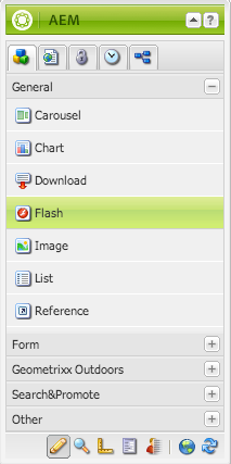
SIDEKICK – CLASSIC UI

The Components tab of the sidekick allows you to browse the components available to be added to the current page. The required group can be expanded, then a component dragged to the required location on the page.

Selecting Assets

ASSETS BROWSER – TOUCH-OPTIMIZED UI

The assets browser shows all assets that are available for direct use on your current page.
The assets browser is a tab within the side panel (together with the components browser). To open (or close) the side panel use the icon at the top left of the toolbar:
When you open the side panel it will slide open (from the left side). Select the Assets tab if necessary, when open you can browse through all the assets available for your page. Infinite scrolling is used to expand the list when required.
To add an asset to your page, select and drag to the required location; this can be:
  • An existing component of the appropriate type.
    For example, you can drag an asset of type image onto an Image component.
  • placeholder in the paragraph system to create a new component of the appropriate type.
    For example, you can drag an asset of type image onto the paragraph system to create an Image component.

NOTE

This is available for specific assets and component types. See Inserting a Component using the Assets Browser for more details.
From the top toolbar of the assets browser, you can filter the assets by:
  • Name
  • Path
  • Asset type (i.e. images, manuscripts, documents, videos, pages, paragraphs, products)
  • Asset characteristics; this is available for certain asset types, for example, images can be filtered by Orientation(PortraitLandscapeSquare) and Style (ColorMonochromeGrayscale)
The actual appearance and handling are dependent on the device type you are using:
NOTE: A mobile device is detected when the width is less than 1024px; i.e. also on a small desktop window.
  • Mobile device; for example iPad
    The assets browser completely covers the page being edited.
    To add an asset to your page touch-and-hold the required asset, then move it towards the right – the assets browser will close to show the page again, where you can add the asset to the required component.

  • Desktop device
    The assets browser is opened on the left side of the window.
    To add an asset to your page click on the required asset and drag it to the required component.

THE CONTENT FINDER – CLASSIC UI

The Content Finder is a quick and easy way to find assets and/or content within the repository when editing a page.
You can use the content finder to locate a range of resources. Where appropriate you can drag an item and drop it into a paragraph on your page:

Finding Images

This tab lists any images in the repository.
After you have created an Image paragraph on your page, you can drag an item and drop it into the paragraph.

Finding Documents

This tab lists any documents in the repository.
After you have created a Download paragraph on your page, you can drag an item and drop it into the paragraph.

Finding Movies

This tab lists any movies (for example, Flash items) in the repository.
After you have created an appropriate paragraph (for example, Flash) on your page, you can drag an item and drop it into the paragraph.

Products

This tab lists any products. After you have created an appropriate paragraph (for example, Product) on your page, you can drag an item and drop it into the paragraph.

Finding Pages

This tab shows all pages. Double-click any page to open it for editing.

Referencing Paragraphs from other Pages

This tab allows you to search for another page. All paragraphs from that page will be listed. You can then drag a paragraph to your current page, this will create a reference to the original paragraph.

Finding Manuscripts

This tab can be used to locate manuscripts:

Using the Full Repository View

This tab shows all the resources in the repository.

Using Search with the Content Browser

On all options, you can search for specific items. Any tags and any resources that match the search pattern are listed:
You can also use wildcards for search. Supported wildcards are:

  • matches a sequence of zero or more characters.
  • ?
    matches a single character.

NOTE

There’s a pseudo property “name” which must be used to perform a wildcard search.
For example, if there is an image available with the name:
    ad-nmvtis.jpg
the following search patterns will find it (and any other images matching the pattern):
  • name:*nmv*
  • name:AD*
    the character matching is not case sensitive.
  • name:ad?nm??is.*
    you can use any number of wildcards in a query.
NOTE: You can also use SQL2 search.

Showing Page References

SHOWING REFERENCES – TOUCH-OPTIMIZED UI

References show any connections to the selected page:
  • Launches
  • Live copies
  • Language copies
  • External links
  • Use of the reference component
  • References to Product pages (from the Commerce – Products console)
Open the required console, then navigate to and select the required resource (selection mode). Open the secondary railReferences, using:
A list of references types relevant to that resource will be shown:
Select the appropriate reference type for more information. In certain situations, further actions are available when you select a specific reference, including:
For example, you can fix a broken reference within a Reference component:

SHOWING REFERENCES – CLASSIC UI

AEM lets you view which pages are linked to the page you are currently working on.
To show direct page references:
  • In the sidekick, select the Page tab icon.

  • Select Show References… AEM opens the References window and displays which pages refer to the selected page, including their paths.
In certain situations, further actions are available from Sidekick, including:

Showing Page Activity

TIMELINE – TOUCH-OPTIMIZED UI

For appropriate resources (e.g. pages from the Sites console, or assets from the Assets console) the timeline can be used to show the recent activity on any selected items.
Open the required console, then navigate to and select the required resource (selection mode). Open the secondary railTimeline, using:
Select either Show All or Activities to list any recent actions on the selected resources:

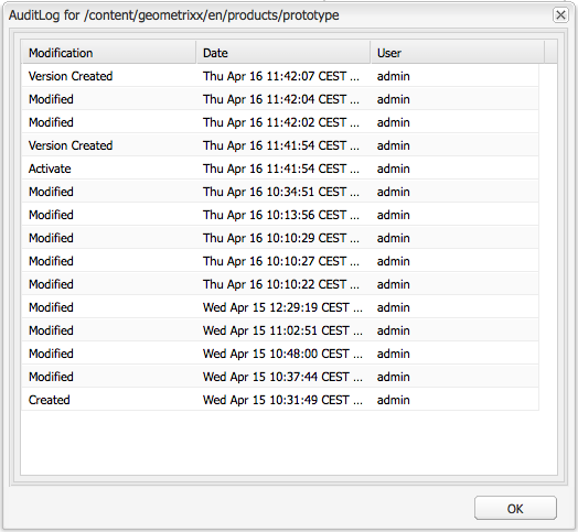
AUDIT LOG – CLASSIC UI

The Audit Log can be accessed from the Information tab of the sidekick. It lists the recent actions taken on the current page; for example:

PAGE INFORMATION – TOUCH-OPTIMIZED UI

The Page Information (equalizer icon) opens a menu that also provides details about the last edit and the last publication. Depending on the characteristics of the page (and the site it is located in) more options might be available:
For example, when appropriate, Page Information also:
  • Provides access to analytics and recommendations
  • Allows you to perform a page rollout

PAGE INFORMATION – CLASSIC UI

The Website console also provides information about the current status of the page; for example, publication, modification, locked, livecopy, etc.

Page Modes

MODES – TOUCH-OPTIMIZED UI

When editing a page with the touch-optimized UI there are various modes:
  • Edit – the mode to use when editing the page content.
  • Targeting – increase content relevance through targeting and measuring across all channels.
  • Scaffolding – help you to create a large set of pages that share the same structure but have differing content.
  • Live Copy Status – allows a quick overview of the live copy status and which components are/are not inherited.
  • Developer – allows you to perform various actions (requires privileges); these include inspecting the technical details of a page and its components or performing automated tests.
  • Design – allows you to enable/disable components for use on a page; also to configure the design of the component.
  • Preview – used to view the page as it will be shown on the publish environment, or to navigate using links in the content.
  • Annotate – used to add or view annotations on the page.
You can access these using the icons in the top right corner, the actual icon will change to reflect the mode you are currently using:

NOTE

  • Developer mode is not available on mobile devices (space restrictions).
  • Access to some modes requires the appropriate permissions/privileges.
  • There is a keyboard shortcut (Ctrl-Shift-m) to toggle between Preview and the currently selected mode (e.g. EditScaffolding, etc).

MODES – CLASSIC UI

When editing a page with the classic UI there are various modes that can be accessed using the icons at the bottom of the sidekick:
The row of icons at the bottom of the Sidekick are used to switch modes for working with the pages:
  • Edit
    This is the default mode and allows you to edit the page, adding or deleting components and making other changes.
  • Preview
    This mode allows you to preview the page as if it were appearing on your website in its final form.
  • Design
    In this mode, you have the possibility to edit the design of the page by configuring the components accessible.


By aem4beginner