Showing posts with label CQ Dialog. Show all posts

March 30, 2021
Estimated Post Reading Time ~

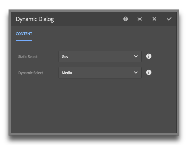
Display dynamic content in a Touch UI (Granite) Dialog Select Field

Update: I've added a proper GitHub project here.

In classic UI, it was easy to specify the options property on a selection xtype.

This made getting dynamic data into a dropdown very easy. Simply point the options property to /path/to/resource.infinity.json and you were done. In Granite, things don't work this easy.

There are two approaches that I found. 1) Use a listener. 2) Use ACS Commons GenericList / Datasource solution.

The ACS commons solution works great, but it's a bit rigid on the data structure. I used it as my starting point for the solution below.

My solution is a 3 step process, requires no JS and no external dependencies.

Step 1
Make a data source component. It only needs to have one JSP file in it...

<%@page session="false" import="
org.apache.sling.api.resource.Resource,
org.apache.sling.api.resource.ResourceUtil,
org.apache.sling.api.resource.ValueMap,
org.apache.sling.api.resource.ResourceResolver,
org.apache.sling.api.resource.ResourceMetadata,
org.apache.sling.api.wrappers.ValueMapDecorator,
java.util.List,
java.util.ArrayList,
java.util.HashMap,
java.util.Locale,
com.adobe.granite.ui.components.ds.DataSource,
com.adobe.granite.ui.components.ds.EmptyDataSource,
com.adobe.granite.ui.components.ds.SimpleDataSource,
com.adobe.granite.ui.components.ds.ValueMapResource,
com.day.cq.wcm.api.Page,
com.day.cq.wcm.api.PageManager"%><%
%><%@taglib prefix="cq" uri="http://www.day.com/taglibs/cq/1.0" %><%
%><cq:defineObjects/><%

request.setAttribute(DataSource.class.getName(), EmptyDataSource.instance());
Locale locale = request.getLocale();
Resource datasource = resource.getChild("datasource");
ResourceResolver resolver = resource.getResourceResolver();
ValueMap dsProperties = ResourceUtil.getValueMap(datasource);
String genericListPath = dsProperties.get("path", String.class);

// What fields and values do we want from the children resources? This should be inside the component dialog.
String value = dsProperties.get("value", String.class);
String text = dsProperties.get("text", String.class);

// If the path isn't null, get the resource and loop through the children.
if (genericListPath != null) {

Resource parentResource = resourceResolver.getResource(genericListPath);

// Create a list to stuff our values
List<Resource> fakeResourceList = new ArrayList<Resource>();

// Grab the children and get their properties.
for(Resource child : parentResource.getChildren()){

ValueMap vm = new ValueMapDecorator(new HashMap<String, Object>());

ValueMap childProperties = ResourceUtil.getValueMap(child);

vm.put("value", childProperties.get(value, String.class));
vm.put("text", childProperties.get(text, String.class));

fakeResourceList.add(new ValueMapResource(resolver, new ResourceMetadata(), "nt:unstructured", vm));
}

// Create a new data source from iterating through our fakedResourceList
DataSource ds = new SimpleDataSource(fakeResourceList.iterator());

// Add the datasource to our request to expose in the view
request.setAttribute(DataSource.class.getName(), ds);
}
%>


Step 2
Add a data source node to your dialog property. Read the gist for pertinent info.

<dropdown
jcr:primaryType="nt:unstructured"
sling:resourceType="granite/ui/components/foundation/form/select"
fieldLabel="Dropdown"
name="./dropdown"
rootPath="/content">
<!-- Params: value, text, path -->
<datasource
jcr:primaryType="nt:unstructured"
sling:resourceType="myapp/components/utilities/datasource"
value="value"
text="text"
path="/apps/myapp/components/content/snippets/statsbar/dialog/articleLabels/articleLabelsSelect/options" />
</dropdown>

Step 3
Profit.

By aem4beginner

January 4, 2021
Estimated Post Reading Time ~

Search/Filter Touch UI Dialog Dropdown in AEM

Sometimes we have a requirement that needs to populate the dynamic list in the touch UI dialog dropdown. We can achieve populating the dynamic list in dialog easily for example https://helpx.adobe.com/experience-manager/using/creating-granite-datasource.html but what if the list is too long, assume we need to create a dialog dropdown to choose color and color list having approximate 148 items (https://www.w3schools.com/colors/colors_names.asp )
So it’s quite tough for the content author to scroll the dropdown to select the appropriate value.

What can be done to reduce efforts for content author:
Is it possible to have a kind of In-place search dropdown where the content author can type the character and the drop-down list will only show relevant value?
The answer is Yes, It is possible.

How:
This can be achieved by modifying the existing dropdown node:

Replacing sling:resourceType value from ‘select’ to 'autocomplete' component (/libs/granite/ui/components/coral/foundation/form/autocomplete)
Create ‘options’ nodes parallel to ‘datasource’ node and create sling:resourceType property with granite/ui/components/coral/foundation/form/autocomplete/list value for ‘options’ node

That’s it. Find more info about the autocomplete component at Autocomplete

Example dialog:
<?xml version="1.0" encoding="UTF-8"?>
<jcr:root xmlns:sling="http://sling.apache.org/jcr/sling/1.0" xmlns:cq="http://www.day.com/jcr/cq/1.0" xmlns:jcr="http://www.jcp.org/jcr/1.0" xmlns:nt="http://www.jcp.org/jcr/nt/1.0"
jcr:primaryType="nt:unstructured"
jcr:title="Promo Box"
sling:resourceType="cq/gui/components/authoring/dialog">
<content
jcr:primaryType="nt:unstructured"
sling:resourceType="granite/ui/components/coral/foundation/container">
<items jcr:primaryType="nt:unstructured">
<tabs
jcr:primaryType="nt:unstructured"
sling:resourceType="granite/ui/components/coral/foundation/tabs">
<items jcr:primaryType="nt:unstructured">
<contentdata
jcr:primaryType="nt:unstructured"
jcr:title="Content"
sling:resourceType="granite/ui/components/coral/foundation/fixedcolumns">
<items jcr:primaryType="nt:unstructured">
<column
jcr:primaryType="nt:unstructured"
sling:resourceType="granite/ui/components/coral/foundation/container">
<items jcr:primaryType="nt:unstructured">
<heading
jcr:primaryType="nt:unstructured"
sling:resourceType="granite/ui/components/coral/foundation/form/textfield"
fieldDescription="Enter Promo Box Heading"
fieldLabel="Heading"
name="./heading"/>
<background
jcr:primaryType="nt:unstructured"
sling:resourceType="granite/ui/components/coral/foundation/form/autocomplete"
emptyText="---- Please Select a Value -----"
fieldDescription="Select Background colour from Dropdown"
fieldLabel="Select or type background colour from Dropdown"
name="./bg-color"
required="{Boolean}true">
<datasource
jcr:primaryType="nt:unstructured"
sling:resourceType="/apps/blog/dailog/dropdown"/>
<options
jcr:primaryType="nt:unstructured"
sling:resourceType="granite/ui/components/coral/foundation/form/autocomplete/list"/>
</background>
</items>
</column>
</items>
</contentdata>
</items>
</tabs>
</items>
</content>
</jcr:root>


Dropdown with all items


Dropdown with Filter/Search


By aem4beginner

January 3, 2021
Estimated Post Reading Time ~

Touch UI - RTE HTML Element Selector, Custom Style Plugin & Color Picker Plugin

Touch UI RTE is always a challenging topic because of a lack of documentation to create or customize plugins, There are great articles at http://experience-aem.blogspot.com/2013/08/in-blog-experiencing-adobe-experience.html which talk about RTE plugins. I got the idea from the ColorPicker plugin and tried to create a new Style Picker plugin that may help the AEM community to achieve more from RTE.

This blog covers :
HTML DOM Navigation and HTML element selector inside RTE Editor
Custom Style(Style Picker) Plugins
Color Picker Plugin

HTML DOM Elements Navigator extension:
  • Shows selected/current HTML element's DOM structure in RTE
  • Allows selecting an exact HTML element in RTE to apply settings using RTE plugins.
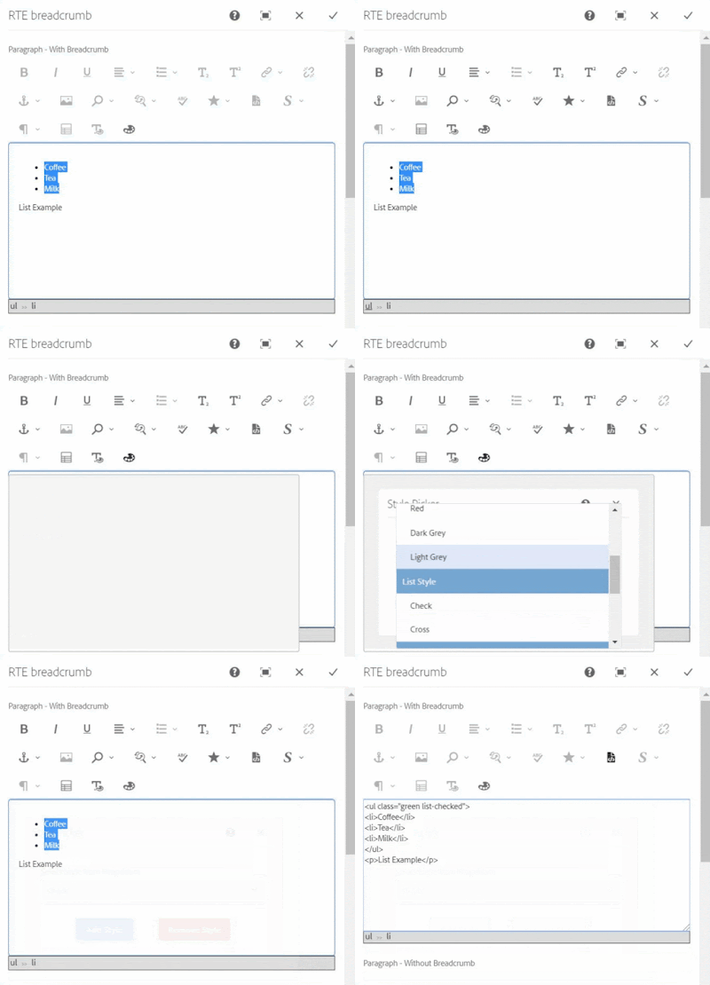
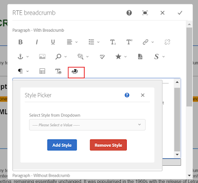
Style Picker Plugins apply a class attribute to selected HTML elements unlike the OOTB style plugin to create a span tag. The exact HTML element can be selected from the DOM navigator e.g. ul, ol, hr, p, div, img, etc. These elements can be selected by DOM Element Navigator and class can be applied to them.
The Color Picker Plugin as the same as ColorPicker Plugin from http://experience-aem.blogspot.com but I modified it to work with all AEM version from 6.3+

Color Picker, Style Picker Plugins, and HTML DOM navigation


RTE Element Selection from DOM navigation


Applying class to ul element using Style Picker

When the selected item already has existing styles, the style will be pre-selected in the dropdown, If another style is chosen, the new class will be added and the existing class will also remain, this will allow applying multiple styles to a single element.

In case of applying a different style or a single style to an element then an existing style should be chosen and removed using the Remove Style button. 

Pre-selected style


Applying another style to list


Removing style from the list

If only a text is selected for applying the style using this custom style picker plugin, the style will be added to its parent's node. If you want to apply a style to text using a span tag, use the OOTB style plugin.

Style is added to P tag


OOTB style plugin, style added with a span tag

Note: If multiple HTML items are selected then the style will be applied to only one element.

Code
You can install the below packages from GitHub to use these plugins in AEM 6.3+
Packages contain:
Details
1. DOM Elements Navigation and Selector inside RTE Editor

In RTE, the element tree breadcrumb is created at the bottom section of RTE, which shows the DOM navigation and allows a user to select a particular HTML element in RTE by clicking on breadcrumb items.

RTE Navigation will only be shown for the RTE which has showBreadcrumb property with true.
ShowBreadcrumb property in RTE item node


RTE DOM Tree
Although navigation can be enable for all the RTEs by changing below line in /apps/commons/rte/rte-breadcrumb/js/rte-breadcrumb.js file
replace
$('.coral-RichText[data-showbreadcrumb="true"]').each(function() {
$(this).parent().find(".rte-sourceEditor").after(breadcrumbItem);
});

with
$('.coral-RichText').each(function() {
$(this).parent().find(".rte-sourceEditor").after(breadcrumbItem);
});

The DOM navigation extension is independent of the style plugin and can be used with other plugins as well to select, cut, copy, etc.

2. Custom Style Picker Plugins

StylePicker Plugin in RTE toolbar

After installing the package you can find the Style Picker Plugins files at:

Plugins JS and CSS at
/apps/commons/rte/plugins/clientlibs/js/style-picker.js
/apps/commons/rte/plugins/clientlibs/css/style-picker.css

Plugins popover dialogs
/apps/commons/rte/plugins/popovers/style-picker

Plugin Popover Dialog - dropdown option datasource and JSON at
/apps/commons/rte/plugins/popovers/style-picker/datasource
/apps/commons/rte/plugins/popovers/style-picker/options.json

Datasource is a JSP file which read json specified in options property and populates dropdown option for Style Picker plugin.
JSON file should have an array of elements in the below format:

If want to show as Heading/Category use the below format(value could be anything)
{"text": "Background Color","value": "BTC","heading": "true"}

If Option

{"text": "White","value": "white"}

Example: /apps/commons/rte/plugins/popovers/style-picker/options.json

[
{"text": "Background Color","value": "BTC","heading": "true"},
{"text": "White","value": "white"},
{"text": "Black","value": "black"},
{"text": "Green","value": "green"},
{"text": "Orange","value": "orange"},
{"text": "Light Grey","value": "lightgrey"},
{"text": "List Style","value": "LS","heading": "true"},
{"text": "Check","value": "list-checked"},
{"text": "Cross","value": "list-crossed"},
{"text": "Link Style","value": "LS","heading": "true"},
{"text": "Primary","value": "btn-primary"},
{"text": "Secondary","value": "btn-secondary"}
]


List Style and List Style are the Category and can't be selected

Plugin configuration in RTE
create 'styleformat' child node of rtePlugins node and create features property in it with * value as shown in below screenshot.

Add 'styleformat#styles' in the toolbar property on the inline node as shown in the below screenshot.


3. Color Picker Plugin
ColorPicker Plugin in RTE toolbar

After installing the package you can find the ColorPicker Plugins files at :

Plugins JS and CSS at
/apps/commons/rte/plugins/clientlibs/js/color-picker.js
/apps/commons/rte/plugins/clientlibs/css/color-picker.css

Plugins popover dialogs
/apps/commons/rte/plugins/popovers/color-picker

Plugin configuration in RTE

create 'colorformat' child node of rtePlugins node and create features property in it with * value as shown in below screenshot.

Add 'colorformat#colorPicker' in the toolbar property on the inline node as shown in the below screenshot.


Sample Components
Sample Test Component package contains a sample component (/apps/mfHTL63/components/content/simple-rte)

This component can be referred for ColorPicker and StylePicker Plugins configurations.

References
http://experience-aem.blogspot.com/2017/06/aem-63-touch-ui-rte-rich-text-editor-color-picker-plugin-inplace-dialog-edit.html


By aem4beginner

Touch UI Dialog - Assets Panel

In Touch UI dialog when we use file upload type e.g. cq/gui/components/authoring/dialog/fileupload or granite/ui/components/foundation/form/fileupload field to allow authoring assets from the side panel.
In order to author the images, the side panel should be opened before editing via dialog.

AEM Page editor with side panel and dialog opened


Authoring image using drag and drop

If you forgot to open the side panel before opening the dialog then you need to close the dialog, open the side panel, and open the dialog again to author assets.


This is kind of annoying to close the dialog and open it again just to author images/Assets.
Why can't the side panel open from the dialog without closing the dialog?
That's it, here you go -

Side panel toggle button in dialog header


side panel toggle from the dialog

How to do it
This can be achieved by simply adding a side panel toggle button in the dialog header alongside help or other buttons. When clicking on this button, the click event will be triggered on the actual side panel toggle button and rest will be OOTB.

Create a clientlibs of category 'cq.authoring.dialog'
Create js.txt and dialog.sidepanel.js files with below content or click on file name to get file from github.

js.txt
dialog.sidepanel.js

dialog.sidepanel.js
(function($, $document) {
"use strict";
var flag = true;
$document.on("dialog-ready", function() {

var buttonHTML = '<button is="coral-button" icon="railLeft" variant="minimal" class="cq-dialog-header-action cq-dialog-railLeft coral-Button" type="button" title="Toggle Side Panel" size="M">';
buttonHTML += '<coral-icon class="coral-Icon coral-Icon--sizeS coral-Icon--railLeft coral3-Icon--railLeft" icon="railLeft" size="S" role="img" aria-label="rail left"></coral-icon>';
buttonHTML += '<coral-button-label></coral-button-label>';
buttonHTML += '</button>';

$('.cq-Dialog coral-dialog-header.cq-dialog-header>div.cq-dialog-actions > button:nth-child(1)').after(buttonHTML);

if (flag)
$(document).on('click', 'button.cq-dialog-railLeft', toggleLeftRail);

function toggleLeftRail() {
flag = false;
$('.editor-GlobalBar coral-actionbar-primary coral-actionbar-item button.toggle-sidepanel').click();
}

});

})($, $(document));


Or
Package

You can install the below packages from GitHub to enable the side panel option in the Touch UI dialog. These works in AEM 6.3+

However, packages contain:
1. Clientlibs to enable the side panel option in touch ui dialog.
2. Clientlibs to enable displaying touch ui field in two-column layout in floating touch UI dialog

If you install this package, the Below files will be installed in the repository at

/apps/commons/clientlibs/dialog/js.txt
/apps/commons/clientlibs/dialog/js/dialog.sidepanel.js
Other files are getting used to showing field in the same row, more details at https://aemlab.blogspot.com/2019/07/aem-touch-ui-dialog-fields-in-same-row.html.

/apps/commons/clientlibs/dialog/js/dialog.field.2column-layout.js
/apps/commons/clientlibs/dialog/css.txt
/apps/commons/clientlibs/dialog/css/dialog.field.2column-layout.css


By aem4beginner

Touch UI Dialog - Display fields in a same row in Two Column Layout

In Touch UI dailog Coral/Granite type fields displays in a stack/top to bottom, one after another in a floating dialog and in fullscreen. In fullscreen it can be displayed in 2 column layout if column layout is used for dialog (columns inside granite/ui/components/foundation/layouts/fixedcolumns type )


and It will show fields in a dialog like below:

Floating mode and Fullscreen mode

Improve Authoring Experience
Visit https://experiencemanaged.com/posts/improve-the-aem-authoring-experience-ax.html blog to see how the authoring experience can be improved.

There are several scenarios where having a top-to-bottom approach to all fields can have a negative impact on the authoring experience. To improve the experience, fields can be added one after another in the same row.
How to do it

Create clientlibs from code mentioned in ClientLibs Code section
Add rowresume (Boolean) = true property in the field to display field in the same row. Make sure this property is added in all the fields which should display in the same row.
rowresume property

Add rowresume property in the field, if Coral2 type is used
if you are using coral3/Granite type then add rowresume property in granite:data node


'rowresume' Coral2 resource type

'rowresume' Granite/Coral3 resource type

ClientLibs Code
Create a clientlibs of category 'cq.authoring.dialog'
Create js.txt , css.txt, dialog.field.2column-layout.css and dialog.field.2column-layout.js files with below content or click on the file name to get the file from Github.

js.txt
dialog.field.2column-layout.js

dialog.field.2column-layout.js

(function($, $document) {

"use strict";
$document.on("dialog-ready", function() {
var items = $('[data-rowresume="true"]');
$(items).each(function(i) {
$(this).closest('.coral-Form-fieldwrapper').addClass("coral-Form-fieldwrapper--rowresume");
});
});

})($, $(document));


css.txt
dialog.field.2column-layout.css
.coral-Form-fieldwrapper.coral-Form-fieldwrapper--rowresume { width: 44%; display: inline-grid; margin: 0 3%; }

Dialog fields after adding rowresume property to width, height, dropdown, and radio group fields


Fullscreen mode

Dialog fields after adding rowresume property to height, dropdown, and radio group fields


Package
You can install the below packages from GitHub to enable this feature for the Touch UI dialog. These works in AEM 6.3+

However, packages contain:
1. Clientlibs to enable the side panel option in the Touch UI dialog.
2. Clientlibs to enable displayingTouch UI field in two-column layout in floating touch UI dialog

If you install this package, the Below files will be installed in the repository at
  • /apps/commons/clientlibs/dialog/js.txt
  • /apps/commons/clientlibs/dialog/js/dialog.field.2column-layout.js
  • /apps/commons/clientlibs/dialog/css.txt
  • /apps/commons/clientlibs/dialog/css/dialog.field.2column-layout.css
Other files are getting used to enable the side panel option in Touch UI dialog, Find more details about it at AEM - Touch UI Dialog - Assets Panel

Limitation:Work only with form field type.


By aem4beginner

AEM - Touch UI - Coral2 JSON store to Coral3 node store conversion

In Touch UI, Coral2 multifield with ACS common allow multifield data to stored as JSON but when you are going to migrate to Coral3/Granite type, new Granite type store multifield data in nodes not in JSON.

If the dialogs are already authored and if you convert them to Granite type then multifield dialogs fields would not be prepopulated without already authored data.

There are multiple solutions to pre-populate multifield fields with JSON data, the one is to create node structure from JSON.

In this article, I will show one of the approaches, to convert JSON data to node data.

Suppose if the dialog has a multifield item like below :
https://github.com/arunpatidar02/aem63app-repo/blob/master/packages/tmp/dialog-snippet1.xml

after dialog authored the values are stored in a JSON format.


To make the above dialog compatible with coral3, the data should be stored in a node under iItems. like below:


Note: The dialog fields should be changed separately from coral2 to coral3 resourcetype.

The below servlet runs SQL2 query and look for the touchmulti component and convert JSON data to nodes, so it will be compatible with coarl3 multifield and prepopulate the authored data.

Code:
https://github.com/arunpatidar02/aem63app-repo/blob/master/java/MultifieldConvertCoral2to3Servlet.java


By aem4beginner

January 2, 2021
Estimated Post Reading Time ~

Understanding and Trying Out the New AEM Dialog Conversion Tool Version 2

You may have been on Adobe Experience Manager (AEM) for more than three years, no matter if you are an admin, developer, or author, you probably got used to the legacy Classic UI interface and dialogs. Personally, I tend to use the Classic UI site admin console to view/manage content pages, because I like how it easily lets me navigate through the tree and give me a lot of page information in one panel. However, with the release of AEM 6.3, Adobe officially announced that Classic UI will be deprecated in April 2018, and completely removed from AEM in April 2019. 

This means that Adobe will explicitly display the deprecation message in Classic UI in next year’s release, and it will be completely gone from OOTB AEM in 2 years. With that said, it may be sooner than you thought if you don’t put it in your roadmap and take action for architecture, development and training, especially if you are still on or heavily rely on Classic UI. Related to this topic, I am going to try out the new dialog conversion tool (version 2) Adobe developed and released in June this year in this blog, and let you know the enhancements, concepts, steps, test result,s and pros, and cons.


(dialog conversion tool v2 user interface)

Version 2 Enhancements
First of all, the AEM dialog conversion tool v2.0.0 can convert both Classic UI dialogs and Granite UI/CoralUI 2 dialogs to Granite UI/CoralUI 3 dialogs. If you have not already known, AEM’s touch-enabled UI is built with Adobe’s Granite UI and CoralUI. CoralUI is the front-end implementation (HTML, CSS, JS) of Adobe’s visual style for touch-enabled UI. It is developed to provide consistent UX among different Adobe products (like many of Adobe Experience Cloud products). Granite UI components are server-side components that are built with CoralUI, CRX, Apache Felix, and Apache Sling technologies. 

They are used in a Granite-based platform like AEM. They are also reusable and modular building blocks for most Touch UI dialogs and consoles in AEM. So if you want to write a custom Touch UI console or dialog that has the same look and feel as the OOTB AEM environment, you can either assemble and configure different Granite UI components, or write CoralUI HTML and define custom action and services.

CoralUI 3 is the latest version of CoralUI that comes with AEM 6.3. If you are on AEM 6.2, it has partially CoralUI 2 and 3, as it was transitioning to 3. AEM 6.1 has CoralUI 2. To check the version of CoralUI, see your AEM developing reference materials and Touch UI documentation.

Now you may wonder what is the difference between CoralUI 3 and 2? The answer is not much. Except for some platform and component changes, one of the major changes I found is that CoralUI 3 uses web component’s custom elements. This encapsulates the detailed presentation markups and behavior into a custom HTML tag, so developers can write coral elements in the HTML file and don’t need to worry about how it works behind the scene. For example, if I need a checkbox on my page, I’ll just write:

<coral-checkbox value="kittens">
CoralUI Rocks
</coral-checkbox>


On CoralUI 2, it uses generic HTML tags with CoralUI classes and some with data attributes. For example, the same checkbox will look like this:

<label class="coral-Checkbox">
<input class="coral-Checkbox-input" type="checkbox" name="c2" value="2">
<span class="coral-Checkbox-checkmark"></span>
<span class="coral-Checkbox-description">Unchecked</span>
</label>


Another noticeable change is that on AEM 6.2, the component Touch UI dialog has a dark grey background color, and on AEM 6.3, it’s white.

(Touch UI dialog in aem 6.3)


(Touch UI dialog in aem 6.2)

For the complete CoralUI 3 enhancements, see the CoralUI 3 documentation.

Compatible AEM versions: 6.3
I have tested and installed the tool on AEM 6.1-6.3 instances. Unfortunately, it only works with 6.3. There are different errors in 6.1 and 6.2. On 6.2, you won’t be able to see the path field to search for dialogs and didn’t show any dialogs when clicking on the show dialogs button. On 6.1, there’s a package dependency error that requires a higher version of AEM product codes.


(path field not shown in AEM 6.2) (package dependency issue in AEM 6.1)

The process to Use Tool
Use of the tool is simple, go to Global Navigation -> Tools -> Operations -> Dialog Conversion. Put in the path of your component root folder and it will list all dialogs with type classic or coral 2 (Granite UI/CoralUI 3 dialogs will not be listed). Then just select the ones you want to convert and click the convert button. If successful, it will prompt you to another screen with converted dialog information. If not, it will show you the error message.

After that, you can simply use FileVault (VLT), either the command line or the VLT plugin in your IDE, to get the converted dialog from CRX to your code.

Behind The Scene and Custom Rewrite Rules
I understand that your Classic UI dialog or even Granite UI/CoralUI 2 dialog may have custom dialog fields (or properties). These fields may be extended from OOTB Ext JS widgets, Granite UI components, or custom developed scripts. Custom xtype or sling:resourceType will be processed by the conversion tool as it is unless you have a custom rewrite rule associated with it. For that, I think it’s necessary to know more about the dialog conversion tool behind the scene.

The dialog conversion tool is built on the concept of graph rewriting and rewrite rule, which is a paring of a pattern and a replacement graph.

The tool will take all the selected dialog paths from the request parameter and send them to a dialog rewriter class, in which it’s performing the node rewriting algorithm. The basics of the algorithm are that it will traverse all the dialog nodes from top-level, all the way to bottom, see if there’s a matching rule for the subtree rooted at each level, then overwrite the node based on the matching rule, and start the traversal from top node again; if no match is found, it will keep the original node as it is; traversal will stop until all nodes are final (each node that is processed will be put into a linked hash set, so it will be skipped by the tool in the next traversal).

There are two types of rewrite rules: JCR node-based and Java class-based.

The dialog conversion tool already provides a good amount of OOTB rewrite rules: 3 Java-based, 21 JCR node based for Classic UI, and 35 JCR node based for Granite UI/CoralUI 2.

Properties of the xtype or sling:resourceType can also be defined in the rewrite rules, otherwise they will be omitted by the tool. The replacement tree can define mapped properties that will inherit the value of a property in the original tree. Here’s an example: /libs/cq/dialogconversion/rules/classic/textfield/replacement/text. If your Classic UI dialog text field has a field label property named “./fieldLabel”, the value you defined for that field in Classic will be copied to the converted Granite UI/CoralUI 3 dialog.

You can copy /libs/cq/dialogconversion/rules to /apps to modify existing and/or add new rules to this new instance. You can also implement com.adobe.cq.dialogconversion.DialogRewriteRule interface or extend com.adobe.cq.dialogconversion.AbstractDialogRewriteRule class.

I will try not to go over complicated with custom rewrite rules. In my opinion, if you spend a lot of time configuring custom rewrite rules or even write a custom rewrite rule class, it’s better to let the tool convert the xtype/sling:resourceType as it is and then spend the time to develop the Granite UI/CoralUI 3 dialog directly, as the tool is supposed to aid your dialog conversion process, it does not and can not take full control of the conversion.

Test Result
I have tested the tool with Classic UI dialog, design dialog, and a Granite UI/CoralUI 2 dialog. The result is that all three were successful. The tool is able to convert most of the OOTB xtype and sling:resourceType. I just found that it omits the fields inside a multifield. For custom xtype and sling:resourceType, it kept as it is. The Granite UI/CoralUI 2 dialog node will be appended with “.coral2” in the name after the conversion.

I have put the sample component dialogs I used to test and the converted dialogs onto my Blog GitHub project: https://github.com/guangweiyao/blog. Feel free to check them out.

(converted touch ui dialog)
Pros and Cons

Pros:
  1. Automate dialog conversion process, this will be very helpful when you have a lot of components
  2. Able to provide basic shell (if not fully converted) for Touch UI dialog development
  3. Make sure your dialog code align with latest Adobe technology
  4. Reduce Touch UI dialog conversion and development time
  5. Provide flexibility with custom rewrite rule
  6. Tool is straight forward and easy to use
  7. Tool source code is open source and hosted on GitHub
Cons:
  1. Doesn’t work on older versions of AEM
  2. The show link is not able to show Touch UI dialogs
  3. It just tells you whether the process is successful or not, but didn’t provide the granular level information of which field is not able to be converted, or which property is omitted, so developer/admin have a record
  4. To modify existing and/or add new rules, you have to copy and paste the whole /libs/cq/dialogconversion/rules to /apps, it doesn’t support the newer overlay mechanism
Tips and Tricks
If you have both Classic UI and Granite UI/CoralUI 2 dialog for a component, the tool will only display Granite UI/CoralUI 2 dialog
Copy and paste whole /libs/cq/dialogconversion/rules to /apps in order to modify existing and/or add new rules
Sample custom rewrite rules reference to AEM Dialog Conversion tool project
AEM development references is a good place to find all AEM related APIs and documentation

Conclusion
Despite some space for improvement, I think the new AEM Dialog Conversion Tool Version 2 can help you or your client accelerate the component dialog conversion process and align with Adobe’s Classic UI deprecation timeline, so you can plan for paying down your technical debt and building beautiful and touch-enabled UI component dialogs.


By aem4beginner

AEM Touch UI Dialog Validation New Best Practice: Use Foundation-Validation

Oftentimes, AEM developers will be asked to develop a validator for the component dialog. Back in the Classic UI dialog days, you would probably write a JavaScript function for dialog before submitting an event. In Touch UI dialog, if you’ve Googled around, you probably found a lot articles/codes to use jQuery based validator, i.e. $.validator.register({}). Recently, I found out that this jQuery-based validator is deprecated starting in AEM 6.2 (see screenshot below), where the new best practice is to use foundation-validation

In this blog, I am going to walk you through foundation-validation, and the things you can do with it, using a sample icon component. You can find all the source codes in my GitHub project.

The sample icon picker validator mentioned in this blog is tested in AEM 6.3.


When Do You Need to Write a Validator?
A lot of the validation business requirements for dialog I’ve seen are for mandatory fields. If you are using Granite UI components, this, for the most part, is already resolved by setting required="{Boolean}true". 

But, for instance, if you have a multi-field, or RTE (resourceType of cq/gui/components/authoring/dialog/richtext), or an icon picker from ACS commons, or even your custom-developed dialog field, you may need to write a validator for a mandatory field and/or any other custom validation requirements.

If you are looking for an RTE validator that is easy to customize and scalable, we have a good blog post about it, which also uses foundation-validation.
How to Hook Validator to Dialog Field?

There are two ways you can call the validator for your dialog field:

1. Validation/custom data attribute
Most Granite UI components have a validation attribute that you can use to trigger a custom validator. It adds a data-validation attribute to the component markup; then, in your custom validator, you can use the data-validation attribute and value as a selector to trigger the validation.

If you are not using Granite UI components, you can add any custom data attribute to your dialog field node and use that as a selector for your validator. Of course, you can also use the same “validation” attribute, but just to make sure the component is adding that data – or data-validation attribute to a -foundation-submittable element (refer to “What is –foundation-submittable?” section). If not, you can’t use it directly as a selector; instead, you will need to register a new selector to the foundation registry.

These validations will be triggered when the dialog submit button is clicked. It will stop the dialog submit event first, scan through the dialog to look for fields with a validator, validate those fields and show errors, if any. If all fields are valid, it will proceed with the dialog submit event.

<icon
jcr:primaryType="nt:unstructured"
sling:resourceType="acs-commons/components/authoring/graphiciconselect"
fieldDescription="Icon to display"
fieldLabel="Icon"
name="./icon"
class="icon-picker-base"
validation="icon-picker">
<datasource
jcr:primaryType="nt:unstructured"
sling:resourceType="acs-commons/components/utilities/genericlist/datasource"
path="/etc/acs-commons/lists/font-awesome-icons"/>
</icon>


2. Foundation validation API
You can also trigger the dialog validation from the foundation validation API. This can be tied to any event on the dialog field, and you can toggle the error UI based on the validity of the field. See the example in the “Even Better” section.

What is –foundation-submittable?
Basically, it’s similar to the applicable elements in the jQuery validator, plus some coral and foundation elements (see the OOTB list screenshot below). Only these submittable elements can be used as a selector and trigger the foundation validation. You can still register a new selector if the data attribute is not in a –foundation-submittable field. For example, the data-validation attribute is added to an <span> element in the icon picker.


Register Selector
You can register a custom selector if the dialog component is a composite field or is not adding the data-validation attribute to a –foundation-submittable element, i.e. input, select, button, textarea…

The best practice for validation selector is to use fast flat selector, i.e. “[data-validation=icon-picker]”. Below is the code snippet of how you can register a selector:

registry.register("foundation.validation.selector", {
submittable: "[data-validation=icon-picker]",
candidate: "[data-validation=icon-picker]:not([disabled]):not([readonly])",
exclusion: "[data-validation=icon-picker] *"
});


Where is the Source Code of Foundation Validation?
This is based on AEM 6.2 and 6.3:
/libs/granite/ui/components/foundation/clientlibs/foundation/js/coral/validations.js
/libs/granite/ui/components/coral/foundation/clientlibs/foundation/js/validation/validation.js

Register Adapter
Foundation validation uses .adaptTo() for adapting elements; it’s the same idea as Sling adapter. You can register an adapter for your element and return custom properties/functions. For example, this is useful when I need to set my icon picker field valid/invalid. I can create an adapter for my icon picker and encapsulate my logic there, so I can reuse it in other places.

function createGenericIsInvalid(el) {
return function() {
return el.attr("aria-invalid") === "true";
};
}
function createGenericSetInvalid(el) {
return function(value) {
el.attr("aria-invalid", "" + value).toggleClass("is-invalid", value);
};
}
registry.register("foundation.adapters", {
type: "foundation-field",
selector: "[data-validation=icon-picker]",
adapter: function(el) {
var field = $(el);
var button = field.children(".icons-selector");
var select = field.children("select");
return {
isDisabled: function() {
return select.prop("disabled");
},
setDisabled: function(disabled) {
select.prop("disabled", disabled);
input.prop("disabled", disabled);
},
isInvalid: createGenericIsInvalid(field),
setInvalid: createGenericSetInvalid(field)
};
}
});


Register Validator
Besides selector, there are validate, show, and clear properties. They are all pretty self-explanatory. For validate, if it returns any string value, it means it’s invalid; otherwise, it’s valid. Below is the snippet of my icon picker validator. I am validating if any icon other than the empty icon is selected from the icon picker, meaning this is a mandatory field.

registry.register("foundation.validation.validator", {
selector: "[data-validation=icon-picker]",
validate: function (element) {
var field,
value;
field = $(element);
value = $(field).find(".selected-icon>i").attr("class");
if (value == "fip-icon-block") {
return "Please select the icon";
} else {
return;
}
},
show: function(element, message, ctx) {
$(element).closest(".icon-picker-base").adaptTo("foundation-field").setInvalid(true);
ctx.next();
},
clear: function(element, ctx) {
$(element).closest(".icon-picker-base").adaptTo("foundation-field").setInvalid(false);
ctx.next();
}
});


Even Better
You can use foundation validation API to check the validity and/or update U accordingly. For example, I want to check validity whenever someone selects a new icon from the icon picker (instead of when they click dialog submit) and I want to toggle the red error triangle and message based on the validity of the select. I can bind the click event from the icon selector, trigger a function to call the foundation validation API. I will find the icon picker element and adapt that to “foundation-validation,” and then I can call the foundation validation API.

var validateHandler = function(e) {
var iconpicker = $(document).find("[data-validation=icon-picker]");
var api = $(iconpicker).adaptTo("foundation-validation");
if (api) {
api.checkValidity();
api.updateUI();
}
};
$(document).on("dialog-ready", function () {
var container = $(this).find("div.fip-icons-container");
if (container.length > 0) {
$('.fip-icons-container').on('click', function(){
setTimeout(validateHandler, 200);
});
}
});


Feel free to comment on your specific questions for foundation-validation. I understand that when you have to go through all the documentation and source codes without any working reference can be very challenging, so I hope this blog gives you pointers and examples to lighten up your Touch UI dialog validation implementation.


By aem4beginner

Fixing Last Dropdown Visibility in Fullscreen Dialog

I recently saw an issue with AEM dialogs where, if you have a Dropdown in the dialog and open that dialog in full screen, you have to scroll down to see the Dropdown items. This issue happens on AEM 6.5.0

The issue:


This is especially annoying on the page properties:


Do you see how I have to scroll to see the rest of the dropdown items? Although it is not a big deal, you can easily fix it with some CSS.
The CSS Fix

Create a clientlib with categories="[cq.authoring.dialog]"

Add the following CSS:
/* fix for page properties */
.cq-siteadmin-admin-properties , .cq-siteadmin-admin-properties .cq-dialog-content-page {
height: 100%;
}
/* fix for full screen component dialogs */
.coral3-Dialog--fullscreen .cq-dialog {
height: 100vh;
overflow-y: scroll;
}
.coral3-Dialog--fullscreen .cq-dialog .coral3-Dialog-content,
.coral3-Dialog--fullscreen .cq-dialog .cq-dialog-content {
height:100%;
}

and here is the result:


and in page properties:


That is it for this one. I hope you’ve enjoyed the complimentary GIFs!


By aem4beginner