Core Components were introduced to provide robust and extensible base components, built on the latest technology and best practices, and adhering to accessibility guidelines.
Core Components leverage the latest technology to enable the creation of flexible, extensible, and feature-rich components to enable authors to easily create content.
AEM Core components are with HTML Template Language, or HTL, Touch UI dialogs and Sling Models, Secure, robust, version-able
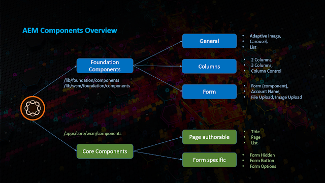
There are 16 Core Components in AEM 6.4 at present (This count keeps getting increased based on developer contributions in GitHub), which can be divided into two categories.
Page authorable components
-Breadcrumb
-Content Fragment
-List
-Navigation
-Page
-Quick Search
-Social Media Sharing
-Text
-Title
-Language Navigation
-Image
Form specific core components
-Form Hidden
-Form Options
-Form Text
-Form Button
-Form Container
When to Use the Core Components?
New Projects - New projects should always attempt to use Core Components.
Existing Projects - The recommendation is to keep using the foundation components unless a site or component refactoring is planned.
New Custom Components - Assess if an existing Core Component may be customized. If not, the recommendation is to build a new custom component following the Component Guidelines.
Existing Custom Components - If your components work as expected, then keep them as they are.
If not, refer to "New Custom Components" above.
Foundation Component Support
Since the foundation components have served as a basis of so much project development over many versions, they will continue to be supported into the foreseeable future.
However, Adobe's development emphasis has shifted to the core components and new features will be added to them whereas only bug fixes will be made to the foundation components
Core Components Advantages
· 100% written in HTL.
· Apache 2.0 License.
· Allow versioning of components.
· GitHub
· Latest features are supported, plus backward compatibility is also available.
· Unit test coverage > 80%
Steps to create sample core components:
· Download and Install
· Create Proxy Components
· Load the Core Styles
· Enable the Components
No comments:
Post a Comment
If you have any doubts or questions, please let us know.