So in this blog, I will talk about the two situations in detail with the sample package.
1. Show and Hide tabs based on Drop Down selection
2. Show and Hide fields based on Drop Down selection
Show and Hide Tabs based on Drop Down Selection
Let’s take an example, in which There are two options “Image” and “Video” in the drop down in the first tab and if author choose image, the tab 2 "Image" shows up and if author choose video,tab 3 "Video" shows up.
Step 1: Make a drop downfield in the first tab and make second and third tab
as per your requirement.
Step 2: The drop down node must have these properties:
Name
|
Type
|
Value
|
class
|
string
|
cq-dialog-tab-showhide
|
cq-dialog-tab-showhide-target
|
string
|
.list-option-tab-showhide-target
|
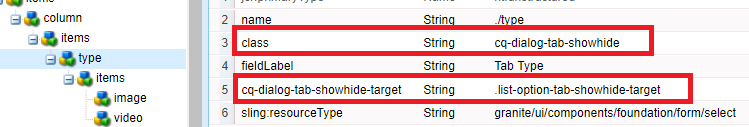
Fig -1 Add Properties in the DropDown Field Widget
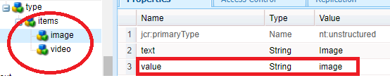
Step 3: The value property of options is very important as in my component, the value property is image and video for both options.
Step 4: Now to open Tab 2 on the selection of “Image” Option from the drop -down, create a node “layoutConfig” as shown below in the tab and configure a property class having value “hide list-option-tab-showhide-target image”.
Here “image” in class name should match with the value of option selected in tab1. For video tab the value will be “hide list-option-tab-showhide-target video”.

Step 4: Create a clientlib having “categories” as “cq.authoring.dialog” and add a js file in it.
/**
* Extension to the standard dropdown/select component. It enabled hidding/unhidding of tabs based on the
* selection made in the dropdown/select.
*
* How to use:
*
* - add the class cq-dialog-dropdown-tab-showhide to the dropdown/select element
* - add the data attribute cq-dialog-dropdown-tab-showhide-target to the dropdown/select element, value should be the
* selector, usually a specific class name, to find all possible target elements that can be shown/hidden.
* - add the target class to each target Tab/layoutConfig that can be shown/hidden
* - add the class hidden to each target Tab to make them initially hidden
* e.g.:
* + myComponent
* - jcr:title = "My Component"
* + cq:dialog
* - jcr:title = "My Component Dialog"
* - sling:resourceType = "cq/gui/components/authoring/dialog"
* + content
* - sling:resourceType = "granite/ui/components/foundation/container"
* + layout
* - sling:resourceType = "granite/ui/components/foundation/layouts/tabs"
* - type = "nav"
* + items
* + Tab1
* - jcr:title = "Tab 1"
* - sling:resourceType = "granite/ui/components/foundation/section"
* + layout
* - sling:resourceType = "granite/ui/components/foundation/layouts/fixedcolumns"
* + items
* + column
* + items
* + mydropdown
* - class = "cq-dialog-tab-showhide"
* - cq-dialog-tab-showhide-target = ".list-option-tab-showhide-target" // this is a selector for tabs
* + items
* + opentab2
* - text = "Open Tab 2"
* - value = "second"
* + opentab3
* - text = "Open Tab 3"
* - value = "third"
* + Tab2
* - jcr:title = "Tab 2"
* - sling:resourceType = "granite/ui/components/foundation/section"
* + layout
* - sling:resourceType = "granite/ui/components/foundation/layouts/fixedcolumns"
* + layoutConfig
* - class = "hide list-option-tab-showhide-target second"
* // hide: to hide the Tab, list-option-tab-showhide-target: used as selector in dropdown, second: selector value
* + items
* + column
* + items
* + myElement
* - fieldLabel = "Second tab item"
* - sling:resourceType = "granite/ui/components/foundation/form/textfield"
* + Tab3
* - jcr:title = "Tab 3"
* - sling:resourceType = "granite/ui/components/foundation/section"
* + layout
* - sling:resourceType = "granite/ui/components/foundation/layouts/fixedcolumns"
* + layoutConfig
* - class = "hide list-option-tab-showhide-target third"
* // hide: to hide the Tab, list-option-tab-showhide-target: used as selector in dropdown, third: selector value
* + items
* + column
* + items
* + myElement
* - fieldLabel = "Third tab item"
* - sling:resourceType = "granite/ui/components/foundation/form/textfield"
* + Tab4
* - jcr:title = "Tab 4 Open"
* - sling:resourceType = "granite/ui/components/foundation/section"
* + layout
* - sling:resourceType = "granite/ui/components/foundation/layouts/fixedcolumns"
* + layoutConfig
* - class = " "
* // leave it empty or do not create node or use some other class to use with different dropdown
* + items
* + column
* + items
* + myElement
* - fieldLabel = "Fourth tab item"
* - sling:resourceType = "granite/ui/components/foundation/form/textfield"
*
*/
(function(document, $) {
"use strict";
// when dialog gets injected
$(document).on("foundation-contentloaded", function(e) {
// if there is already an inital value make sure the according target element becomes visible
showHide($(".cq-dialog-tab-showhide", e.target));
});
$(document).on("selected", ".cq-dialog-tab-showhide", function(e) {
showHide($(this));
});
$(document).on("change", ".cq-dialog-tab-showhide", function(e) {
showHide($(this));
});
function showHide(el){
el.each(function(i, element) {
/* get the selector to find the target elements. its stored as data-.. attribute */
var target = $(element).data("cqDialogTabShowhideTarget");
if ($(element).data("select")) {
// get the selected value
var value = $(element).data("select").getValue();
// make sure all unselected target elements are hidden.
$(target).not(".hide").addClass("hide");
/* show the target element that contains the selected value as data-showhidetargetvalue attribute */
if(value)
$(target+'.'+value).removeClass("hide");
}else if($(element).is('input:checkbox')){
// toggle the target element that contains the selected value as data-showhidetargetvalue attribute
if($(element).is(':checked')){
$(target).removeClass( "hide" );
}else{
$(target).addClass( "hide" );
}
}
})
}
})(document,Granite.$);
That’s all you are supposed to do and your component will start working.This is not AEM OOTB feature, so to support this functionality we are using custom JS.
Show and Hide Fields based on Drop Down Selection
Let’s take an example, in which There are two options “Title” and “URL” in the drop down, if author choose “title” show “Title” else show “URL” widget for adding path.
Step 1: Make a drop down having two options:Title and URL having value “title” and “url”.
Step 2: The drop-down node must have these properties:

Fig -3 Add layoutConfig Node to Show/Hide Tabs
/**
* Extension to the standard dropdown/select component. It enabled hidding/unhidding of tabs based on the
* selection made in the dropdown/select.
*
* How to use:
*
* - add the class cq-dialog-dropdown-tab-showhide to the dropdown/select element
* - add the data attribute cq-dialog-dropdown-tab-showhide-target to the dropdown/select element, value should be the
* selector, usually a specific class name, to find all possible target elements that can be shown/hidden.
* - add the target class to each target Tab/layoutConfig that can be shown/hidden
* - add the class hidden to each target Tab to make them initially hidden
* e.g.:
* + myComponent
* - jcr:title = "My Component"
* + cq:dialog
* - jcr:title = "My Component Dialog"
* - sling:resourceType = "cq/gui/components/authoring/dialog"
* + content
* - sling:resourceType = "granite/ui/components/foundation/container"
* + layout
* - sling:resourceType = "granite/ui/components/foundation/layouts/tabs"
* - type = "nav"
* + items
* + Tab1
* - jcr:title = "Tab 1"
* - sling:resourceType = "granite/ui/components/foundation/section"
* + layout
* - sling:resourceType = "granite/ui/components/foundation/layouts/fixedcolumns"
* + items
* + column
* + items
* + mydropdown
* - class = "cq-dialog-tab-showhide"
* - cq-dialog-tab-showhide-target = ".list-option-tab-showhide-target" // this is a selector for tabs
* + items
* + opentab2
* - text = "Open Tab 2"
* - value = "second"
* + opentab3
* - text = "Open Tab 3"
* - value = "third"
* + Tab2
* - jcr:title = "Tab 2"
* - sling:resourceType = "granite/ui/components/foundation/section"
* + layout
* - sling:resourceType = "granite/ui/components/foundation/layouts/fixedcolumns"
* + layoutConfig
* - class = "hide list-option-tab-showhide-target second"
* // hide: to hide the Tab, list-option-tab-showhide-target: used as selector in dropdown, second: selector value
* + items
* + column
* + items
* + myElement
* - fieldLabel = "Second tab item"
* - sling:resourceType = "granite/ui/components/foundation/form/textfield"
* + Tab3
* - jcr:title = "Tab 3"
* - sling:resourceType = "granite/ui/components/foundation/section"
* + layout
* - sling:resourceType = "granite/ui/components/foundation/layouts/fixedcolumns"
* + layoutConfig
* - class = "hide list-option-tab-showhide-target third"
* // hide: to hide the Tab, list-option-tab-showhide-target: used as selector in dropdown, third: selector value
* + items
* + column
* + items
* + myElement
* - fieldLabel = "Third tab item"
* - sling:resourceType = "granite/ui/components/foundation/form/textfield"
* + Tab4
* - jcr:title = "Tab 4 Open"
* - sling:resourceType = "granite/ui/components/foundation/section"
* + layout
* - sling:resourceType = "granite/ui/components/foundation/layouts/fixedcolumns"
* + layoutConfig
* - class = " "
* // leave it empty or do not create node or use some other class to use with different dropdown
* + items
* + column
* + items
* + myElement
* - fieldLabel = "Fourth tab item"
* - sling:resourceType = "granite/ui/components/foundation/form/textfield"
*
*/
(function(document, $) {
"use strict";
// when dialog gets injected
$(document).on("foundation-contentloaded", function(e) {
// if there is already an inital value make sure the according target element becomes visible
showHide($(".cq-dialog-tab-showhide", e.target));
});
$(document).on("selected", ".cq-dialog-tab-showhide", function(e) {
showHide($(this));
});
$(document).on("change", ".cq-dialog-tab-showhide", function(e) {
showHide($(this));
});
function showHide(el){
el.each(function(i, element) {
/* get the selector to find the target elements. its stored as data-.. attribute */
var target = $(element).data("cqDialogTabShowhideTarget");
if ($(element).data("select")) {
// get the selected value
var value = $(element).data("select").getValue();
// make sure all unselected target elements are hidden.
$(target).not(".hide").addClass("hide");
/* show the target element that contains the selected value as data-showhidetargetvalue attribute */
if(value)
$(target+'.'+value).removeClass("hide");
}else if($(element).is('input:checkbox')){
// toggle the target element that contains the selected value as data-showhidetargetvalue attribute
if($(element).is(':checked')){
$(target).removeClass( "hide" );
}else{
$(target).addClass( "hide" );
}
}
})
}
})(document,Granite.$);
That’s all you are supposed to do and your component will start working.This is not AEM OOTB feature, so to support this functionality we are using custom JS.
Show and Hide Fields based on Drop Down Selection
Let’s take an example, in which There are two options “Title” and “URL” in the drop down, if author choose “title” show “Title” else show “URL” widget for adding path.
Step 1: Make a drop down having two options:Title and URL having value “title” and “url”.
Step 2: The drop-down node must have these properties:
Name
|
Type
|
Value
|
class
|
string
|
cq-dialog-dropdown-showhide
|
cq-dialog-dropdown-showhide-target
|
string
|
.title-url-hide-show
|
Fig -4 Add Properties in the DropDown Field Widget
The value of “cq-dialog-dropdown-showhide-target” can be changed as per your need. Right now it is “.title-url-hide-show”. You can change it to” .text-image-hide-show” if you are hiding and showing text and image. Try to use good naming convention.
Step 3: Now to show and hide fields based on title, follow the steps:
Create a node name “title” of type "nt:unstructured" having "sling:resourceType" as "granite/ui/components/foundation/container" having the following properties:
Name
|
Type
|
Value
|
showhidetargetvalue
|
string
|
title
|
class
|
string
|
hide title-url-hide-show
|
Note: “showhidetargetvalue” depends on the “value” of options in the dropdown. For URL Option, the “showhidetargetvalue” would be “url”.
Note: the “class” value will be same as defined in the property of “cq-dialog-dropdown-showhide-target” of the drop-down. just add “hide” before that value
- Create “items”(nt:unstructured) as a child node of “title” node.
- Create “well” (nt:unstructured) as a child node of items having sling:resourceType as “granite/ui/components/foundation/container”
- Create a node “layout” (nt:unstructured) under “well” node having sling:resourceType as granite/ui/components/foundation/layouts/well.
- Create a “items” (nt:unstructured) node parallel to layout of type nt:unstructured.
- Add as many widgets under “items” node you want to show on the selection of title option.
Step 4: Repeat Step 3 for URL option as well.

And that’s all you are supposed to do. There is no need to write any custom JS as AEM has this as an OOTB functionality.
And that’s all you are supposed to do. There is no need to write any custom JS as AEM has this as an OOTB functionality.

No comments:
Post a Comment
If you have any doubts or questions, please let us know.