So today in this blog, we will talk about some of the very interesting properties of a component and how can we use them.
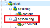
cq:icon: If you see the icon of a component, by default it refers to the first two letters of a component Title as an abbreviation.

Fig - Default icons contain the first two letters of the component title
But the icon of a component can be modified by various ways using cq: icon property:
Abbreviation: You can change the abbreviation by adding the property abbreviation in the cq: Component node and can change the number of characters shown as component icons. But it's advisable to use only two characters for better visualization.
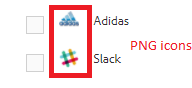
Coral UI Icon: There are a lot of coral UI Icons available that can be used for the component icons.
Add cq:icon property in a component node and its value is from the Coral UI icon.

Fig - Added cq:icon property in component dialog
In the design mode, the icons of the component look like this.

Fig - Coral UI icon added in a component
PNG Images: You can configure a PNG Image as a component icon by adding an image as cq:icon.png node of nt:file type under cq:component node.
PNG Images should have a transparent background and background set of #707070 color and size of 20px by 20px.However to accommodate retina displays 40px by 40px might be more preferable.
SVG Images: You can configure SVG Images as a component icon by adding an image as cq:icon.svg of nt:file under cq:component node the same as PNG Images. SVG Images should have a background set of #707070 color and size of 20px by 20px.
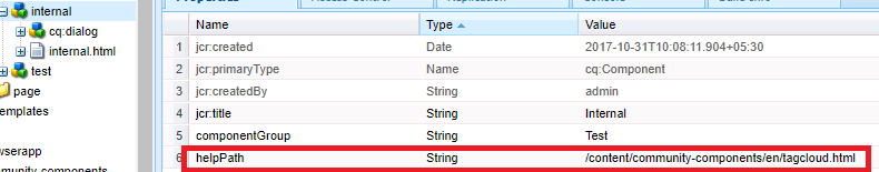
helpPath: I ignored this property a lot, but the benefits of this property are like a boon to an author.
We used to provide an authoring guide to authors so that they can go to that and author the website. They just open the doc to find the component which they want to author and continue their work.
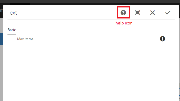
Fig - Help icon in the component dialog
helpPath property links the help icon to a particular page. We can create an authoring guide page in AEM only and add that page path as a value of helpPath property. You can add also the external path and if the author starts authoring, he/she can just click on the icon and see the documentation. It is quite a useful property.
For out-of-the-box components, this often references a page in the documentation.
If no helpPath is specified, the default URL (documentation overview page) is shown.
Add caption
Decoration Tag: When a component is getting rendered on a page, an HTML element can be wrapped that component.
The reasons can be:
The component can only be edited if it is wrapped with an HTML element.
The wrapping element is used to apply HTML classes that provide Layout and Styling Information. The following nodes and properties can be applied to a component to control the behavior of the decoration tag.
cq:noDecoration{Boolean}: If we add this property as true in the component node, all the default wrapper HTML elements won’t get displayed. But this property won’t let the component editable as wrapping elements are mandatory to open a dialog in the edit mode.
cq:htmlTag Node: If you want to change the default class of wrapper element, put some styling over the component, you can create cq:htmlTag node under the component with the following properties:
cq:tagName: This property can be used to add a custom HTML tag in the wrapper of the component in place of default div element.
Class: This property is used to add a custom class in the default wrapper.
Other property names will be added as HTML attributes with the same String value as provided.
Decoration Tags with HTL and JSP:
Decoration Tag behaves differently in both HTL and JSP.
HTL: In general, the wrapper behavior in HTL can be summarized as follows:
No wrapper DIV is rendered by default (when just doing data-sly-resource="foo").
All wcm-modes (disabled, preview, edit on both author and publish) render identically.
The behavior of the wrapper can also be fully controlled.
The HTL script has full control over the resulting behavior of the wrapper tag.
Component properties (like cq:noDecoration and cq:tagName) can also define the wrapper tag.
Use Cases for Decoration Tag
Let’s understand the different use cases for the decoration Tag.
+--content/page1
+--parent(sling:resourceType=/apps/components/parent) [Parent Component]
+--child(sling:resourceType=/apps/components/child)[Child Component]
+--/apps/components
+--parent
+--parent.html
+--child
+--child.html
+--cq:htmlTag/
+--@cq:tagName =”article”
+--@class =”article-child”
1. Include a component for Code Reuse :
If you are including a child component in the parent component just for the code reusability purpose and the child component doesn’t have any dialog to the author, cq:noDecoration can be true because no need to have any wrapper elements.
parent.html: <sly data-sly-resource="${'child' @ resourceType='/apps/aem-training/components/content/child'}"></sly>
child.html: This is Child Page.
Resulting output on /content/page1.html:
This is Child Page.
2. Include an Editable Component: When the need of including the child component in the parent component in the editable format, we need to have the wrapping elements for the child component to make it enable for working.
Since the included component is in this case an independent component, it needs a wrapper element for the editor to work, and to define its layout and style to apply. To trigger this behavior, we need to add cq:htmlTag node in the child component.
3.Custom Behavior: There can be any number of complex cases, which can be achieved easily by the possibility of HTL to provide explicitly:
decorationTagName='ELEMENT_NAME' To define the element name of the wrapper.
cssClassName='CLASS_NAME' To define the CSS class names to set on it.
parent.html: <sly data-sly-resource="${'child' @ resourceType='/apps/aem-training/components/content/child',decorationTagName=article, cssClassName='child'}"></sly>
child.html: Hello World!
Resulting output /content/page1.html:
<article class="child">Hello World!</article>
JSP: When including a component using cq:include or sling:include, the default behavior in AEM is to use a DIV to wrap the element. However, this wrapping can be customized in two ways:
Explicitly tell AEM not to wrap the component using cq:noDecoration. Use a custom HTML tag to wrap the component using cq:htmlTag/cq:tagName or decorationTagName.

No comments:
Post a Comment
If you have any doubts or questions, please let us know.