Before going to this topic, I would like to say, why we are going for touch-enabled UI. Over the years we were using AEM Classic UI, and currently, Adobe has planning to deprecate the Classic UI. So gradually we have to move into a new user interface called Touch-enabled UI.
Adobe introduced touch-optimized UI with AEM 5.6 for the author's environment. This differs considerably from the original classic UI as it is designed to operate on both touch and desktop devices. The basic principles of the touch-optimized UI are:
- Mobile-first (with desktop in mind)
- Responsive design
- Context relevant display
- Reusable
- Include embedded reference documentation
- Include embedded tests
- Bottom-up design to ensure these principles are applied to every element and component
The touch-enabled UI includes:
The suite header that,
- Shows the logo
- Provides a link to the Global Navigation
- Provides a link to other generic actions; such as Search, Help, Marketing Cloud Solutions, Notifications, and User Settings.
- Timeline
- Filters
- References
- Lists the items of content (be they pages, assets, forum posts, etc)
- Can be formatted as requested, e.g. column, card, or list
- Uses a responsive design (the display resizes automatically according to your device and/or window size)
- Uses infinite scrolling (no more pagination, all items are listed in one window)
- Indicates which console you are currently using and/or your location within that console
- Selection for the left-hand rail
- Breadcrumbs
- Access to appropriate Create actions
- View selections
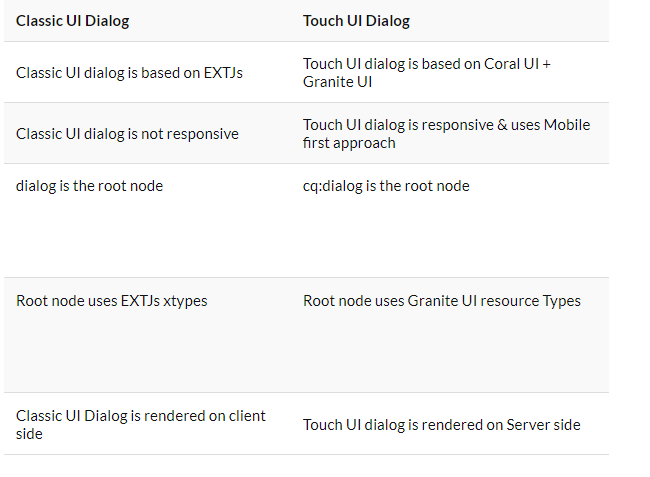
Touch UI Component Using Coral UI
Touch-optimized UI is designed by Adobe to provide consistent user experience across multiple platforms, like mobile, tablet, and desktop. It is based on:
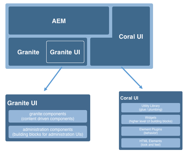
Touch-optimized UI is designed by Adobe to provide consistent user experience across multiple platforms, like mobile, tablet, and desktop. It is based on:
- Coral UI (CUI) an implementation of Adobe’s visual style for the touch-enabled UI. Coral UI provides everything your product/project/web application needs to adopt the UI visual style.
- Granite UI components are built with Coral UI.
- Granite: Granite is basically a collection of several open-source projects like Apache Sling, Felix, Jackrabbit, and Lucene.
- Granite UI: Granite UI is a foundation UI framework provided by adobe to develop modular, layerable, and reusable components. It consists of two parts client-side and server-side and achieved through a REST call.
- Coral UI: It is a set of CSS and JS files designed and built for Adobe Cloud products. Coral UI provides a wide range of html components pre-developed for your website like buttons, navigation bar, toolbar, tables, grid, dialogs, etc. and save you time from developing these components. So that you can focus more on your product.
Advantages of Coral UI
There are various advantages of using coral ui over create our own css and js files for ui customization.
There are various advantages of using coral ui over create our own css and js files for ui customization.
- Icons: Coral UI provides a wide range of icons to choose from and is fully customizable according to customer needs. It provides around 400+ icons to choose from.
- Open Development: It is an open development project that means it allows everyone inside adobe to contribute.
- XD Approved: All the designs and components are XD approved.
Granite UI Foundation Components
The Granite UI foundation components provide the basic building blocks needed for building any UI. They include, amongst others:
/libs/granite/ui/components/foundation
This library contains a Granite UI component for each Coral element. A component is content-driven, with its configuration residing in the repository. This makes it possible to compose a Granite UI application without writing HTML markup by hand.
Purpose:
The Granite UI foundation components provide the basic building blocks needed for building any UI. They include, amongst others:
- Button
- Hyperlink
- User Avatar
/libs/granite/ui/components/foundation
This library contains a Granite UI component for each Coral element. A component is content-driven, with its configuration residing in the repository. This makes it possible to compose a Granite UI application without writing HTML markup by hand.
Purpose:
- Component model for HTML Elements
- Component composition
- Automatic unit and functionality testing
- Repository based composition and configuration
- Leveraging testing facilities provided by the Granite platform
- JSP templating
HTML Elements — The Markup Layer
The HTML elements provide a common look and feel for all base UI elements (including navigation bar, button, menu, rail, amongst others).
At the most basic level, an HTML element is an HTML tag with a dedicated class name. More complex elements can be composed of multiple tags, nested inside each other (in a specific manner).
The CSS is used to provide the actual look and feel. To make it possible to easily customize the look-and-feel (e.g. for the case of branding) actual style values are declared as variables that are expanded by the LESS pre-processor during runtime.
Purpose:
- Provide basic UI elements with a common look-and-feel
- Provide the default grid system
- HTML tags with styles inspired by bootstrap
- Classes are defined in LESS files
- Icons are defined as font sprites

No comments:
Post a Comment
If you have any doubts or questions, please let us know.