To solve this, you need to create solid documentation listing all relevant information including some background information on why the component was created, the configuration options, special behavior or potential limitations, as well as some technical details that are important for the development team if they want to make changes in the future.
Usually, as it becomes clear in the list above, component documentation benefits the development team just as much as the authoring team. It can help them to understand why the component was created in the first place and if a new component needs to be created or if an existing component should be updated when new requirements come in.
Component overview and detail pages in AEM
Starting from AEM 6.3, a component overview page and component detail pages are already available as part of the AEM installation. It contains some useful features like a list of component references in the content, something we had to build custom before.
The component overview can be found under Tools > General > Components.

Adding the documentation tab
By default, the documentation tab on the component detail page will not show. It becomes visible when we ship a README.md with the component. So all you need to do, is to add a README.md that includes the component documentation and AEM will do the rest.
The syntax used in this README.md somewhat resembles the standaard MD syntax without support for tables. As seen in the example below, tables can be built with HTML tags.
If additional styling is needed, you can create a clientlib with category ‘cq.sites.components’ that contains the CSS.
Component Structure in code with README file highlighted

Image Banner Component README example
Direct link from dialog to documentation
To improve usability, we want to create a link to the component documentation from the dialog somehow so an author can be taken straight to the documentation of that component when they need more information.
Again, AEM is already providing that option for us…
We can set the property “helpPath” with a link to the component detail page. This will result in the question mark icon in the component dialog that links directly to the documentation. Handy, right?
Component dialog.xml
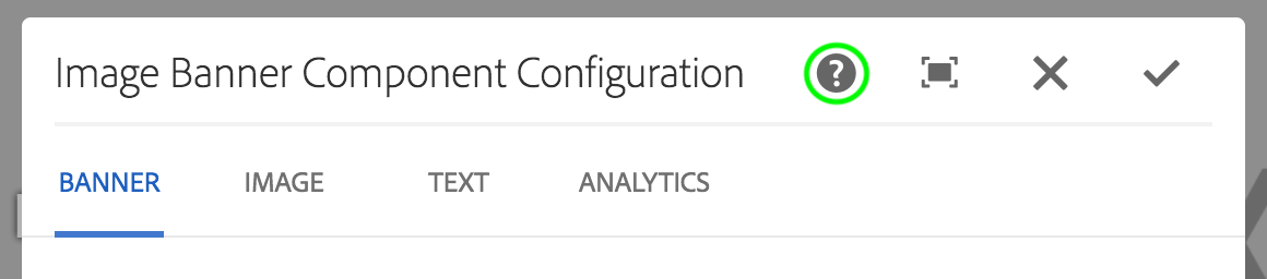
Component dialog with highlighted help icon
Conclusion
AEM comes with some out-of-the-box features to display component documentation. As a developer, you can create and maintain documentation that is versioned along with the rest of your code, making it clear when a component and its documentation was last updated.
As a content author, you can now easily access documentation without leaving AEM and even when navigation straight from the component dialog.
While the creation of documentation becomes a lot simpler in AEM, good component documentation is still defined by making sure it’s up-to-date, relevant for content authors, and well-structured.

No comments:
Post a Comment
If you have any doubts or questions, please let us know.