As I have mentioned previously, there are multiple types of components, and while most of what I write in this section is relevant to both content components and page components I will discuss page components in more depth later.
What makes up a component depends on how complex you want it to be
There are only 1 file that is mandatory for a component, and that is the .content.xml file
<?xml version="1.0"encoding="UTF-8"?>
<jcr:root xmlns:cq=http://www.day.com/jcr/cq/1.0" xmlns:jcr=http://www.jcp.org/jcr/1.0"
jcr:primaryType=
jcr:title="Link"
componentGroup="Sample Links"/>
jcr:primaryType=
jcr:title="Link"
componentGroup="Sample Links"/>
As you can see as per other .content.xml files, it defines it's primary type, in this case cq:Component and a title to display for it.
There are a few possible additional properties that you can add to the component
- componentGroup
- Defines the component group this component belongs to
- cq:isContainer
- Indicates if the component is a container component
- cq:htmlTag
- Defines what the html tag that the component will be wrapped in
- cq:noDecoration
- Defines if AEM should wrap the component with an html tag
- jcr:title
- The title of the component
- jcr:description
- The description of the component
- sling:resourceSuperType
- The component that this component extends
While there are a lot more properties available these are the main ones that get used. For more take a look at the Adobe Component documentation
Deploying a component as part of the codebase you will have the following structure
- _cq_dialog
- .content.xml
- clientlib
- css.txt
- css
- <css>
- js.txt
- js
- <js>
- _cq_editConfig.xml
- .content.xml
- <component>.html
Inheritance
Inheritance is a very powerful function for components and pages. It allows us to take a component that does most or more than what we want, and modify it to our needs
Component Inheritance
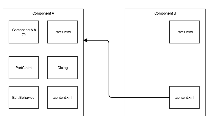
This example is pretty basic, but imagine that we have our component a, it is made up of 3 pieces of html (I will explain that later), a dialog, some edit behavior, and of course it's .content.xml.
We say I want a component that is nearly like it, however, the bit in PartB.html I want to change so it works differently, in this case, we create our new component b and instead of either copying the component code and changing the bit we want, we tell AEM via the .content.xml configuration sling:resourceSuperType that this inherits from component a using its the full path
sling:resourceSuperType="sample/components/content/componentA
You will notice we don't put apps/sample, while you can AEM understands that all components are under the apps folder so you don't have to reference it.
Once we have extended the component, all we have to do is write the pieces that we want to change. In this case we are only changed PartB.html, but we could if we wanted change the dialog, the edit behaviour, or any of the html files. This becomes a very powerful tool just like in the java code where you can extend classes to add functionality the same can be done with components.
Dialogs
While AEM currently supports both classic and touch ui dialogs, I am only going to talk about touch ui dialogs. The classic dialog was the original way of creating dialogs and we should avoid building them unless you really need to support both classing and touch ui functionality. The default when logging in to AEM is touch ui.
Dialogs are optional, and if you component is self controlled then it doesn't need one. A dialog is there so the editor can add additional items of data to the component. This could be editorial values or configuration on how the component will display
If the component has a cq:dialog node below it (_cq_dialog folder in code) then it supports a dialog.
The structure of a dialog is quite complex, for full documentation on the granite-ui components that make up a dialog go to the documentation
<?xml version="1.0" encoding="UTF-8"?>
<jcr:root xmlns:jcr="http://www.jcp.org/jcr/1.0" xmlns:nt="http://www.jcp.org/jcr/nt/1.0" xmlns:sling="http://sling.apache.org/jcr/sling/1.0" jcr:primaryType="nt:unstructured" sling:resourceType="cq/gui/components/authoring/dialog">
<jcr:root xmlns:jcr="http://www.jcp.org/jcr/1.0" xmlns:nt="http://www.jcp.org/jcr/nt/1.0" xmlns:sling="http://sling.apache.org/jcr/sling/1.0" jcr:primaryType="nt:unstructured" sling:resourceType="cq/gui/components/authoring/dialog">
<content jcr:primaryType="nt:unstructured" sling:resourceType="granite/ui/components/foundation/container">
</jcr:root>
<layout jcr:primaryType="nt:unstructured" sling:resourceType="granite/ui/components/foundation/layouts/tabs" type="nav" />
<items jcr:primaryType="nt:unstructured">
</content><items jcr:primaryType="nt:unstructured">
<basic jcr:primaryType="nt:unstructured" jcr:title="Basic Information" sling:resourceType="granite/ui/components/foundation/section">
<icon jcr:primaryType="nt:unstructured" jcr:title="Icon" sling:resourceType="granite/ui/components/foundation/section">
</items>
<layout jcr:primaryType="nt:unstructured" sling:resourceType="granite/ui/components/foundation/layouts/fixedcolumns" margin="{Boolean}false" />
<items jcr:primaryType="nt:unstructured">
</basic><items jcr:primaryType="nt:unstructured">
<column jcr:primaryType="nt:unstructured" sling:resourceType="granite/ui/components/foundation/container">
</items>
<items jcr:primaryType="nt:unstructured">
</column>
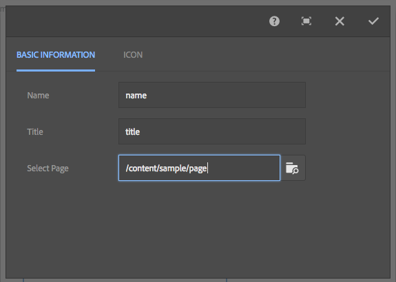
<name jcr:primaryType="nt:unstructured" sling:resourceType="granite/ui/components/foundation/form/textfield" required="{Boolean}true" fieldLabel="Name" name="./name" />
<title jcr:primaryType="nt:unstructured" sling:resourceType="granite/ui/components/foundation/form/textfield" required="{Boolean}true" fieldLabel="Title" name="./title" />
<pagePath jcr:primaryType="nt:unstructured" sling:resourceType="granite/ui/components/foundation/form/pathbrowser" fieldLabel="Select Page" name="./page" rootPath="/content/sample/folders" />
</items><title jcr:primaryType="nt:unstructured" sling:resourceType="granite/ui/components/foundation/form/textfield" required="{Boolean}true" fieldLabel="Title" name="./title" />
<pagePath jcr:primaryType="nt:unstructured" sling:resourceType="granite/ui/components/foundation/form/pathbrowser" fieldLabel="Select Page" name="./page" rootPath="/content/sample/folders" />
<icon jcr:primaryType="nt:unstructured" jcr:title="Icon" sling:resourceType="granite/ui/components/foundation/section">
<layout jcr:primaryType="nt:unstructured" sling:resourceType="granite/ui/components/foundation/layouts/fixedcolumns" margin="{Boolean}false" />
<items jcr:primaryType="nt:unstructured">
</icon><items jcr:primaryType="nt:unstructured">
<column jcr:primaryType="nt:unstructured" sling:resourceType="granite/ui/components/foundation/container">
</items>
<items jcr:primaryType="nt:unstructured">
</column>
<icon jcr:primaryType="nt:unstructured" sling:resourceType="granite/ui/components/foundation/form/fileupload" autoStart="{Boolean}false" fieldLabel="Icon" mimeTypes="[image]" multiple="{Boolean}false" name="./iconName" title="Icon" />
</items>
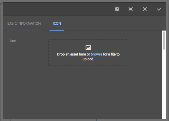
This creates a dialog with 2 tabs in it:
Dialogs
As you will see to get a nicely structured dialog you do tend to put a lot of structure in place. In our dialog the structure is
- Container
- There always has to be a base container, without it nothing will show
- We use the granite-ui component granite/ui/components/foundation/container
- Requires a layout
- To have the tabs we are using granite/ui/components/foundation/layouts/tabs but there are lots of other layouts, some of which we use later
- Requires a set of items to go in the container
- This is where you put your tabs. For this dialog we have 2 tabs basic and icon. I will talk more about the basic tab and just briefly mention the icon itself
- The base item we are using is a section (granite/ui/components/foundation/section), this is another form of container
- As you can see we are using a different layout for the section, for this we use the fixedcolumns layout (granite/ui/components/foundation/layouts/fixedcolumns)
- We have 3 components in the items list. I will explain a few of the more important ones that we can use, check the documentation for the others, and there are a lot. You can also write your own but i won't go into that
- textfield (granite/ui/components/foundation/form/textfield)
- Displays a text entry
- The only mandatory field is name
- Tells the dialog where to store the data
- Is a jcr location from the current component's location
- You can have settings outside of the component i.e ../name will store a name value in the node above the current component
- fieldLabel
- The text that appears before the entry
- fieldDescription
- A description that will appear when you click on the info button at the end of the item
- disabled
- Allows a field to start disabled and javascript can re-enable it
- required
- Makes the dialog not save if a value has not been entered
- autofocus
- Specifies that the item should be enabled when the dialog appears
- maxlength
- The maximum amount of characters allowed
- pathbrowser (granite/ui/components/foundation/form/pathbrowser)
- Displays a path or url editor
- The only mandatory field is name
- Tells the dialog where to store the data
- Is a jcr location from the current component's location
- You can have settings outside of the component i.e ../name will store a name value in the node above the current component
- fieldLabel
- The text that appears before the entry
- fieldDescription
- A description that will appear when you click on the info button at the end of the item
- disabled
- Allows a field to start disabled and javascript can re-enable it
- required
- Makes the dialog not save if a value has not been entered
- rootPath
- The base point that a page can be selected within AEM
- File Upload (granite/ui/components/foundation/form/fileupload)
- Displays a file
- The file can be uploaded or dragged from the dam
- The only mandatory field is name
- Tells the dialog where to store the data
- Is a jcr location from the current component's location
- You can have settings outside of the component i.e ../name will store a name value in the node above the current component
- fieldLabel
- The text that appears before the entry
- fieldDescription
- A description that will appear when you click on the info button at the end of the item
- sizeLimit
- The maximum size of the file
- mimeTypes
- The type of file to use
- Select (granite/ui/components/foundation/form/select)
- Select dropdown
- fieldLabel
- The text that appears before the entry
- fieldDescription
- A description that will appear when you click on the info button at the end of the item
- disabled
- Allows a field to start disabled and javascript can re-enable it
- required
- Makes the dialog not save if a value has not been entered
- multiple
- Makes the dropdown a multi select
- ordered
- Makes the items ordered
- dataSource
- A granite Data source with the following structure
- value
- The value to return
- disabled
- If the item is disabled
- text
- The text of the option
- value
- A granite Data source with the following structure
- items
- If not using a datasource you can add items in the same format as the data source
- Field Set (granite/ui/components/foundation/form/fieldset)
- Allows a grouping of multiple fields to be added as a group
- Fieldset is a container so has a layout and a set of items
- The Fieldset is usually used with a multi field
- Multi field (granite/ui/components/foundation/form/multifield)
- Allows you to add multiple entries of the group of fields below it.
- Requires an unusual structure to work
- fieldset
- layout
- items
- column
- items
- multifield
- fieldset
- layout
- items
- container
- items
- fields
- items
- container
- fieldset
- multifield
- items
- column
- While this isn't documented in many places without putting a multifield inside a fieldset I couldn't get it to work properly.
For more information on the values possible in a dialog go to the granite documentation
Edit Behaviour
While most applications won't use the edit behaviour, it is quite handy if you want to make the AEM editing structure a bit nicer.
The default icons available when clicking on a component depends on the state of the component, but will generally be similar to this
Edit Icons
In code this would controlled by the file _cq_editConfig.xml in the component. If this file doesn't exist then AEM will apply the default behaviour to your component
<?xml version="1.0" encoding="UTF-8"?>
<jcr:root xmlns:jcr="http://www.jcp.org/jcr/1.0" xmlns:cq="http://www.day.com/jcr/cq/1.0" xmlns:sling="http://sling.apache.org/jcr/sling/1.0" cq:actions="[text:My Component,EDIT,DELETE,COPYMOVE]" jcr:primaryType="cq:EditConfig" cq:disableTargeting="{Boolean}true">
<jcr:root xmlns:jcr="http://www.jcp.org/jcr/1.0" xmlns:cq="http://www.day.com/jcr/cq/1.0" xmlns:sling="http://sling.apache.org/jcr/sling/1.0" cq:actions="[text:My Component,EDIT,DELETE,COPYMOVE]" jcr:primaryType="cq:EditConfig" cq:disableTargeting="{Boolean}true">
<cq:dropTargets jcr:primaryType="nt:unstructured">
<cq:listeners jcr:primaryType="cq:EditListenersConfig" afterinsert="function(path, definition) { CQWidgets.refreshParent(this); }" afteredit="function(path, definition) { CQWidgets.refreshParent(this); }" />
</jcr:root>
<video jcr:primaryType="cq:DropTargetConfig" propertyName="./asset">
</cq:dropTargets>
<parameters jcr:primaryType="nt:unstructured" sling:resourceType="foundation/components/video" />
</video><cq:listeners jcr:primaryType="cq:EditListenersConfig" afterinsert="function(path, definition) { CQWidgets.refreshParent(this); }" afteredit="function(path, definition) { CQWidgets.refreshParent(this); }" />
The following properties define how the dialogs work
- cq:actions
- The actions that can be taken on your component and the order they will appear
- An array of options
- defaults to edit,delete,insert,copymove
- Adding text: will display a piece of text at that position, but will have no action
- - adds a spacer in the toolbar
- edit
- Adds an edit button
- delete
- Adds a delete button
- insert
- Adds an insert button to add a component before this one
- copymove
- Adds a button to copy and cut the component
- cq:emptyText
- Defines text that is displayed when no visual content is present
- cq:inherit
- A true false flag to specify if missing values are inherited from the component that it inherits from
As well as this there are a set of additional sub tasks that can be added
cq:dropTargets
Defines points that an asset can be dropped onto the component without going into the dialog.
Only a single drop target can be defined in touch UI even though you can define multiple image types in the dialog.
cq:actionConfigs
Action configs allow you to add new items into the menu
<cq:actionConfigs jcr:primaryType= "nt:unstructured" >
<manage jcr:primaryType= "nt:unstructured"
</cq:actionConfigs>
handler="function(editable){$.ajax({
text= "Edit" />
<stuff jcr:primaryType= "nt:unstructured"
type: 'GET' ,
url: '/bin/sample/security.json?path=' +editable.path,
success: function(msg){
});}"url: '/bin/sample/security.json?path=' +editable.path,
success: function(msg){
if (msg.status == 'OK' ) {
}
ns.DialogFrame.openDialog( new ns.edit.Dialog(editable));
} else {
alert( 'You do not have the required access to edit' );
}text= "Edit" />
handler= "function(){alert('you pressed stuff');}"
text= "Stuff" />
text= "Stuff" />
As you can see in the above example, you can add one or more additional commands.
There are only 2 properties that are important
- text
- What is displayed in the menu bar
- handler
- The javascript that is run when the button is pressed
- As you have access to jquery in AEM you can use any jquery libraries as long as they are loaded as part of the page
- You also have access to the AEM ns library which controls most of AEM's controls and dialogs
- The parameters is an object representing the component itself
cq:formParameters
Defines additional parameters that are added to the dialog form.
While this is available, I wouldn't recommend using it, instead define your dialog with all the required fields
cq:listeners
Defines what happens before or after an action occurs on the dialog
Listeners can be defined as either a javascript function taking 2 parameters or one of the templated responses
- REFRESH_PAGE
- Refreshes the entire page
- REFRESH_SELF
- Refreshes the component only
The possible values for the listeners are
- beforedelete
- Before the component is deleted
- beforeedit
- Before the component is edited
- beforecopy
- Before the component is copied
- beforemove
- Before the component is moved
- beforeinsert
- Before the component is inserted into the page
- beforechildinsert
- Before the component is inserted into another component
- afterdelete
- After the component has been deleted
- afteredit
- After the component has been edited
- aftercopy
- After the component has been copied
- afterinsert
- After the component has been inserted
- aftermove
- After the component has been moved
- afterchildinsert
- After the component has been inserted into a child component
Clientlibs
Client libs as I have mentioned before are pieces of javascript and css that are relevant to the component. For components, they should be put in the folder clientlib
By defining a category for the client lib you can either add it directly into the page/component with
<sly data-sly-use.clientlib="/libs/granite/sightly/templates/clientlib.html" data-sly-call="${clientlib.all @ categories='clientlib1,clientlib2'}"/>
specifying the categories that you want, or as mentioned in the ui.apps page, you should use the designs client libs as by default a components clientLib will come from the /apps folder which would be excluded by sling mappings or dispatcher rules.
If all of your components use the same category then they will all be pulled into the clientLib at the same time, however, is this really what you want? For common components yes that might well be what you are after, however for components that are built for specific page types then you would want to give them a category that is only used on the page type that is appropriate.
HTML
While AEM does support building components in jsp, this should be avoided and you should use sightly instead.
The main html file for the component has to be the same name as the component. If this file doesn't exist AEM will use the superResourceType as the base html and will use any html files in the component to override the same-named files in the parent component.
To allow for inheritance your code should be structured where ever you think a piece might be overwritten you can put that in a separate html file
<sly data-sly-include="partials/partB.html" data-sly-unwrap/>
I do tend to put partial code in a partials folder, and then if it is split even more subfolders for each section
This will allow you to create a new component that extends this one, but only overwrite the partB.html file with new logic

No comments:
Post a Comment
If you have any doubts or questions, please let us know.