Here’s a simple example to show how it works. Authors use images for different use cases like:
- Adding a hero image to make a great landing page
- Using an image as a card to link to another experience
- Identifying individual is an avatar or other user-generated images
- Representing an event with a snapshot
- Illustrating product functionality with product images
 One image component showing multiple visual variations
All these images have different visual requirements and, as a developer, if you are not using the AEM style system you may end up creating separate, duplicate components or doing lots of backend development for each requirement.
Now let’s see how we can create just one image component to use in different scenarios.
Personas
The following user types would benefit from and interact with the image component in different ways.
The following user types would benefit from and interact with the image component in different ways.
- Developer: Creating a component and adding CSS or LESS code
- Template author: Configuring component to allow visual variations to be used by authors
- Author: Using component and available visual variations.
Requirements
- AEM 6.4 or AEM 6.3 with Service Pack 2
- Core Components v2 (Core components v2 are enabled with style tab in design dialog by default. If you are creating your component from scratch, you will need to create style tab in the design dialog.)
Steps: Developer
In this demo, we will be using we.retail sample site and adding styles to the image component.
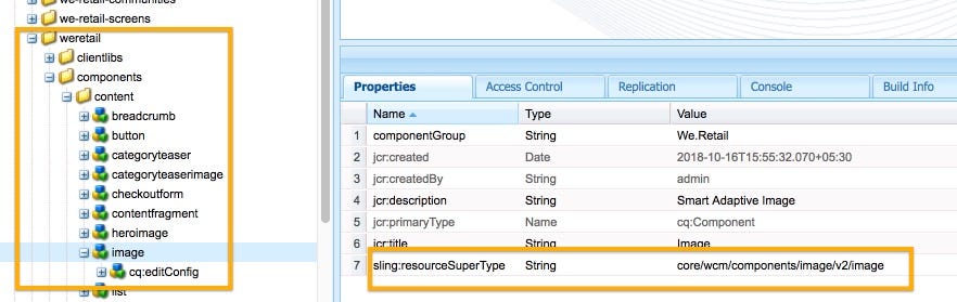
Go to /apps/weretail/components/content/image. This component is a proxy component of /apps/core/wcm/components/image/v2/image.
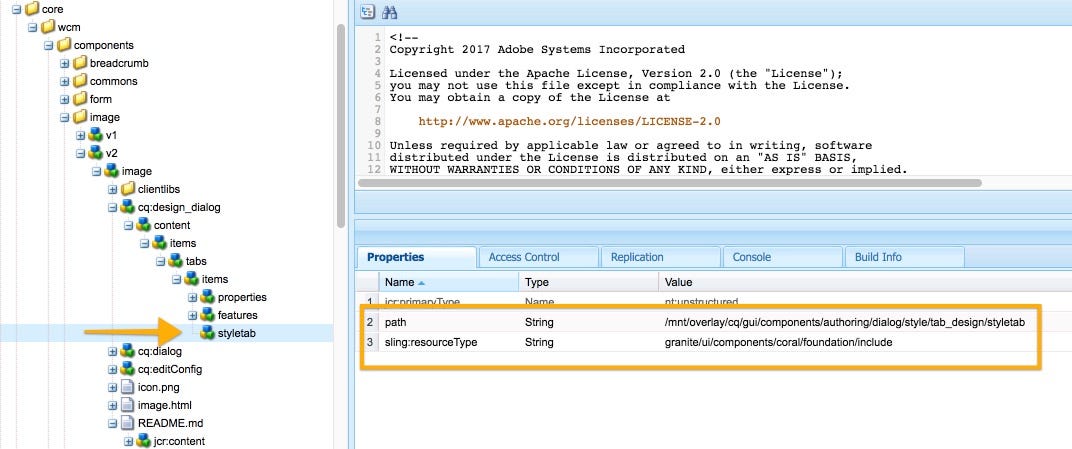
2. Here let’s review the image core component as well. The design dialog of this component contains a style tab. If you are creating a new component from scratch you can copy this style tab and add it to your own design dialog.
3. Go to /apps/weretail/components/content/image and create a client library to contain CSS of all required visual variations.
4. Now we need to add CSS code as per our style requirements. The following is the syntax for creating the css/less file.
The syntax for Style System
4.1 Copy the following code and paste it in the image.less file in the client library folder.
Note: For the sake of simplicity, we have used CSS in this demo. You can use LESS as well.
Steps: Template author
The style defined by the developer is not available to the author directly. The template author needs to add style class names to the policy of the component.
 Style Icon ( Paint Brush )
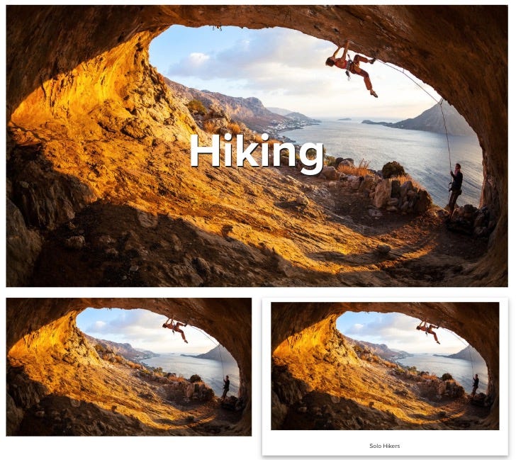
4. Now you can toggle your image to be a hero image, a simple card, or a Polaroid image. You can also show or hide the text.
 Images with different layouts
In this demo, we will be using we.retail sample site and adding styles to the image component.
Go to /apps/weretail/components/content/image. This component is a proxy component of /apps/core/wcm/components/image/v2/image.
2. Here let’s review the image core component as well. The design dialog of this component contains a style tab. If you are creating a new component from scratch you can copy this style tab and add it to your own design dialog.
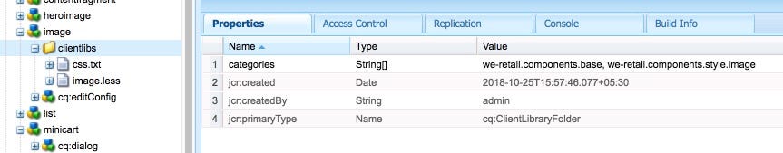
3. Go to /apps/weretail/components/content/image and create a client library to contain CSS of all required visual variations.
- 3.1. Create node of Type cq:clientLibraryFolder , Name clientlibs
- 3.2. Add property
- categories | String [] | we.retail.components.base, we-retail.components.style.image
- 3.3 Create two files, css.txt and image.less
- 3.4 Open css.txt in CRXDe and add image.less as code. Save All.
4. Now we need to add CSS code as per our style requirements. The following is the syntax for creating the css/less file.
The syntax for Style System
4.1 Copy the following code and paste it in the image.less file in the client library folder.
Note: For the sake of simplicity, we have used CSS in this demo. You can use LESS as well.
Steps: Template author
The style defined by the developer is not available to the author directly. The template author needs to add style class names to the policy of the component.
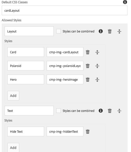
- Go to AEM > Tools > General > Templates > We.Retail
- Edit Content Page template.
- Select the policy icon of the image component > Select Styles tab in Properties section.
- In the Default CSS Classes text field, provide the default style class name without the dot (e.g., cardLayout)
- Click the Add button to create two groups: Layout and Text
- In the Layout group, add three styles and provide the class name
- In the Text group, add one style and provide a class name.
Steps: Author
- Create a page using the Content Page template in We.Retail Site.
- Add a few image components to the page. Add images and edit captions by configuring the component.
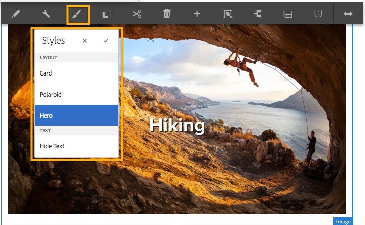
- Select the image component. Now you should see a paint brush icon that lists all the styles.
Style Icon ( Paint Brush )4. Now you can toggle your image to be a hero image, a simple card, or a Polaroid image. You can also show or hide the text.
Images with different layouts
Conclusion
The AEM style system, when used in conjunction with the core components, the template editor, and the responsive layout, offers powerful capabilities to very flexibly compose rich experiences.
The AEM style system, when used in conjunction with the core components, the template editor, and the responsive layout, offers powerful capabilities to very flexibly compose rich experiences.

No comments:
Post a Comment
If you have any doubts or questions, please let us know.