This is a brief overview of the Web Accessibility features for websites developed with Adobe Experience Manager. The most commonly faced accessibility issues on AEM developed websites are discussed herein, along with several examples of the best approaches you should take to resolve these issues.
Why Accessibility is important for your site?
Developers tend to assume that websites are accessible by everyone who can see and use the pointer interface (for example, mouse pointer on the screen and touchscreen experience); however, users with any disabilities may find a website difficult to navigate. The goal of a website developer is to make this less challenging of an experience for the normal, everyday user. Websites should be user specific when user experience is taken into consideration and must accommodate individuals with impairments, whether they be situational, temporary or permanent. Therefore, developers must be very specific when writing the website code to achieve accessibility standards.
How to find Accessibility recommendations and implement in AEM?
Web accessibility evaluation requires a combination of semi-automated evaluation tools and manual evaluation.
Your website can be tested for web accessibility with one of the following tools:
- WAVE Evaluation Tool Please click on WAVE tool plugin to download this plugin on Google Chrome. To test your websites with the WAVE tool on browsers other than Google Chrome, please click here and follow the instructions.
- NVDA Screen Reader (NonVisual Desktop Access) Please click here to download this software.
We use WAVE software to test the accessibility errors on AEM sites. WAVE is an open source web accessibility evaluation tool available as a plugin download only for Google Chrome. Once we enable this tool on any published site, we can observe/view the red tags on the site. These tags describe the type of accessibility error which has occurred. The following examples address some of the commonly occurring web-accessibility issues that users may experience. Their respective solutions are followed by the issue explanation.
How to use WAVE tool on your AEM website?
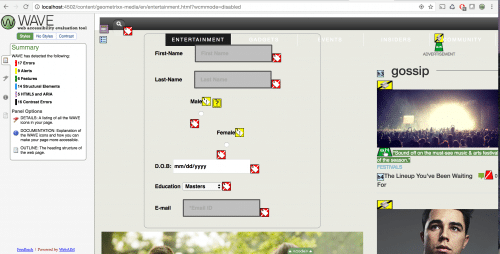
A simple form component is included on the geometrixx-media website and WAVE is activated on the published page. It is important that you remember to switch to Preview Mode to enable WAVE to test on author instance.
Once the WAVE tool is enabled, it addresses the accessibility errors on the page.

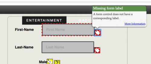
For example, in this case, the error was as follows:

This diagram shows the approach of WAVE in addressing the errors on the page.
WAVE not only displays the web accessibility errors but also suggests solutions to solve them. However, most of the suggestions are vague and may not guide the developer into attaining an immediate solution. Therefore, the following explanation has been provided, in brief, to overcome accessibility issues and gives you an idea of the methods you must implement to approach these errors.
Click on the “i” icon to view the information related to the errors.

EXAMPLES OF THE FEW MOST COMMON ACCESSIBILITY ISSUES:
A form control does not have a corresponding label: The solution for this error requires the label attribute to the form element. Label attributes identify all form controls like text fields, radio buttons, checkboxes and drop-down menus.
Approach:
Once the WAVE tool is enabled, it addresses the accessibility errors on the page.

For example, in this case, the error was as follows:

This diagram shows the approach of WAVE in addressing the errors on the page.
WAVE not only displays the web accessibility errors but also suggests solutions to solve them. However, most of the suggestions are vague and may not guide the developer into attaining an immediate solution. Therefore, the following explanation has been provided, in brief, to overcome accessibility issues and gives you an idea of the methods you must implement to approach these errors.
Click on the “i” icon to view the information related to the errors.

EXAMPLES OF THE FEW MOST COMMON ACCESSIBILITY ISSUES:
A form control does not have a corresponding label: The solution for this error requires the label attribute to the form element. Label attributes identify all form controls like text fields, radio buttons, checkboxes and drop-down menus.
Approach:
<label> tag can be included to identify the form controls as follows:
A) Using label
<form>
A) Using label
<form>
<label for= “my-name”> Name: </label>
<input type=”text” id=”my-name”>
</form>
“for” should be addressing the ID used for the referral tag.
B) Hiding the label element
When the label should not be displayed on the page, CSS/WAI-ARIA attributes can be used to resolve this issue.
<form>
B) Hiding the label element
When the label should not be displayed on the page, CSS/WAI-ARIA attributes can be used to resolve this issue.
<form>
<label for= “my-name” class=”hide-label”> Name: </label>
<input type=”text” id=”my-name”>
</form>
Although the styles for the class can be configured as per the requirement, to hide the label it can simply be
.hide-label { display: none; }
C) Using aria-label attribute
This approach is very accessible by screen readers. However, aria-label does not convey the information to the visual users like the title attribute option.
Code:
<form>
<input type = ”submit” id=”my-name” aria-label=”submit button”>
</form>
Input field is missing a description: Every input field requires a description so that any area on the page is accessible for visually impaired website visitors. Approach:
A) Using title attribute
Using a title attribute can visually display the description of the field when the element is hovered over by the mouse pointer.
Example code:
<input title=”Please enter your first name ” type=”text” name=”first-name”>
NOTE:
This approach is generally less reliable to be used as a label (previous example) because some of the screen reader’s assistive technologies do not interpret the title attribute as a replacement for the label element as title attribute frequently used to provide information of the field. Therefore, this method is not recommended to resolve label accessibility error.
B) Using aria-label / aria-labeled by
Aria-label attribute can also be used to provide the description of a field. This can be done when the description is not needed to be displayed for the screen readers but still serves the purpose.
Example code:
<input type=”submit” id=”submit-button” aria-label=”submit-button”>
(Or)
aria-labelled by can address the Id of the group to describe the purpose of the field.
<div id=”test”>Testing Accessibility</div>
<div> <div id=”One”>One </div>
<input type=”text” aria-labelledby=”test”/>
</div>
CLICK ON ARIA ATTRIBUTES TO UNDERSTAND MORE . Missing Button in form: Every form requires a submit button, which is a very important element of the form. The following approach can be implemented for form buttons to be accessible:
Approach:
A) Add correct type in the input field
Example code:
<form>
<input title=”search” type=”submit”>Search</input>
</form>
“type” attribute should be set to “submit” to enable the screen readers to understand the
B) Using role and wai-aria attributes
Example code:
<form>
B) Using role and wai-aria attributes
Example code:
<form>
<input role=”button” type=”submit” aria-pressed=”false”></input>
</form>
WAI-ARIA role for the drop down button in a form The correct Aria-role attributes should be used for the form fields. The drop down functionality roles may vary depending on its purpose. The following example is the role that should be used for a form element <select> which displays all the countries in the list.
WAI-ARIA role for the drop down button in a form The correct Aria-role attributes should be used for the form fields. The drop down functionality roles may vary depending on its purpose. The following example is the role that should be used for a form element <select> which displays all the countries in the list.
Example Code:
<select role=”listbox” name=”state”>
<select role=”listbox” name=”state”>
<option></option>
<option></option
…..
…..
</select>
CLICK HERE TO GET MORE INFORMATION ON ROLES. Image missing alternative text Image link requires an alternative text describing the purpose of the link. Every image that is used in the page should be presented with an alternative text because the users will understand the purpose of the image with or without the image being displayed on the page.
Adding the alternative text in the image link that states the topic of the page can resolve this issue.
Approach:
Example code:
<a href=”/home/personal/mobile-app.html” class=””>
<img src=”/content/dam/geometrixx-media/sample.png” class=”” alt=”Sample image for the accessibility test”>
</a>
The above description of the image within the alternative image attribute (alt) should be meaningful and precise to the images used within the respective tags. Avoid using <bold> tags The ‘bold’ tag is used to highlight text.
The above description of the image within the alternative image attribute (alt) should be meaningful and precise to the images used within the respective tags. Avoid using <bold> tags The ‘bold’ tag is used to highlight text.
Consider the following:
The text should be emphasised semantically, use the ‘strong’ tag instead.
If the text is a heading, an ‘H’ tag (such as H1, H2, H3…) should be used instead.
If the text is highlighted as a visual effect, CSS should be used to do this.
The text should be emphasised semantically, use the ‘strong’ tag instead.
If the text is a heading, an ‘H’ tag (such as H1, H2, H3…) should be used instead.
If the text is highlighted as a visual effect, CSS should be used to do this.
Approach:
A) Using Strong tags:
<strong> This is a way to avoid using bold tags </strong>
B) Using appropriate styles:
<p style=”font-weight: bold”> This is another way of avoiding the bold text</> Avoid using <font> tags The font tags should be avoided to style the text on the page. Many authors tend to use font tags to configure the content on the page through dialog box; this approach will be the root cause of inaccessibility of content on the page for a visually impaired visitor.
Approach: Example code:
<font color=”#fff”>This is an example</font>
The above content should be replaced with the appropriate tags and the styles should be given separately as follows.
A) Using Appropriate tags with styles:
<p style=”color: #fff”> This is another way of avoiding the bold text</p>
<font color=”#fff”>This is an example</font>
The above content should be replaced with the appropriate tags and the styles should be given separately as follows.
A) Using Appropriate tags with styles:
<p style=”color: #fff”> This is another way of avoiding the bold text</p>
Presentational Attributes used error:
In the event that presentational attributes such as ‘border’, ‘align’, or ‘bgcolor’ are used then CSS should be used for styling instead.
It is important to review these issues and determine if they can be fixed by moving the presentational attributes to your CSS. Furthermore, it is not always practical to make these changes; however, they should be made whenever possible and considered a best practice.
Approach: Inline styles can be included for fixing this issue when the issue has occurred because of the dialog box content configuration.
Example code:
<iframe style=”height: 200px; width: 200px; border: 0px”>”this is an iframe”</iframe>
Conclusion:
Example code:
<iframe style=”height: 200px; width: 200px; border: 0px”>”this is an iframe”</iframe>
Conclusion:
As clients focus more on making websites accessible for everyone, many of you will start working on accessibility issues sooner than later. I hope this blog helps you “jump start” the process of finding and implementing accessibility items for websites.
No comments:
Post a Comment
If you have any doubts or questions, please let us know.