
Image shamelessly was stolen from https://www.umaryland.edu/web-accessibility/
Who is Accessibility for?
Accessibility can mean many different things. In general, when we talk about web accessibility, we are referring to users with a physical, visual, or auditory disability, but accessibility can span many more things. Each type of disability has a huge spectrum on how it impacts users, for example, a person with significant vision impairment might expect to be able to easily scale up the font size, and so would a person who misplaced their glasses that morning.
Why Does Accessibility Matter?
Web accessibility is important because all users expect great experiences on the web. It is important to create inclusive experiences so that our websites are usable by everyone. Following accessibility best practices also can have a significant impact on the user experience for all users.
For example:
Lastly, accessibility is becoming more and more important for SEO crawlers.
So, what can you do as a front end developer to keep your site accessible?
At the bare minimum:
With that said, here’s a list of very specific accessibility features that I think all front end developers should know. If you follow these guidelines, it will not make your website fully WCAG accessible, but it will make a huge difference. These are all techniques I have learned on the job working through accessibility problems.
Semantic HTML
Don’t use divs to build all of your layouts, instead consider using semantic html. Some of the big ones are: nav to build your navigation, use the footer to build your footer, use section to wrap blocks on content, and use articles to wrap articles.
Fonts
Don’t use tiny fonts! In general, the smallest font size you should be using is 12px, but strive for keeping the majority of content at 16px.
Don’t use px to define your font sizes! Instead, define your font sizes using rem units. In general, you can think of 1rem = 16px.
Rem units allow users to resize font sizes using their device and/or browser. Fonts defined using pixel values will only resize if a user explicitly zooms in or out of a page.
Focus
Ensure focus states can clearly be seen. In general, focus states will work unless you intentionally break them. Never remove outlines without creating your own focus indicators (I will probably block your PR if I an outline: 0).
Generally, it’s recommended to keep the default focus states, so that users who depend on them will have a consistent experience across different sites. Links, buttons, inputs, and all other interactive elements should have clear focus states.
Color Contrast
Ensure all content meets WCAG 2 color contrast. This is a simple tool from WebAIM for checking colors. Having accessible colors generally starts with having accessible branding guidelines, so make sure your design and branding teams are on board.
Buttons
- Accommodating users with a physical impairment who cannot use a mouse will also benefit a user whose mouse batteries just died
- Using proper contrast ratios will make your site more readable by everyone
- Building accessible forms are important for users with screens readers and will also make them work better with browser autofill
- When was the last time you tried using your website on a smart TV or game console? These are extreme examples, but users will use a wide range of devices, from small phones, tablets, to massive ultra-wide displays.
Lastly, accessibility is becoming more and more important for SEO crawlers.
So, what can you do as a front end developer to keep your site accessible?
At the bare minimum:
- Use semantic html, and use it properly
- Use chrome’s built-in accessibility tools
- Install the axe chrome extension
- Run Lighthouse audits for accessibility on code changes.
With that said, here’s a list of very specific accessibility features that I think all front end developers should know. If you follow these guidelines, it will not make your website fully WCAG accessible, but it will make a huge difference. These are all techniques I have learned on the job working through accessibility problems.
Semantic HTML
Don’t use divs to build all of your layouts, instead consider using semantic html. Some of the big ones are: nav to build your navigation, use the footer to build your footer, use section to wrap blocks on content, and use articles to wrap articles.
Fonts
Don’t use tiny fonts! In general, the smallest font size you should be using is 12px, but strive for keeping the majority of content at 16px.
Don’t use px to define your font sizes! Instead, define your font sizes using rem units. In general, you can think of 1rem = 16px.
Rem units allow users to resize font sizes using their device and/or browser. Fonts defined using pixel values will only resize if a user explicitly zooms in or out of a page.
Focus
Ensure focus states can clearly be seen. In general, focus states will work unless you intentionally break them. Never remove outlines without creating your own focus indicators (I will probably block your PR if I an outline: 0).
Generally, it’s recommended to keep the default focus states, so that users who depend on them will have a consistent experience across different sites. Links, buttons, inputs, and all other interactive elements should have clear focus states.
Color Contrast
Ensure all content meets WCAG 2 color contrast. This is a simple tool from WebAIM for checking colors. Having accessible colors generally starts with having accessible branding guidelines, so make sure your design and branding teams are on board.
Buttons
- Do not use divs as buttons. Divs are not focusable and do not activate on key presses. If you absolutely have to use a div or other non-interactive element, be sure to add role="button", tabindex="0", and a keypress handler to trigger the same click functionality when the enter key is pressed.
- Do not use anchors as buttons. Links are not buttons, they are links.
- Aim for 40px by 40px tap targets, so that users will not accidentally mis-click neighboring elements.
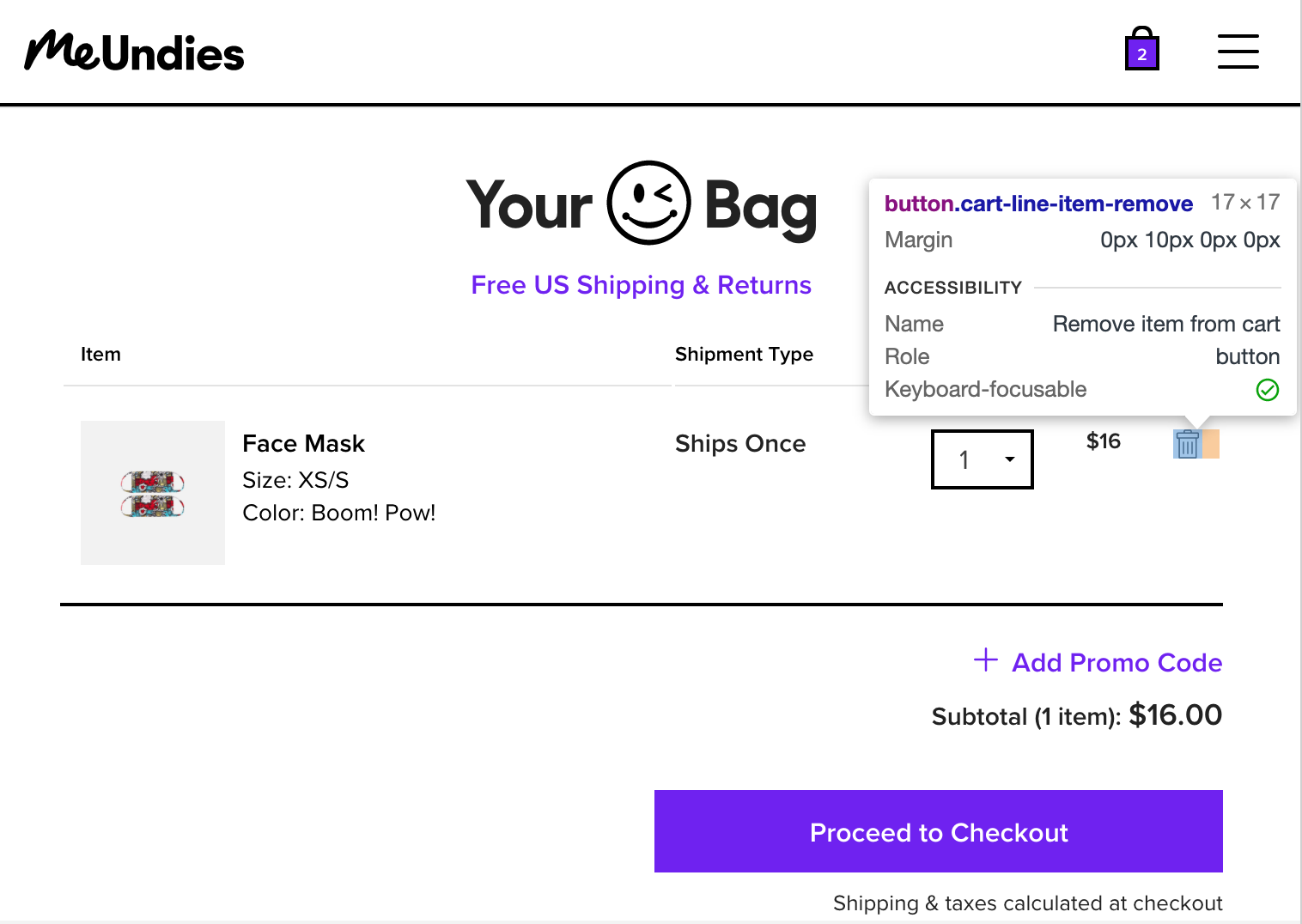
- Add aria labels to buttons without text. When buttons do not have text, briefly describe their action using an aria-label. For example, a button that looks like a trash can on a shopping cart page might look like this:<button aria-label="Remove item from cart" class="trash-icon" />
An example of accessible trash can button (although it would be nice if the tap target size was a little larger).
Links
Do not use links as buttons or buttons as links
Ensure all links have a valid href. If your link doesn’t have an `href`, ask yourself why you are using a link. Not including an href may also affect your SEO ranking.
Images and Pictures
Use alt text if the image conveys meaning. For most images, you should have descriptive alt text that states what the image shows. For infographics and charts, the alt text should describe the infographic or chart.
If an image is purely decorative, such as borders, dividers, and abstract shapes, use alt="" to convey that the image does not convey meaning.
Avoid using images with text. Instead, try to position text over images. This can be difficult and is not always possible, so be sure to include alt text for images with text.
Videos
Videos should have descriptive captions, however, I’ve never personally had to implement this. Godspeed trying to make accessible videos.
Lists
When creating lists in html, make sure that your ol and ul tags only haveli as their direct descendants.
Don’t add interactivity to li elements. Instead, place a button or an element inside the li.
Headings
Use headings in order without skipping levels — headings aren’t for styling, they are meant for creating an outline of your page.
Use an h1 at the top of your page, and use h2 through h6 in order to describe sections
Only use one h1 tag on a page
MDN has a very useful “usage notes” section on headings here
For an example on how to use skip links, refer WebAIMs page and example here
Modals
Modals are intrusive, are usually not accessible, and can be tricky to get right. At the minimum, modals should do the following:
Close when pressing escape.
The focus should be trapped within the modal. If a modal has 4 interactive elements, tab selecting should only cycle between all four elements.
*bonus* to be even more accessible, consider using role="alertdialog"and aria-modal="true".
Be sure to check out this great example from w3
If you are using React, consider using a react-modal or another library that handles accessibility out of the box.
Testing Accessibility
First, make sure that the features and flows you are building can be done fully without a mouse. Users should be able to use tab navigation to perform the same tasks, with clear focus states.
Second, periodically test your application using Chrome’s built-in vision deficiencies simulator. To view the page with simulated vision issues in Chrome:
Chrome Dev Tools -> kebab menu -> More Tools -> Rendering -> Emulate Vision Deficiencies
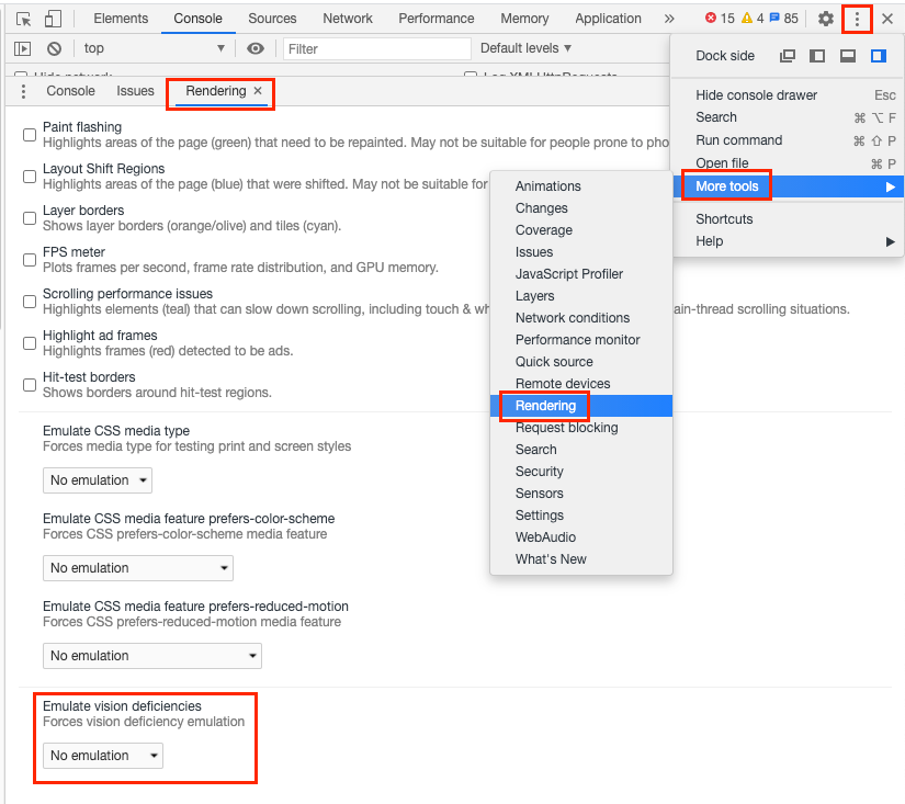
How to access the somewhat hidden vision deficiencies menu in Chrome dev tools.
Third, periodically test your application using a screen reader or other voice over software. If you are using a mac, you can use the built-in voiceover utility. There are also Chrome extensions, such as Chrome Vox, for adding voiceover support.
How do you make accessibility fun?
In the past, I’ve worked at places where non-developers were given specific tasks to do without a mouse or with their monitor turned off. In your next retro or demo, you can challenge a product manager to perform a feature end to end using a voiceover. This can be a fun way to bring accessibility to the front of everyone’s mind, and drive empathy for ensuring that accessibility is prioritized as part of the core user experience.
Dark Mode & Theming
Consider adding a dark/light mode. Modern browsers even have an API for detecting device preference. For even more control, there are tools like Accessible that allow users to “theme” pages, to address their own individual needs.
Skip Links
Skip links are rare but are a cool, useful feature that is not that hard to build.
Create invisible skip link components to skip large blocks of content, so that users can quickly navigate a page. Upon focus, the skip link becomes visible and allows a user to skip a block of content. Skip links are often used to skip long navigation links directly to the main content section.

No comments:
Post a Comment
If you have any doubts or questions, please let us know.