This blog covers :
HTML DOM Navigation and HTML element selector inside RTE Editor
Custom Style(Style Picker) Plugins
Color Picker Plugin
HTML DOM Elements Navigator extension:
- Shows selected/current HTML element's DOM structure in RTE
- Allows selecting an exact HTML element in RTE to apply settings using RTE plugins.
The Color Picker Plugin as the same as ColorPicker Plugin from http://experience-aem.blogspot.com but I modified it to work with all AEM version from 6.3+

Color Picker, Style Picker Plugins, and HTML DOM navigation

RTE Element Selection from DOM navigation

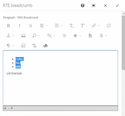
Applying class to ul element using Style Picker
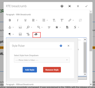
When the selected item already has existing styles, the style will be pre-selected in the dropdown, If another style is chosen, the new class will be added and the existing class will also remain, this will allow applying multiple styles to a single element.
In case of applying a different style or a single style to an element then an existing style should be chosen and removed using the Remove Style button.

Pre-selected style
Applying another style to list

Removing style from the list
If only a text is selected for applying the style using this custom style picker plugin, the style will be added to its parent's node. If you want to apply a style to text using a span tag, use the OOTB style plugin.

Style is added to P tag

OOTB style plugin, style added with a span tag
Note: If multiple HTML items are selected then the style will be applied to only one element.
Code
You can install the below packages from GitHub to use these plugins in AEM 6.3+
Packages contain:
Details
1. DOM Elements Navigation and Selector inside RTE Editor
In RTE, the element tree breadcrumb is created at the bottom section of RTE, which shows the DOM navigation and allows a user to select a particular HTML element in RTE by clicking on breadcrumb items.
RTE Navigation will only be shown for the RTE which has showBreadcrumb property with true.
ShowBreadcrumb property in RTE item node

RTE DOM Tree
Although navigation can be enable for all the RTEs by changing below line in /apps/commons/rte/rte-breadcrumb/js/rte-breadcrumb.js file
replace
$('.coral-RichText[data-showbreadcrumb="true"]').each(function() {
$(this).parent().find(".rte-sourceEditor").after(breadcrumbItem);
});
with
$('.coral-RichText').each(function() {
$(this).parent().find(".rte-sourceEditor").after(breadcrumbItem);
});
The DOM navigation extension is independent of the style plugin and can be used with other plugins as well to select, cut, copy, etc.
2. Custom Style Picker Plugins
StylePicker Plugin in RTE toolbar
After installing the package you can find the Style Picker Plugins files at:
Plugins JS and CSS at
/apps/commons/rte/plugins/clientlibs/js/style-picker.js
/apps/commons/rte/plugins/clientlibs/css/style-picker.css
Plugins popover dialogs
/apps/commons/rte/plugins/popovers/style-picker
Plugin Popover Dialog - dropdown option datasource and JSON at
/apps/commons/rte/plugins/popovers/style-picker/datasource
/apps/commons/rte/plugins/popovers/style-picker/options.json

Datasource is a JSP file which read json specified in options property and populates dropdown option for Style Picker plugin.
JSON file should have an array of elements in the below format:
If want to show as Heading/Category use the below format(value could be anything)
{"text": "Background Color","value": "BTC","heading": "true"}
If Option
{"text": "White","value": "white"}
Example: /apps/commons/rte/plugins/popovers/style-picker/options.json
[
{"text": "Background Color","value": "BTC","heading": "true"},
{"text": "White","value": "white"},
{"text": "Black","value": "black"},
{"text": "Green","value": "green"},
{"text": "Orange","value": "orange"},
{"text": "Light Grey","value": "lightgrey"},
{"text": "List Style","value": "LS","heading": "true"},
{"text": "Check","value": "list-checked"},
{"text": "Cross","value": "list-crossed"},
{"text": "Link Style","value": "LS","heading": "true"},
{"text": "Primary","value": "btn-primary"},
{"text": "Secondary","value": "btn-secondary"}
]

List Style and List Style are the Category and can't be selected
Plugin configuration in RTE
create 'styleformat' child node of rtePlugins node and create features property in it with * value as shown in below screenshot.

Add 'styleformat#styles' in the toolbar property on the inline node as shown in the below screenshot.

3. Color Picker Plugin

ColorPicker Plugin in RTE toolbar
After installing the package you can find the ColorPicker Plugins files at :
Plugins JS and CSS at
/apps/commons/rte/plugins/clientlibs/js/color-picker.js
/apps/commons/rte/plugins/clientlibs/css/color-picker.css
Plugins popover dialogs
/apps/commons/rte/plugins/popovers/color-picker
Plugin configuration in RTE
create 'colorformat' child node of rtePlugins node and create features property in it with * value as shown in below screenshot.
Add 'colorformat#colorPicker' in the toolbar property on the inline node as shown in the below screenshot.
Sample Components
Sample Test Component package contains a sample component (/apps/mfHTL63/components/content/simple-rte)
This component can be referred for ColorPicker and StylePicker Plugins configurations.
References
http://experience-aem.blogspot.com/2017/06/aem-63-touch-ui-rte-rich-text-editor-color-picker-plugin-inplace-dialog-edit.html

No comments:
Post a Comment
If you have any doubts or questions, please let us know.