The author environment allows you to perform the:
- Authoring (including page authoring, managing assets, communities)
- Administering tasks you need when generating and maintaining the content on your website
Two graphical user interfaces are provided to achieve this, these are accessible through any modern browser:
- Touch-Optimized UI
- The newer UI.
- Designed for use on both touch and desktop devices (optimized for touch).
- Predominantly grey.
- Classic UI
- This UI has been available from the start (of CQ5).
- Designed for use on desktop devices.
- Predominantly green.
Navigating and Managing your Site
MANAGING YOUR SITE – TOUCH-OPTIMIZED UI
The Sites console of the touch-optimized UI allows you to navigate and manage your website, using the header bar, navigation rail, toolbar, action icons (applicable for the selected resource) and when selected, secondary rails (for example, references, timeline, and search).
For example, card view with the references rail:

MANAGING YOUR SITE – CLASSIC UI
The Websites console of the classic UI also allows you to manage and navigate your website; using the two panes the structure of your website can be expanded and actions taken on the required element:

Editing your Page Content
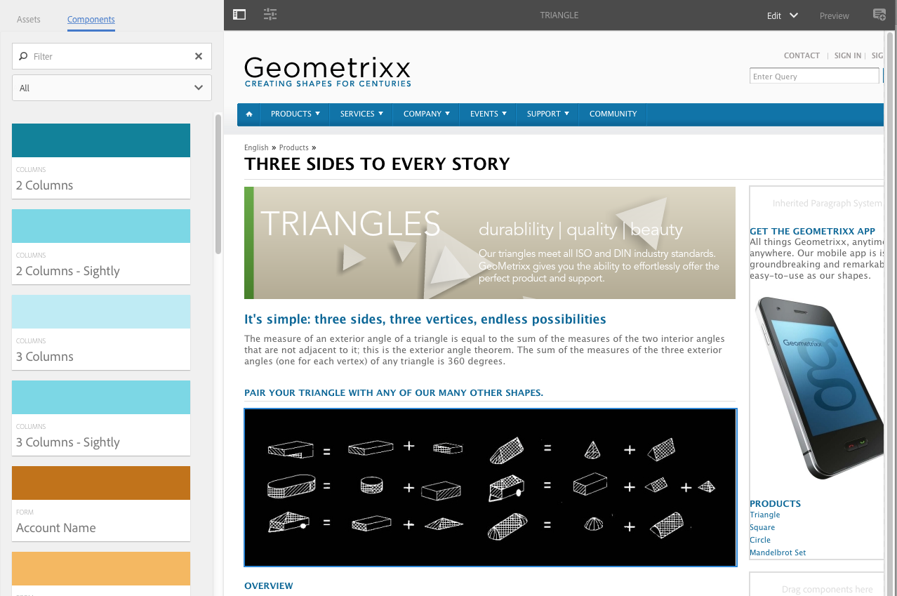
EDITING PAGE CONTENT – TOUCH-OPTIMIZE
You can edit a page with the touch-optimized UI page editor; for example:
http://localhost:4502/editor.html/content/geometrixx/en/products/triangle.html
http://localhost:4502/editor.html/content/geometrixx/en/products/triangle.html
NOTE: The first time you open a page for editing with the touch-optimized UI, a series of slides will provide you with a tour of the features.
You can skip the tour if wanted and repeat it at any time by selecting from the Page Information menu.
EDITING YOUR PAGE CONTENT – CLASSIC UI
There is a separate page editor with the classic UI, using the content finder and the sidekick:
http://localhost:4502/cf#/content/geometrixx/en/products/triangle.html
http://localhost:4502/cf#/content/geometrixx/en/products/triangle.html

Accessing Help
Various Help resources can be directly accessed from within AEM:
- Touch-optimized UIWhen editing a page, Help can be accessed from:
- the Page Information selector; this will show the introductory slides (as shown the first time you access the editor).
- the configuration dialog for specific components (using the ? icon in the dialog toolbar); this will show context-sensitive help.
- The Classic UIAs well as accessing help from the console toolbars, you can also access the help from the sidekick (using the ? icon) when editing a page:Or by using the Help button in the edit dialog of specific components; this will show context-sensitive help.
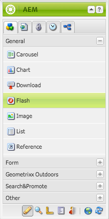
COMPONENTS BROWSER – TOUCH-OPTIMIZED UI
The components browser shows all components that are available for use on your current page. These can be dragged to the appropriate location, then edited to add your content.
The components browser is a tab within the side panel (together with the assets browser). To open (or close) the side panel use the icon at the top left of the toolbar:
When you open the side panel it will slide open (from the left side). Select the Components tab if necessary, when open you can browse through all the components available for your page.
Component groups are indicated by text and color; General is always shown in tones of green, other groups are assigned a random color (up to a maximum of ten colors, with more than ten groups the colors are reused).
From the top toolbar in the Components browser you can:
- filter components by name
- limit the display to a specific group using the drop-down selection
The actual appearance and handling are dependent on the device type you are using:
NOTE
A mobile device is detected when the width is less than 1024px; i.e. also on a small desktop window.
- Mobile device; for example iPadThe component browser completely covers the page being edited.To add a component to your page touch-and-hold the required component and move it towards the right – the component browser will close to show the page again – where you can position the component.

- Desktop deviceThe component browser is opened on the left side of the window.To add a component to your page click on the required component and drag it to the required location.

SIDEKICK – CLASSIC UI
The Components tab of the sidekick allows you to browse the components available to be added to the current page. The required group can be expanded, then a component dragged to the required location on the page.
ASSETS BROWSER – TOUCH-OPTIMIZED UI
The assets browser shows all assets that are available for direct use on your current page.
The assets browser is a tab within the side panel (together with the components browser). To open (or close) the side panel use the icon at the top left of the toolbar:
When you open the side panel it will slide open (from the left side). Select the Assets tab if necessary, when open you can browse through all the assets available for your page. Infinite scrolling is used to expand the list when required.
To add an asset to your page, select and drag to the required location; this can be:
- An existing component of the appropriate type.
For example, you can drag an asset of type image onto an Image component. - A placeholder in the paragraph system to create a new component of the appropriate type.
For example, you can drag an asset of type image onto the paragraph system to create an Image component.
NOTE
This is available for specific assets and component types. See Inserting a Component using the Assets Browser for more details.
From the top toolbar of the assets browser, you can filter the assets by:
- Name
- Path
- Asset type (i.e. images, manuscripts, documents, videos, pages, paragraphs, products)
- Asset characteristics; this is available for certain asset types, for example, images can be filtered by Orientation(Portrait, Landscape, Square) and Style (Color, Monochrome, Grayscale)
The actual appearance and handling are dependent on the device type you are using:
NOTE: A mobile device is detected when the width is less than 1024px; i.e. also on a small desktop window.
- Mobile device; for example iPadThe assets browser completely covers the page being edited.To add an asset to your page touch-and-hold the required asset, then move it towards the right – the assets browser will close to show the page again, where you can add the asset to the required component.

- Desktop deviceThe assets browser is opened on the left side of the window.To add an asset to your page click on the required asset and drag it to the required component.

The Content Finder is a quick and easy way to find assets and/or content within the repository when editing a page.
You can use the content finder to locate a range of resources. Where appropriate you can drag an item and drop it into a paragraph on your page:
- Images
- Manuscripts
- Documents
- Movies
- Scene 7 Media Browser
- Pages
- Paragraphs
- Products
- Or to browse the website by repository structure.
On all options, you can search for specific items.
Finding Images
This tab lists any images in the repository.
After you have created an Image paragraph on your page, you can drag an item and drop it into the paragraph.

Finding Documents
This tab lists any documents in the repository.
After you have created a Download paragraph on your page, you can drag an item and drop it into the paragraph.

Finding Movies
This tab lists any movies (for example, Flash items) in the repository.
After you have created an appropriate paragraph (for example, Flash) on your page, you can drag an item and drop it into the paragraph.

Products
This tab lists any products. After you have created an appropriate paragraph (for example, Product) on your page, you can drag an item and drop it into the paragraph.

Finding Pages
This tab shows all pages. Double-click any page to open it for editing.

Referencing Paragraphs from other Pages
This tab allows you to search for another page. All paragraphs from that page will be listed. You can then drag a paragraph to your current page, this will create a reference to the original paragraph.

Finding Manuscripts

Using the Full Repository View
This tab shows all the resources in the repository.

Using Search with the Content Browser
On all options, you can search for specific items. Any tags and any resources that match the search pattern are listed:

You can also use wildcards for search. Supported wildcards are:
- *
matches a sequence of zero or more characters. - ?
matches a single character.
NOTE
There’s a pseudo property “name” which must be used to perform a wildcard search.
For example, if there is an image available with the name:
ad-nmvtis.jpg
the following search patterns will find it (and any other images matching the pattern):
- name:*nmv*
- name:AD*
the character matching is not case sensitive. - name:ad?nm??is.*
you can use any number of wildcards in a query.
NOTE: You can also use SQL2 search.
Showing Page References
SHOWING REFERENCES – TOUCH-OPTIMIZED UI
References show any connections to the selected page:
- Launches
- Live copies
- Language copies
- External links
- Use of the reference component
- References to Product pages (from the Commerce – Products console)
Open the required console, then navigate to and select the required resource (selection mode). Open the secondary rail, References, using:
A list of references types relevant to that resource will be shown:

Select the appropriate reference type for more information. In certain situations, further actions are available when you select a specific reference, including:
- Instances of the Reference component (e.g. navigate to referencing/referenced page)
- References to Product pages (available from the Commerce-Products console)
- Launches
- Live Copies displays the paths of all live copies that are based on the selected resource.
- Blueprint
- Language Copies
For example, you can fix a broken reference within a Reference component:

AEM lets you view which pages are linked to the page you are currently working on.
To show direct page references:
- In the sidekick, select the Page tab icon.

- Select Show References… AEM opens the References window and displays which pages refer to the selected page, including their paths.

In certain situations, further actions are available from Sidekick, including:
Showing Page Activity
TIMELINE – TOUCH-OPTIMIZED UI
For appropriate resources (e.g. pages from the Sites console, or assets from the Assets console) the timeline can be used to show the recent activity on any selected items.
Open the required console, then navigate to and select the required resource (selection mode). Open the secondary rail, Timeline, using:

Select either Show All or Activities to list any recent actions on the selected resources:

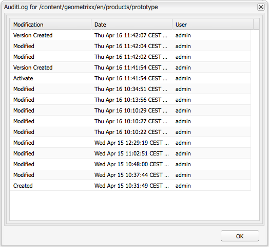
AUDIT LOG – CLASSIC UI
The Audit Log can be accessed from the Information tab of the sidekick. It lists the recent actions taken on the current page; for example:
PAGE INFORMATION – TOUCH-OPTIMIZED UI
The Page Information (equalizer icon) opens a menu that also provides details about the last edit and the last publication. Depending on the characteristics of the page (and the site it is located in) more options might be available:

- Open Properties
- Start Workflow
- Publish Page
- Lock Page
- Unpublish Page
- View in Admin
- Open in Classic UI
For example, when appropriate, Page Information also:
- Provides access to analytics and recommendations
- Allows you to perform a page rollout
The Website console also provides information about the current status of the page; for example, publication, modification, locked, livecopy, etc.
When editing a page with the touch-optimized UI there are various modes:
- Edit – the mode to use when editing the page content.
- Targeting – increase content relevance through targeting and measuring across all channels.
- Scaffolding – help you to create a large set of pages that share the same structure but have differing content.
- Live Copy Status – allows a quick overview of the live copy status and which components are/are not inherited.
- Developer – allows you to perform various actions (requires privileges); these include inspecting the technical details of a page and its components or performing automated tests.
- Design – allows you to enable/disable components for use on a page; also to configure the design of the component.
- Preview – used to view the page as it will be shown on the publish environment, or to navigate using links in the content.
- Annotate – used to add or view annotations on the page.
You can access these using the icons in the top right corner, the actual icon will change to reflect the mode you are currently using:

NOTE
- Developer mode is not available on mobile devices (space restrictions).
- Access to some modes requires the appropriate permissions/privileges.
- There is a keyboard shortcut (Ctrl-Shift-m) to toggle between Preview and the currently selected mode (e.g. Edit, Scaffolding, etc).
When editing a page with the classic UI there are various modes that can be accessed using the icons at the bottom of the sidekick:

The row of icons at the bottom of the Sidekick are used to switch modes for working with the pages:
- Edit
This is the default mode and allows you to edit the page, adding or deleting components and making other changes. - Preview
This mode allows you to preview the page as if it were appearing on your website in its final form. - Design
In this mode, you have the possibility to edit the design of the page by configuring the components accessible.

No comments:
Post a Comment
If you have any doubts or questions, please let us know.