When building sites with AEM, a practical distinction is made between authors and developers. An author’s role is to create content. A developer’s role is to add functionality. When developers build functionality into sets of components, authors can add, arrange, and configure these components with content directly onto user-facing site pages.
Tips for creating components
Start small. Components should reusable across a site.
Group together. Sets of functionality should self-contained.
Build up. Multi-part components should be built on top of existing ones.
Stay simple. Each component should accomplish one goal.
Don’t overarchitect. Only include functionality needed for current use.
Intelligently default. Components should have common settings built in.

Geometrixx Shapes Products Page
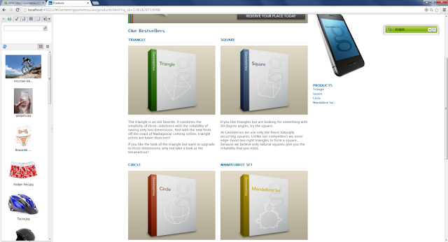
Geometrixx Shapes example
The default instance of AEM 5.6 is provided with a sample site called Geometrixx Shapes. This site contains a product page that provides pictures and descriptions of the best selling shapes offered by the faux company.
The content provided within the products page was able to be constructed using AEM’s default component set. Each bestselling product was built using a title, an image, and some description text.
A developer should realize that this content set is grouped together, and would therefore benefit from being self contained within a single component. Once self-contained, this content can be more easily added to pages by an author. Additionally, developers can add new functionality to the component as need arises. Some examples that can be considered later include dynamic loading of bestsellers, automatic inclusion of featured products, or content population from existing product pages. For now, the focus will be on simply creating a single component.
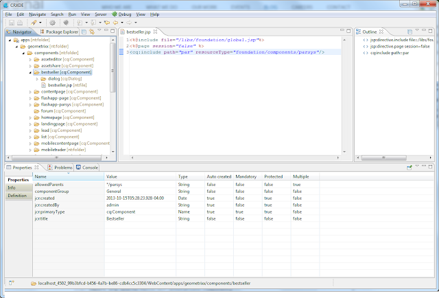
Using AEM’s built-in IDE, CRXDE Lite, a component named “bestseller” can be created and placed within the directory structure and group of the other Geometrixx components.

Create a basic component in CRXDE
Using the existing content as a guide, the newly created bestseller component should encapsulate a title, an image, and some description text.
This can be done in multiple ways, including:
Using dialog properties for each subitem.
Hardcoding subcomponents with <cq:include> tags.
Templating subcomponents within a built-in parsys.
All approaches are equally viable, and choosing one over another is primary a stylistic decision. This example uses the last technique, of which a full package download is available below.
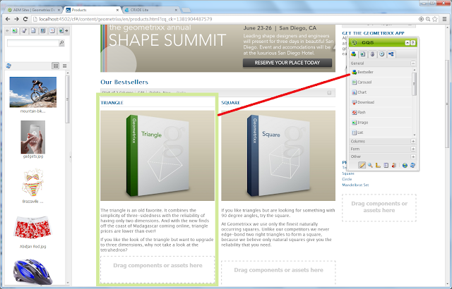
Once the bestseller component is created, it can be added directly to the product page. To do so, open the product page in Design mode, edit the “par” control to bring up its design dialog, and check the “Bestseller” box under the “General” list. After clicking okay and returning to Edit mode, this component will be draggable to the list under “Our Bestsellers”.

The Best Seller component being dragged onto the Products page
From here, the existing content can be moved into the new components, and new shapes can be easily added.
Summary
Considering the tips and examples described here, AEM developers can add functionality and enable authors to create content using components.
Resources
A package of all referenced code and content is available here:
http://aem.matelli.org//wp-content/uploads/2014/10/componentizing-aem-content.zip
This package can be downloaded then, using the CRX Package Manager, uploaded and installed directly into a default geometrixx demo application.
No comments:
Post a Comment
If you have any doubts or questions, please let us know.