How it works:
The column control is a component that resides inside the parsys, specifically on /libs/foundation/components/parsys/colctrl, but its rendering functionality is managed by the parsys component, on the parsys.jsp file Here if checks if the paragraph type is START, BREAK, END, or NORMAL. If it is “NORMAL”, then there’s no column control on the parsys, otherwise, It’s necessary to know if the column control component is starting, changing to a new column or ending. (this happens between lines 35 and 59 of the file parsys.jsp. I’m not posting the file portion because of the licensing).
How to manage the column control component on a page:
To manage the number of columns you need to go to design mode and open the column control design dialog. You can add there as many column layouts as you want. The format for each field goes as follows:
[Number of Columns] + ‘;’ + [Columns Class] + ‘\t’ + [Format Label]

Column Control’s Design Dialog
Just in case, the “Format Label” is the label that is going to be displayed on a selectbox on the column’s regular dialog.

Column Control’s Standard Dialog
Once you have selected a column layout, you can notice by checking the source code, that the class you set on the design dialog for the selected layout is being used on the column control markup:
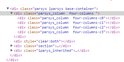
The markup for the selected columns layout
Also, note that each column is assigned a class similar to the one defined on the design dialog, but with a -c0, -c1, etc. This way you can completely control the columns wrapper, and each column layout via your custom css.
Modifying the columns markup to add an extra custom class to the columns wrapper:
In my particular case, I had to modify the column control’s dialog to add a custom css class to the wrapper of it. To achieve this, I had to copy the parsys and iparsys components from its original path (/libs/foundation/components/parsys and /libs/foundation/components/iparsys) to the apps folder (/apps/my-project/components/parsys and /apps/my-project/components/iparsys). Once I did this, I modified the dialog on /apps/my-component/components/parsys/colctrl/dialog to add my custom property field, in this case, a textfield, so it looked like this:

Custom field on the column control dialog
After this, the challenge was how to read this property. The first thing to notice is that the colctrl.jsp file is not the one that draws the columns. The actual file where the property needs to be read is the parsys.jsp, and also iparsys.jsp
To read the dialog custom property and store it on a variable, you need to add the following code after line 49 of both files (parsys.jsp and iparsys.jsp)
//adding a custom class name for columns wrapper
Node parNode = par.adaptTo(Node.class);
String customClass = "";
if(parNode.hasProperty("cl:colsClass")){
customClass = parNode.getProperty("cl:colsClass").getString();
}
Once the value is stored on the customClass variable, you only need to display it wherever you want on the jsp file, using
Node parNode = par.adaptTo(Node.class);
String customClass = "";
if(parNode.hasProperty("cl:colsClass")){
customClass = parNode.getProperty("cl:colsClass").getString();
}
Once the value is stored on the customClass variable, you only need to display it wherever you want on the jsp file, using
<%= customClass %>
That’s it!
Now you can enjoy your custom column control component. Just keep in mind that the parsys/iparsys that you need to include on your project is the one on the apps/your-project folder instead of the one on libs/foundation.
That’s it!
Now you can enjoy your custom column control component. Just keep in mind that the parsys/iparsys that you need to include on your project is the one on the apps/your-project folder instead of the one on libs/foundation.

No comments:
Post a Comment
If you have any doubts or questions, please let us know.